mars
1
yeah tell me which one you think is the nicest
- primary black
- primary white
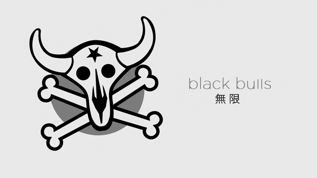
the alt colour
i haven’t done any graphic related things in awhile but these turned out clean fr
felt like the one piece styled logo was really missing something until it got a circle underneath it
obviously this wouldn’t have been possible without my good friend Tobi’s amazing logo design which you can find here:-
8 Likes
Like the black one a bit more, as it looks cooler and it is the “Black” Bulls after all.
1 Like
Tobi
4
Oh no, I can’t decide. The white looks so CLEAN!!! But the black is also very modern and sexy. AAAAAAAAAAAAAA
I can’t decide. 
2 Likes
Level
5
Just refer to your guild name
2 Likes
Took this, beat my head into my desk for 2 hours and made a wallpaper. If u have wallpaper engine and want to download it here are links
Normal: Steam Workshop::microsoft pain
With a funne effect: Steam Workshop::idk lol
Credit to Tobi and mars for the icon and wallpaper, I just made the things move
1 Like
bikbok
7
I like black better. Also it looks like it’s from one piece nice design
1 Like
mars
8
if tobi didn’t fix it up and make it actually look good our logo would’ve ended up like this
bikbok
9
are u gonna change your guilds description too?
mars
10
nah nah it’s aight the way it is
People who said white are racist 
