HE DIDN’T LEAVE
HE RETURNED STRONGER
GREATER
what is this supposed to be (No not the goose)
goose
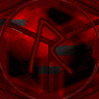
whats this is aupposed to be
main pfp
the cube is from one of my discontinued projects
damn ok
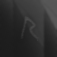
the fourth variant and final for some time
Which one should I use?
- Corruption Variant
- Dimensions Variant
- Goose Variant
- Umbral Variant
0 voters
what is even this?
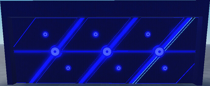
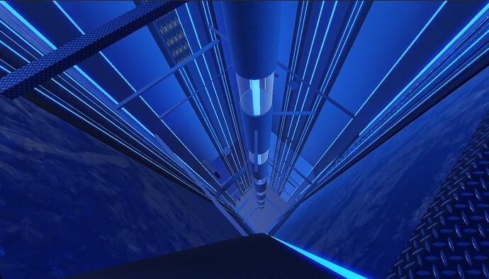
design
zamn that looks sci fi
ikr, I am only good at making block games unless I tap into more of my brain cells
Another design testing.
p o r t a l.
The portal to visit ur father
That’s pretty cool. What if you put the smaller gears a bit further into the portal to make it look like it has some more depth? Because the current looks fine when viewed head-on, but when you go to the side angle at the end of the video it looks a bit like a fancy spotlight.
I created a new User Card Background
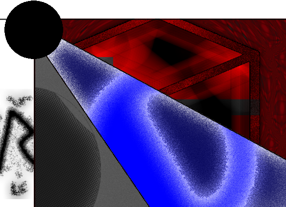
Go ahead. Press my pfp. Look at it.
