OLEG/27: Wow
7/10: Although this is good, something feels like it’s missing, although im not sure what…
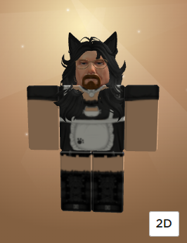
Gus fring mixed with pineapple, 7/10
u missed mine

what about this
very simple i know

I know I have a lot to rate still, but no time to do so. Hopefully in an hour or two I can finish up (sorry btw)
11/10 easily
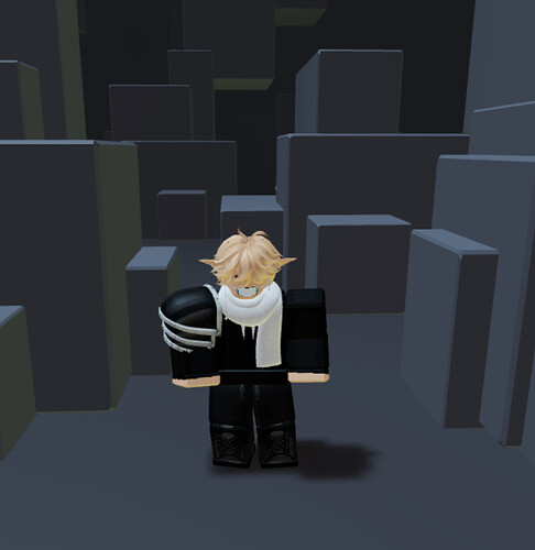
7/10: Has a style it sticks to and looks good for its simplicity, but of course it could use something else
Im so sorry for having taken so long, but I now officially have time. Wish me luck
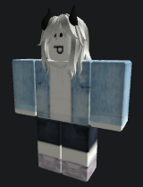
3/10: Very basic, not much style or flair, but it has at least a look to it.
For reference:
1 is complete shit
2 is ass
3 is ass but with coordination
4 has reedeeming qualities
5 is okay
6 and beyond are more open to discretion
fyi you skipped a few above the avatar you’re currently looking at.
1st: 5/10: It sticks to a theme for the most part but can’t stick the landing due to uncanny feeling
2nd: 7/10: Much better theming, but something feels weird once again
Yeah I’m working backwards, works a bit better for me
8/10: I like the atmosphere it holds, and although it isn’t exactly something I would use, it has flair. Very good
An example of how to do a simple avatar. Don’t go crazy, but have flair and style. 9/10
8/10: It’s probably already known I hate avatars that are blocky and use r16, but this one pulls it off very well. Good color combo too!
4/10: I’m fine with it, but it feels more memey than anything. It isn’t bad, but that doesn’t mean it’s great either
6/10: This is fairly good, too much is going on however (could be the white background throwing me off)
