Rating drip but i actually have a fashion sense

my tropical drip

Screenshot 2023-03-04 235932
Screenshot 2023-04-02 221950

good lord how much time do you have

  1. very many accessories, i feel like theres too many small ones around the top 6/10
  2. definitely follows a theme, which fits it but again the hair accessory clip (why vetex) also this is just my opinion but the cape/cloak feels strange here 8/10
  3. interesting, the boots dont match well but the rest looks cool 8/10
  4. the single amulet and bare arm is kinda off 6/10
  5. i guess the title screen doesnt show weapons or smth, it would def look better with a greatsword and shield and dagger 8/10
  6. the edgy queen calvus, it looks really good but for some reason just feels off lol 9/10
  7. chill assassin, hair combo is really nice 8/10
  8. very simple. pads would probably look better if they were darker but idk 8/10
  9. hair is strange, looks deranged lmao 6/10
  10. basic marine outfit, but it kinda fits (first looks: mcdonald employee but blue) the sword is very cool tho 8/10

definitely looks like your profile pic
everything matches here 10/10

hmm
messy at the top because of the shirt but it def fits
i wonder how many wolves bandits you slaughtered
7/10

everything fits very well
could use a boss animation pack but yea i really like this one 10/10

ooo this one has a very nice feel
cape color throws it off tho and maybe the shirt is too simple? idk 9/10

MORDEN?? IS THAT YOU??
ehh its not that edgy at least you dont have an angry face and a katana 7/10 a bit too dark to see details tho

1 Like

i know what youre trying to do here but it doesnt work :sob:
still looks good tho 7/10

first one is very cool 10/10
2nd one is great but the hair makes the face look disfigured
image
9/10

third… eh the helmet and the monocle doesnt fit too well with the other accessories 7/10

  1. simple but the beret sticks out a bit 8/10
  2. looks like what someone irl would wear ngl 9/10
  3. this one the hat fits. the fish looks like its attached to the hand lmao, i feel like it could use something on the back tho 9/10
  4. doesnt match very well 5/10
  5. cool 10/10
  6. yea its a bit too simple rn 6/10
1 Like
  1. everything fits well but the leather pads 9/10
  2. this one the pads do fit and looks very nice 10/10
  3. looks a bit messy at the top and the wolves cloak doesnt match well imo 7/10
  4. no decided color scheme i think so 7/10 (better if the shirt was a color that goes well with black and white)

hair but arcsphere, looks weird if i look at it for too long
sorcerers drip tho 8/10 (remove the ball on your head yes)


you look like youre about to pass out and die lol
facial hair and pants dont match very well, kinda a mixed theme 7/10

  1. mmmmm just looks like an older version of the first one 7/10
2 Likes
  1. the cowboy fit, the shirt would look better as a dark color imo 7/10
  2. very nice drip, but the hat doesnt go too well with the hair 8/10
1 Like

Would you believe me if I said I don’t have much time

Anyways thank for the thoughts :nod:

1 Like

no

1 Like

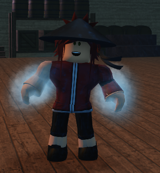
Leo Calstro the hydro fist member of the expeditioners
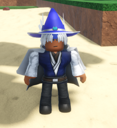
image
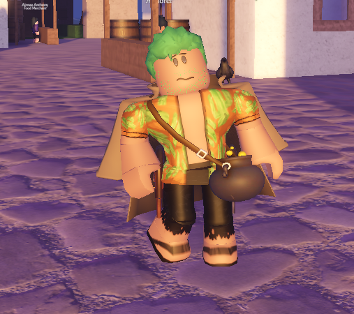
Jasper Cannon light speed conjurer (drip needs work)
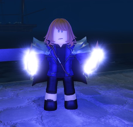
image
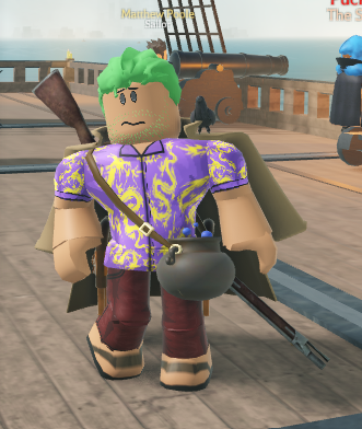
Elroy Alto blazing sailor fist build
image


what do you think about this instead for the third one

yea much better 9/10