Ya, i feel like that’s part of why he didn’t think we’d be able to make game thumbnails like we can’t follow prompts 
Yeah
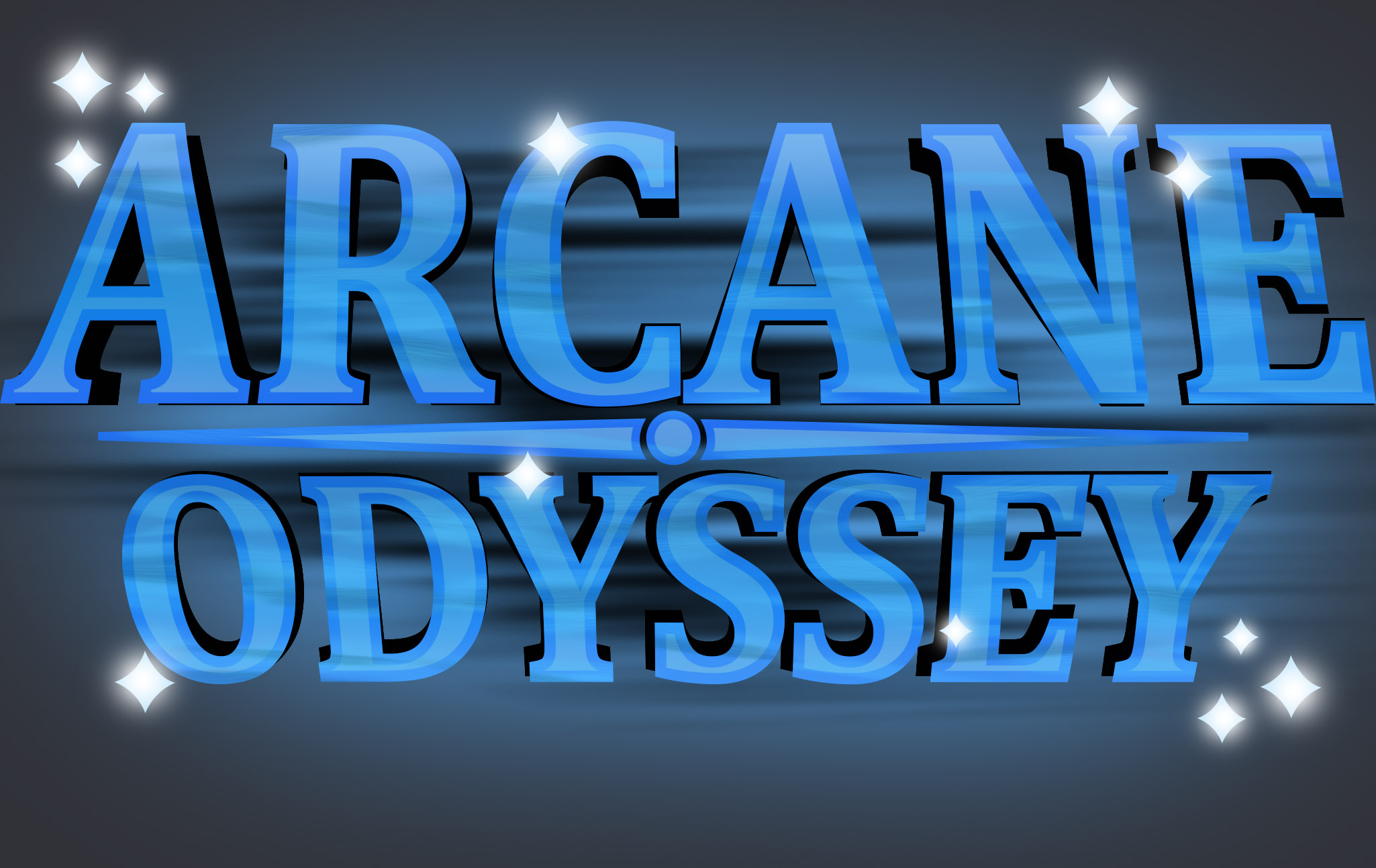
I mean I feel mine is a step up from Vetex’s. It’s nice and simple, but a good deviation from WoM or Arcane Adventures, and my compass hand adds that Odyssey vibe.
1 Like
arcane EVERYTHING
bruh
1 Like
I think it looks way too complicated compared to the official one.
1 Like
The black throws me off and stars remind me of WoM. Compass however was a great idea.
Anything could still work though depending on what the thumbnail is. WoM title was neutral and fit on vetex thumbnails. Blue would theoretically match a few moods and colors. Idk what the purpose of this is lol sorry
1 Like
This. This is epic.
1 Like
Yeah, I created different compass designs and finally settled on this one. Not sure why the black throws you off since Vetex’s logos also had black, but I think I understand why. The reason I used black was to give some contrast between the logo and any background that it is put behind it. I also wanted to fit AO’s more depressing theme, while still being subtle. I personally like the stars and don’t see why referencing WoM is so bad. Both games exist in the same universe, and AO was created from WoM. Most game logos that happen in a shared universe normally have consistent logo designs, but changed up to match the settings of the game. The purpose of this is to be a moc logo of what I personally thought Arcane Odyssey’s logo could look like, nothing more nothing less.
3 Likes
i’m into the black it makes everything feel balanced, it’d feel worse without it imo
1 Like
oh my god this looks great
This is better than the actual, official logo. Good job!
yeah this logo looks lit
1 Like
Thank you. 
1 Like