This is a website suggestion for convenience, it’s not necessary at all.
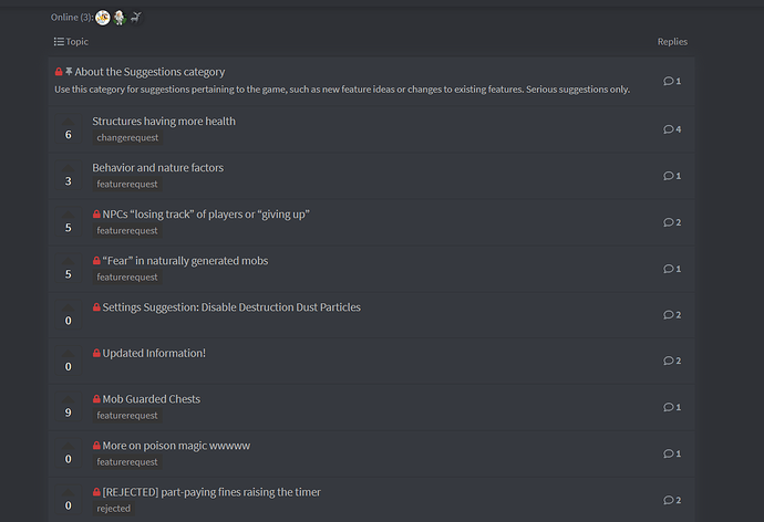
Add some space between open suggestions that we can still vote and reply on and closed suggestions, which aren’t really worth checking compared to open ones. I know there is already a somewhat small lock symbol on every locked message, but space separating the two "types’ wouldn’t hurt, right?
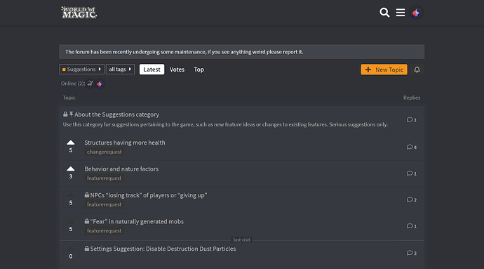
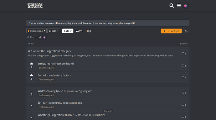
Here’s an example of how the suggestion channel looks like currently and how it may look like with a space between the two “types”:
Before
After


