uh, is it full yet?
Nope, the podium is not full yet, characters are made based on when they were posted on the thread. I believe yours is not too far down the line though
Currently, I’m at @/MrLance and @/arlyborg 's characters
aight k, can’t wait to see wilford in misery
Thx for explainning how it moves.
Glorious
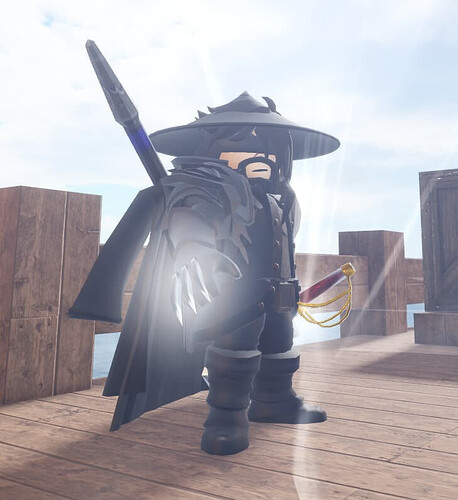
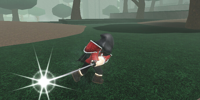
Takashi Silverthorn
Doing this pose
His left hand with a katana and his right hand with a vindicator
My request will take forever but still :pp
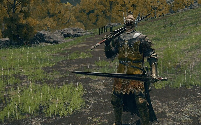
can i request that this absolute gamer is put next to tobin please
theres so many i doubt mine is gonna get on there now lol
but its fine i dont mind that much if i dont make it ![]()
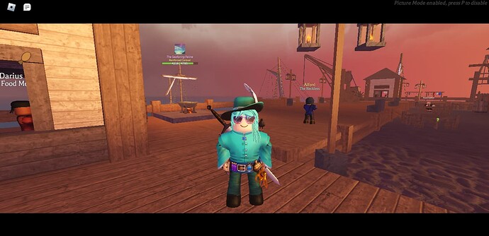
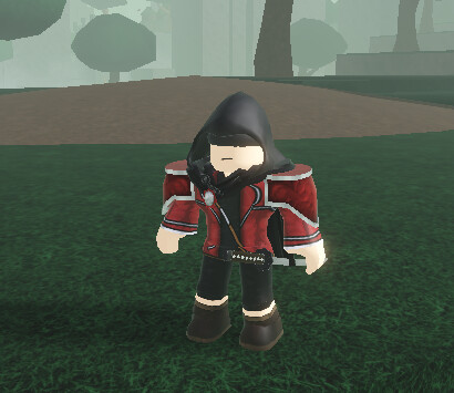
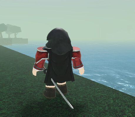
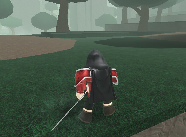
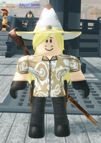
Here’s my character.
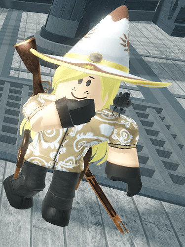
As for the pose, maybe my character can be writing in the notebook tool?
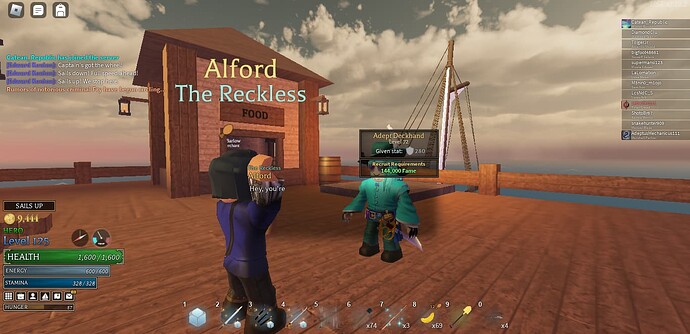
If not then the default greet anim will work (as shown with this deckhand).
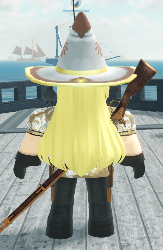
I don’t know the glasses, but here’s the rest of the accessories:
Weapons don’t need to be included, though if you go with the raised arm, put a paper (like this one) into the raised hand. It could be nice
waiting for the day I get on something ![]()
A well dressed gentleman with a fine pet rock I see… You’ve had the weirdest and hardest pose that I’ve had to do so far. It was just so hard to get it to look good with whatever absurdity of an anatomy that a robloxian had…
< “Lance” is prepared to go to war! >
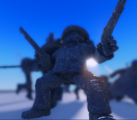
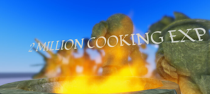
The man we let cook. Continue to cook please. Remade the pot and fire just for you <3
<Abdallahi can COOK!>
Oh wow this thread is pretty big
Yep! Thanks to everyone’s help and encouragement!
Eventually I’m trying to get to 50 forummers on the statue :D!
Currently we’re about 1/5th done ![]()
Well, I would be glad to help you achieve that. Give me one moment to get a good picture of my main AO file and I shall add it here in case you want to construct it on the statue
Alrighty, I’m going to need yall’s opinion on this:
So I want to move the podium’s format to more of a circle so everyone has a decent view and because it’s already sort of shaping up into a circle at the moment.
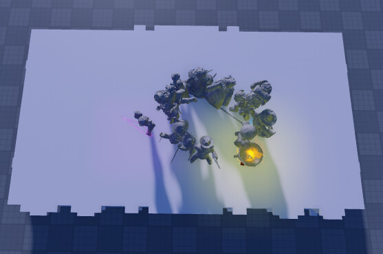
When I started this design I was going for a sort of smash brothers ultimate poster sort of sculpture but I’ve started adding my own twists and methods in there since this is based on a 3D space rather than 2D. I wanted to see what you guys thought about this change, please vote in the polls below:
- Change the podium into a circle
- Keep the podium a rectangle
- Other (Explain in replies)
0 voters
AMERICA (YEAH!)
I’d reccomend a multi-stage circle. Like a smaller one surrounded by a slightly bigger one etc. This way all the models would still be visible as you pan around it, and no one would get obscured for sitting down or having an odd pose.
