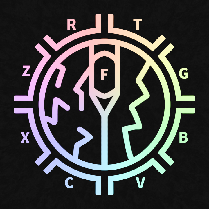
the R/T/G/B/V/C/X/Z at the outer part of the magic circle thing represent the 8 keybinds for a unit’s special/unique skills
the thing in the middle represent a mouse button, with the left side having many small lightning bolts which represent M1s aka lower damage and faster attacks, the right side representing M2s aka higher damage and slower attacks
the F (strangely on the scroll wheel) represents the keybind for blocking
looks pretty good but im not keen on the letters on the outside and the inside even if they represent the keybinds, would be better if you replaced them with some sort of symbols
what elment said, symbols might look cooler but it would also be good for the keybinds to be “rotated” depending on what part of the logo they are on, like keybind r being rotated 15 degrees to the left