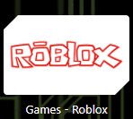
Wish it was 2016 again.

ahh the memories…
Nostalgia: 100
Real talk time.
Why did they go from unique logo to cheezit?
because they’re the same people that thought rthro was a good idea
Why can I only give this post one like?
I got used to the new logo after some time. It isn’t that bad once you get used, but the old one is just nostalgia factor, and people tend to overrate things when they feel nostalgic.
I would agree with you but there’s no way to can tell me that the new design is actually better.
Its literally just a grey cheezit
Partially it is a good idea to allow more character customization options for others (small portion of the playerbase), but the bad thing is shoving it into our throats like there’s no end.
Yes, the silver-grey gradient looks pretty good, and also the new Studio logo is better than the old one. It’s better cause it looks better once you get used to it. I simply forgot the old logos existed cause of it and cause I’m not extremely nostalgic. It’s not just a grey cheezit, don’t even know what those things are.
that logo was fuckin poggers
Look up cheezits and you’ll understand.
Its literally the roblox logo now.
Also nostalgia aside, how is a unique looking logo superior to a square?
color and gradient, and maybe because it’s a newer logo and cause of this you don’t get bored of seeing the same logo everytime. i’m not saying new = good though.
it’s not unique btw, everyone makes a initial letter logo one time at least. and it’s also an angled square representing the O
and i think you inverted it, it’s ‘‘how is a square superior to a unique looking logo’’
New logo is more fitting imo; it fits modern Roblox more compared to the old logo tbh.
