no more blue button colour what we thinking chat
nvm this is ugly
Yeah ![]()
navy blue fancy
Oh actually looks good
does the reply button look a bit better? its either this or i struggle for another two hours trying to change the text
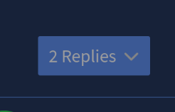
I think your probably good it looks good to me
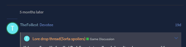
dang am I missing something or do people just not use the forums on desktop ![]()
was kinda wild seeing the colors change before my eyes, but I definitely like that darker blue you chose better, makes the text easier to see ![]()
It’s just easy to use on my phone I look at the forums at school sometimes or just when I’m bored
i do but this is my home
this changes all the buttons to this navy blue so i might see if i can change the text instead but ill leave it be for now to gauge reactions
Are we turning this thread into a forum layout suggestion thread?
If so…
In regard to the discrepancy between the separation of the top bar's buttons and others
![]()
The top bar’s button are stuck together
![]()

Meanwhile, all of the others have a seemingly equal distance separating them (except vertically)
In regard to the 'Top replies' button of a thread's statistic (bottom) bar
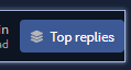
The button has a distance separating it from the top and bottom borders of the container while it is not separated from the right border
i am learning how to write css on the fly youre overestimating my skill here
these are all the website itself i wont be able to change any of this
same, but whenever I’m home I usually just use desktop lol
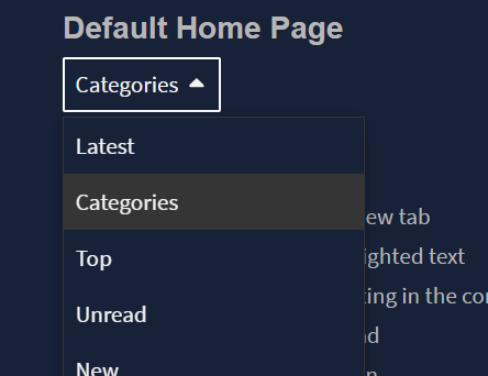
oooohhh wow I’d never even thought about clicking on those tabs, had no idea there were different home pages
personally I actually like the navy blue more and it more or less fixed my issue with the text being tough to see at a glance, so unless somebody else doesn’t like the text color I don’t think you need to burden yourself more ![]()
Im pretty sure that the version of the home page you (and I) use requires a specific setting in preferences to be turned on, ever since an update a few years ago. So for most people, it defaults to the “latest” rather than “categories”
2 Likes
the mark of oldheads who’ve barely changed their settings ![]()
2 Likes
I’m unsure as to whether or not this thread should be utilised (especially in this way) so do tell me about it.
The ‘time leap’ container seems to be messing with the top post separator of replies. This happens at any UI scale (zoom) level.

This being so high contrast annoys me a LOT because it draws focuss where it is not needwd and just… overall does not have a clear use.
Also i wish stuff like my posts, invites etc would be able to get removed because i never use those and an option to customise such or remove them from view would generally be pleasant.