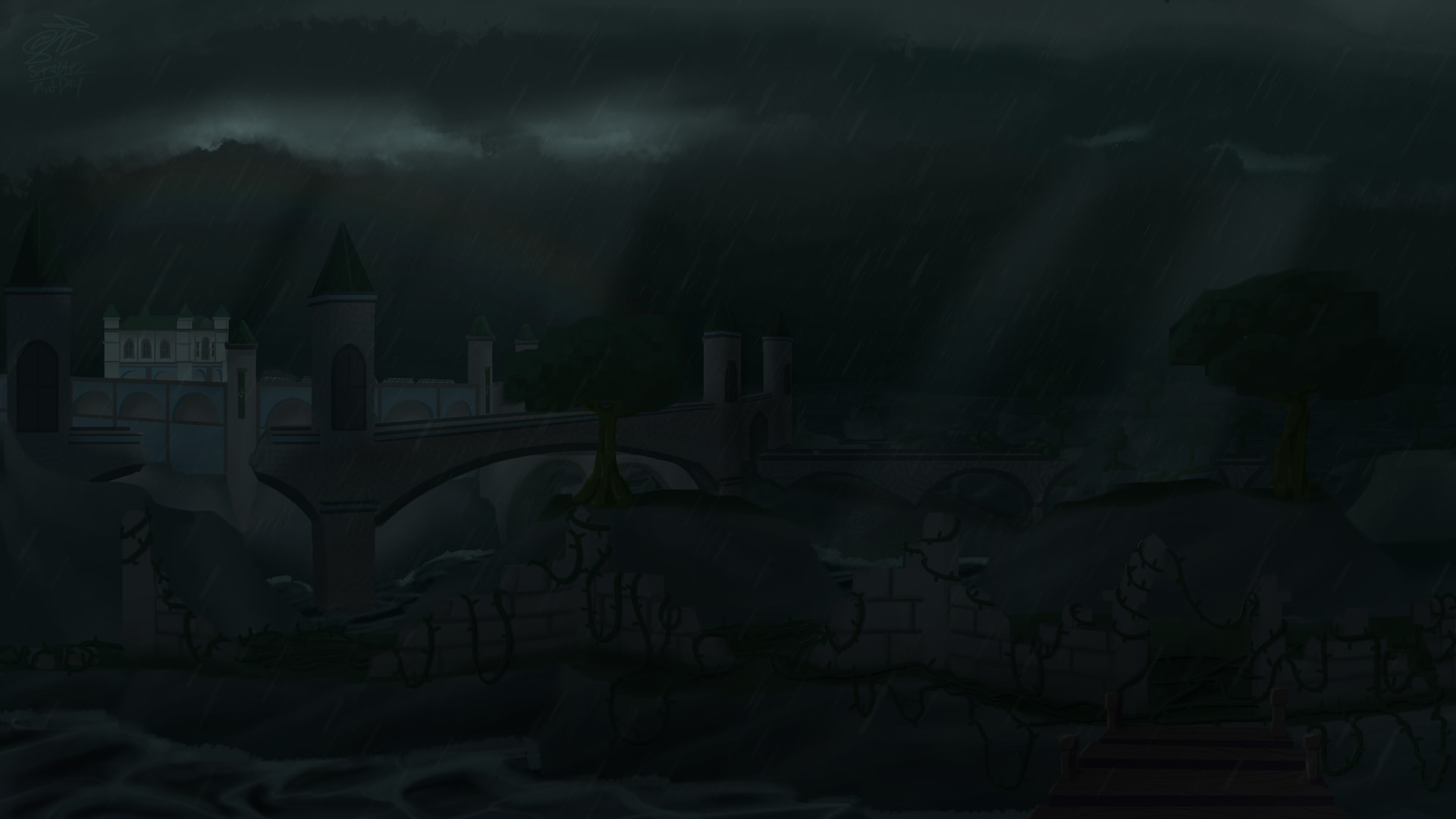
YES I am creating media for a part of the game that currently does not exist. I studied the teaser posts extensively in order to get some of the city at least partially correct.
This was my first time diving into landscape paintings with architecture. It was kind of a pain, but I think it was worth it - because even if it’s not perfect, I still learned a lot.
The concept theme I mentioned in the title is linked here: Tears of a Tyrant
The buildings lacks architectural depth. Since you chose a dark atmosphere with rain, the buildings should have softer edges, less contrast, and more atmospheric haze. They lack asymmetry and imperfection, there are no weather stains, corrosion, or moss/cracks, crooked rooflines etc. You did well in the bridge but the castle/city doesn’t seem as much so.
Also, there seems to be no light in the city, why? If there are no light sources, why the castle looks perfect without any stains or whatnot?
I would say overall, the city looks primitive, its as if someone placed rectangular/cylindirical shapes directly on a canvas, it doesnt look natural.
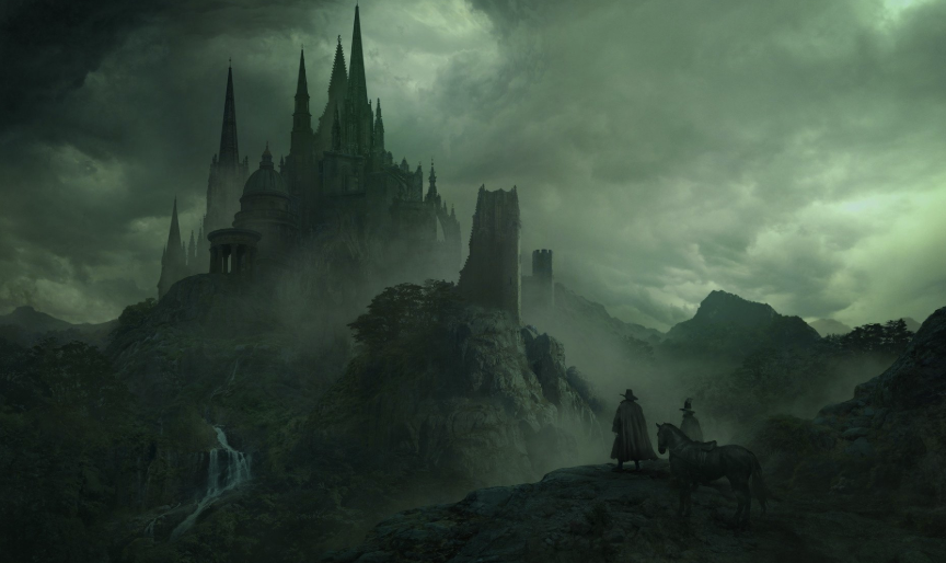
Here is a good similar art I found in the internet that does a good job in the architecture intertwined with atmosphere:
honestly i was going to call you out for being a hater but you provided actual good constructive criticism without being too much of a jerk (still should’ve just posed it as advice rather than bluntly stating your issue with it)
I believe I see what I did wrong here. I was focusing too much on mimicking what I saw in the teaser images, which lack the wear and tear or detritus of an abandoned structure, instead of thinking about how the environment around the city would affect it over time if not kept in check.
Admittedly, I went through the whole process of drawing the city kind of sloppily, because I wasn’t really enjoying drawing such linear shapes over and over again. Luckily, what you’ve suggested I should do kind of counters that. Thank you!! I’ll take this into account next time I draw something like this.
Im sorry if I came off as like that. Its not that I didnt like the art but more so that I found many avenues of improvement, and, especially for artists new to a field, I think its important for them to know what is lacking or could be improved in their art.
Thank you for pointing it out, I will try to be more considerate even if I think I considered what the other side would think enough