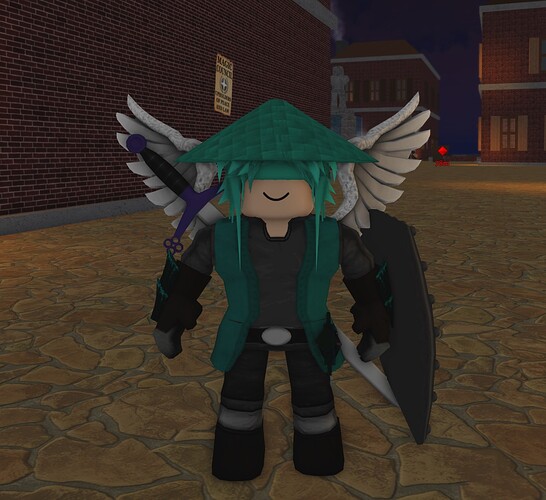
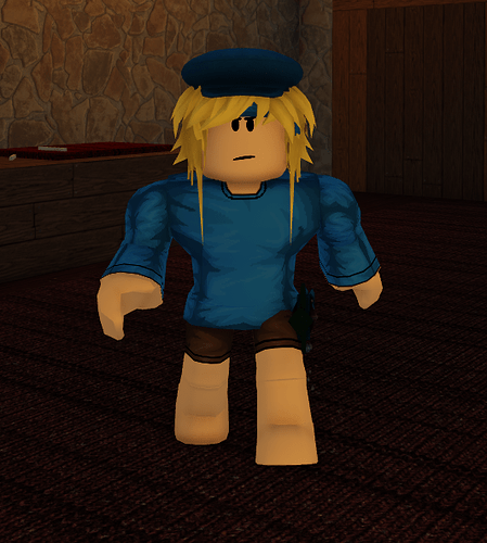
5.9/10 for both good color scheme but hair clipping and very basic
8.5/10 gotta flex the value ![]()
![]()
![]()
![]()
Say mine is that with a headless
What would the rating be
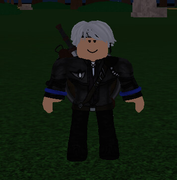
Gonna use funny blue crystal on this in ao
4/10 no color scheme and looks messy
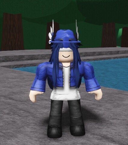
just gonna smack this here
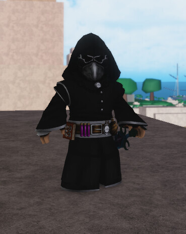
My profile is actually pretty close to this
Cool idea but the wizard robes are just so ugly 7/10
Basic and I hate the shirt and the accessories kinda mid 5.5/10
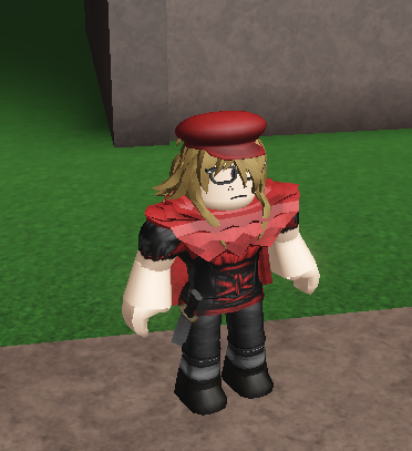
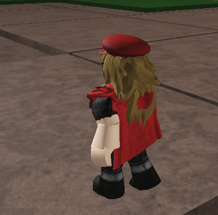
would be better without the wizard parts
7/10 only because the model for the back of the cape sucks and ur hair is clipping through it
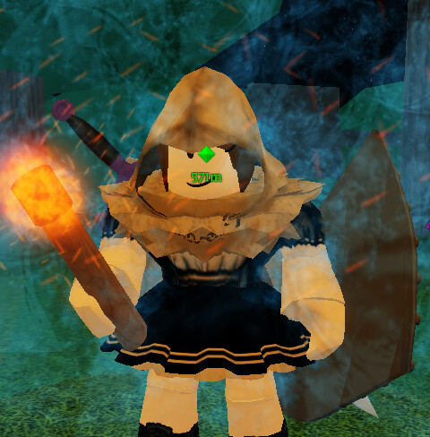
likely no magic build
Magma file development
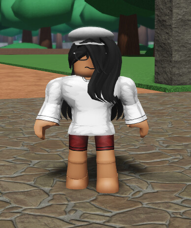
looking better? the clipping hair is still there but i don’t mind it
Water file drafts
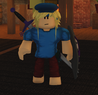
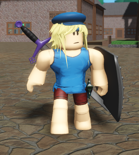
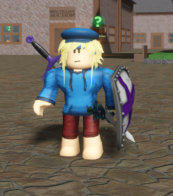
-
- Long sleeves with shorts
-
- Short sleeves with pants
-
- Tank top and shorts
-
- Hoodie and pants
-
- Try something else?
-
- Go with your gut, lettuce.
0 voters
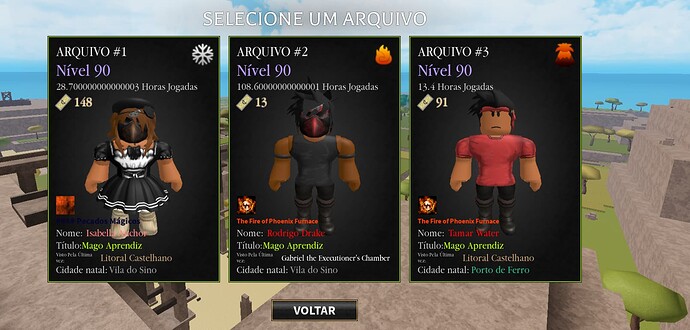
0/10 maid dress
magma file is like a solid 8.5/10, cool trigno looking character
fire file is a 6/10, just looks a little weird with the mask
and then the snow file.
what the hell were you smoking
2/10
