As it is now, the auction house’s GUI fails at fulfilling its one and only purpose: allowing players to quickly find a listing of whichever item they might want.
Why that is is not only due to a barebone filtering and inventory system that require an entire revamp, but also because the categories themselves can vary from individual items to a multitude of them. Id est, there is a terrible lack of organisation.
My solution
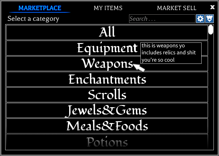
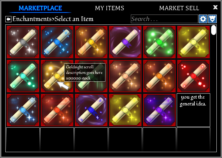
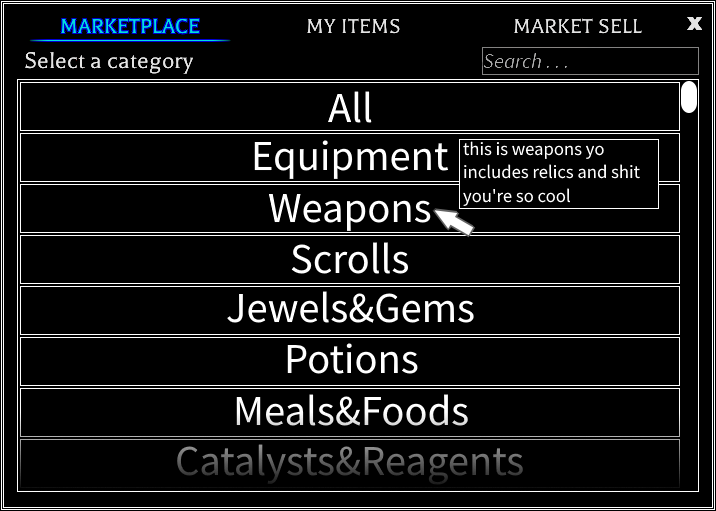
To fix the latter, I propose the following: Adding actual categories that will contain items relevant to them, nesting them. (The nests: Category>Item>ItemListings)
What this will do is organise the auction house and make it a thousand times easier and faster for everyone to browse. It isn’t even difficult to implement either as GUI is simple in nature.
A low cost solution that fixes the issues of an entire feature is always great isn’t it?
Also, there’s really no need for a search bar for individual item listings (the offers, not the items themselves) when this is a possibility, really.
A poll just for fun
So, which would you rather?
I would rather have a GUI redesign.
I would rather have a search bar for listings.
I would rather have AO stay the same because it’s only meant to be slop that dumb kids will play, easy ban.
0voters
Comments
This suggestion was edited shortly before the below comment was made.
All I want is to be able to search for a specific item, and for that item to pop up. Not for the 2 trillion page doom scroll that is “Enchantment Scrolls”. Please Vetex. Please.
I feel like I didn’t get through most of you considering that this has only gotten 1 vote despite being so much better than a search bar for listings.
If you look at the top left of the second image, you can see that the suggestion is about nesting individual items in different categories. This is meant to be for the likes of scrolls, catalysts, reagents, etc. to be separated in multiple listings, not remain the same.
If this feeling is right, then can anyone tell me what was so wrong in my original explanation and drafts? I can only assume that this was caused by a usage of words that most wouldn’t know, but they’re all pretty common and simple, so I doubt that to be the case.
I think I get what you mean? You choose the category, then you choose what you want from that category, right? For me, I’d just rather type in what I want, and then for that to pop up, rather than click 2 buttons. Because I am a completely non-lazy person. Trust me.
And when it comes to voting for this, I’m at my vote limit so I can’t xd.
Suggestions won’t immediately take off unless it’s relating to something that people desperately want changed or is something super cool (i.e. Oracle suggestions or the old Sea Monster Bounties post).
Just to add onto this, it’d be nice if within those groups, items that are a part of a set shared the same tab. I don’t see why the full sets for Skyhall Family items can’t be grouped together, especially since nobody will really buy those outside of Skyhall itself.
atp im convinced the auction house is bad on purpose because whenever I try to find a specific scroll it makes me want to go out there and find it myself
Did you just go against God-Emperor Vetex’s designs? Enjoy your ban nerd!
But in all seriousness I think it’s something we can all unanimously agree on that the auction is terrible right now due to how annoying it is to have to go through page after page to find listings etc. I’d like to have a search bar but a new GUI design would feel very welcome. I often avoid using the marketplace simply just due to how tedious it is to actually use so you have my vote.
At the very least the batched categories need to be better. Like, first of all, why are raw ingredients and finished products lumped into the same category? Jewels/Gems and Cooked Food/Raw Ingredients are the two that bug me most.
Definitely a needed change 100%! Only question on this is why not have both nested categories and the ability to search for specific items in them? That would be more useful overall.
Searching for individual items would still be a thing, no? This suggestion is really only about adding another GUI layer before the current “category” (item) selection as to eliminate the messy, item class-wide ones like catalysts&reagents.
You can still see the search bar in the concept drafts, the one meant to represent item selection being the second with the hidden message.
This misunderstanding better not be why this isn’t as popular as it should be, I thought that I made it pretty clear in the images even if not perfect. Either way, I’ll be editing it soon.
It’s your poll that makes it sound like we have to choose one or the other, but you can’t really edit polls unless you delete them which is a bad idea at this point. I did also kind of skim the suggestion for the important details so I might have missed something that would clarify that.
It’s because it would be completely useless to add a search bar for listings (the offers) when all items would already be separated—something that I’ve already established in the suggestion prior to editing it.