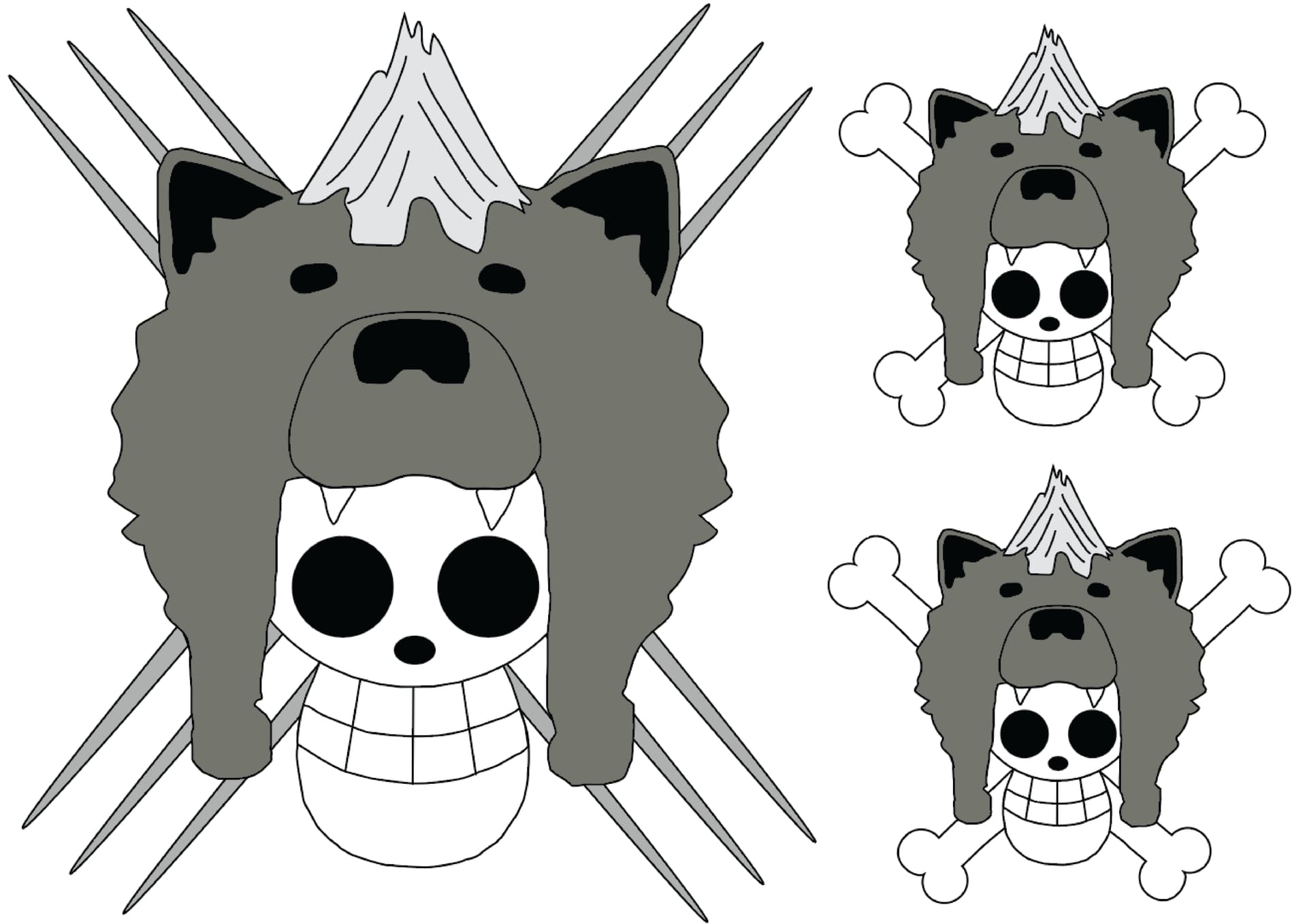
Ill be making a one peice inspired guild/ pirate crew for me and a couple of friends. I based the banner on my characters apearance simular to the anime and i want more peoples opinion because im getting alot of mixed choices from my friends. Im open to suggestions for details to add. Just tell me which one out of all 3 looks best. Ive also not come up with a name but im planning to do that shortly in my spare time.
I think it looks like your a big one piece fan because of the skull there mixed with alpha or something is my impression for the logo. If it’s all for fun go for it. If your planning on expanding it someday, it needs major improvements.
For simple improvements, shading and stuff. Also why did you choose to put your hair on the logo? Is it supposed to be a mohawk.
I believe a clan logo should be able to give an impression to what your clan is about, it certainly does. Skeleton Pirate, who are wolves and maybe alphas. If that’s not what your going for maybe try thinking of other designs.
I apologize if it sounds mean or anything, this is just what I think. In the end of the day it’s your choice.