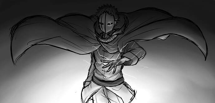
I love the original design, i do changed it a bit tho. The comic concept is pretty cool go check it out : Tobi’s comic he is working on.
god fucking damn, that’s fire
mmmm that’s some really good lighting wowie
are you god but as an artist for this game
this is OMEGAEPIC
looks like tobi isnt goofing around anymore…
ART GOD ART GOD ART GOD
2 posts were merged into an existing topic: Critiquing critique
Day bad
tong posts
Day good
Tong, why must all your art be such FIRE?
The heat of it all is melting my brain.
god damn that lighting is fantastic
damn bro this shit is so good I’m bouta fucking ascend bro god damn the artstyle really fucking slaps man this is so good I’m barely able to describe it with words bro god damn how long have you been drawing for all of your shit is just straight up sexy you’re an art god not even gonna lie you bring something new to the table every time and all of it always looks really fucking good I ain’t kidding your shit should go into a museum, no, you should have a museum dedicated to your own pieces because all of it is just so good bro all of it lookin really fucking epic like bro all the anatomy and the artstyle of imperfect lines almost perfectly fit the lighting of this drawing and the changes made to the mask are just gorgous, because of these lines it makes the drawing look more vibrant i guess not gonna lie I dunno how to describe it but it just looks really good I wonder if you’ll draw some drawings that will be in tobi’s comic or if he’ll do everything by himself, cause your art would look terrifically amazing bro like god damn your art is just soooo good and I think I’m finally reaching the end of my capabilities to compliment your art with words, even though all of this doesn’t even begin to describe it, I would probably need to use at least 8 more languages to even accurately START complimenting it, but let me just use a bit of french german and polish and some cursed text because why not ![]()
Magnifique.
Großartig.
Zajebiste.
̵̛̛̙͈̳̗͛͑̈́́́ ̴̢̛͕̺̺̻͉̻͕̼̼̱͆̀̊̔͐͂ͅق̷̢͓̻̩͉̺̜͉̞͙̀̒̍̏̀͒̓̾̿̊͑͋͐͌̎͝ͅء̷̧̢̭͈̤͈̫̮̳̱̳̼̪̞̈́̏͊̇̉̿̔̋̅́̏̇̐̚͝ر̷̢̧͉̞͖̀͝غ̴̢̧̭͈̱̪̣̟̟͕͍̳͖͇͍̌̆ ̵̤̱̮̑͒́͛̍̎̒͒̇̚
now let me give you some epic Dragon edition cRiTIqUE
your art bad because bad mine better and ur art bad this bad this bad this bad

bro this is bad it should be this

see mine shows all of your flaws bro ur art bad
this was some epic dragon edition cRItiqUe I hope you enjoyed
In all seriousness, how do you do cursed text though?
12 posts were merged into an existing topic: Critiquing critique
AHHHH I’M sO eXCITEDDD yEAAAAA 
Better then any manga release
bruh that’s lit
2 posts were merged into an existing topic: Critiquing critique
I really like what you have done with the original rough sketch I had Kwispy make. I and kwispy have been discussing what elements from your art we will add to a newer more finalized version and have decided to use the hood collar design, and eye shape design. We also decided not to do the comic in color as it will certainly be more work on both our ends. We both really dig the monochromatic art style, with the rough drawing outlines that create a sense of movement. Art like this in the comic may happen, but probably only when Tobi harnesses the power of chaos to go into Chaos boost mode (or when characters get serious). The rest of the comic style will probably be similar to Ikemoto’s and Kishimoto’s coloring with hard black lines. I am no expert as Kwispy will be doing 100% of the character drawings and shading so it is up to her how she will approach the art style. I will just be doing the story (with help from Devo and possibly others), the backgrounds, dialog, text, some panel formatting, and pretty much what a director does.
Thank you for your great concept art.


