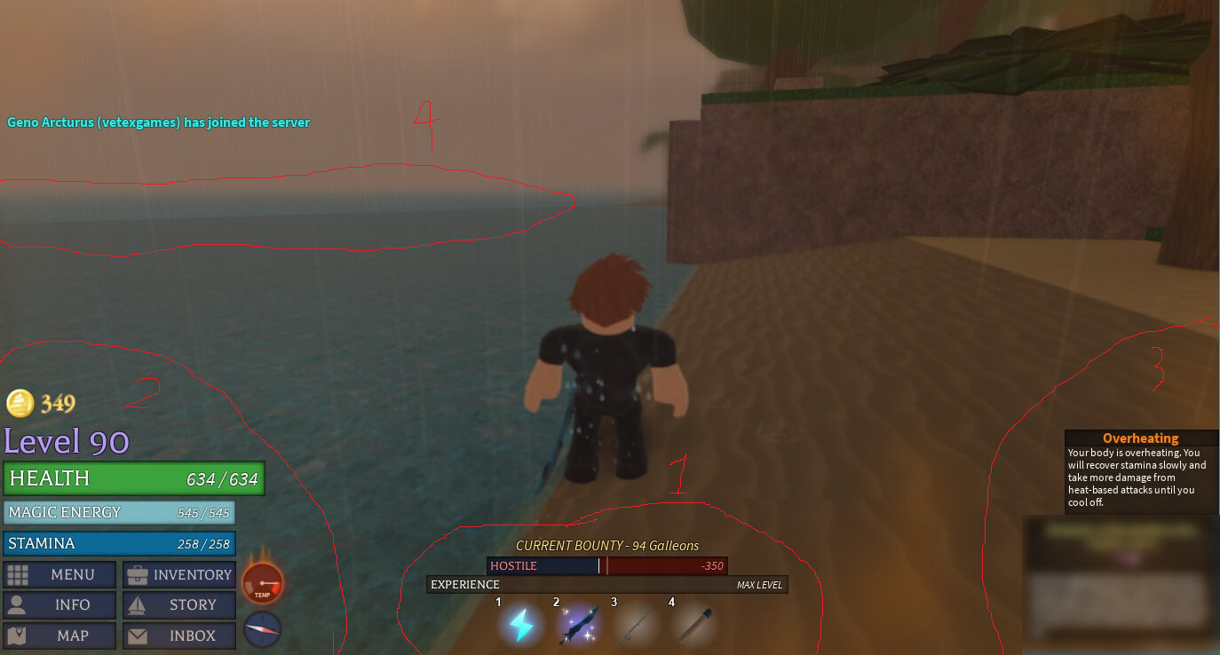
2.) I don’t like the new UI for this side, mainly because it makes smaller things (like mail, story, and “info”) the same size as frequently used buttons such as the menu and inventory. It also looks kinda bland because they’re all the same size, but that may just be me.
3.) I find it interesting that Vetex blurred the storyline quest.
4.) It doesn’t look like Vetex has started building other islands yet, or maybe he intentionally hid them from view in this frame(?).
I dunno, I feel that WoM’s UI is way more intuitive because it highlights the most frequently used buttons making them have easier access to players. Tbh I’d be ok with this change IF vetex keybinds them this update.
I like the hotbar area, both the hotbar itself and how the xp bar is clearly visible.
The lower right hasn’t changed much, or I’m just not seeing what changed, maybe the background colour. It look good nonetheless.
The lower left is nice because now that each button has text saying what it does, the new font and icons are fire, but the galleon icon seems weird to me, could just be this picture.
I like how everything is in a neat box except health, which is slightly protruding, giving it a nice pop compared to other things, signifying its importance.
There seems to be an option to disable the player list, too. Not sure if that was a thing before, but it’s a good thing either way.
It’s a ship, yeah, but I can’t see very well how exactly it looks.
If it’s simplistic like the rest of the icons, then it’s very fitting, no issues there.
But if it’s more elaborate then the rest of the lot, then it might not fit as well imo.
its much better having everything be the same size. it just feels more natural having each actually have text and a small icon. also the entire size of the ui is way smaller which is nice since it doesn’t clutter my entire screen
yeah no spoilers
yeah only 1 island has been made so far
also the blue sucks. it just looks messy and cheap. its like ui you use in a beta and aint polished at all
honestly i was hoping that all the extra menu, inventory, info, story, map, and inbox would be hidden…
more like a little circle below the directional and temperature gauges with the 3x3 squares on it. Then you can click it and open up a pop up menu with the said menu, inventory etc.
For streamlined purposes?
even if that wasn’t added im completely fine with it