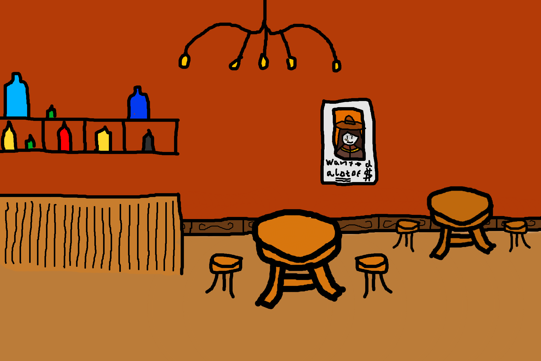
Give me some feedback on this, I’m gonna add people into it soon, I just need your thoughts on of this is on the right level of quality with my other arts
for added fun you can also try and guess who it is in that poster
(There will be people in it and it will feel a lot more alive, now give me feedback on what can be improved)
(I spent a bit too much time on the poster considering this would be in around 1900s or so)
1 Like
sock
October 7, 2022, 2:42am
2
the perspective on the tables is a bit off, their tops look like they’re facing the camera too much
fair, though this is meant to be rather low quality of course but I’ll take it into account if I do stuff like this again
yesway
October 7, 2022, 3:29am
4
it doesn’t have me in it which is why it looks off
The top left has a bit to much empty space, but I like the style.
alright new and improved Bar has been drawn