The inventory currently feels like a giant list you have to scroll through while having to stay in place. This feels a bit unnecessary and should get a redesign to allow players to find items easier and travel while equipping.
Hiding Main HUD
Things such as player list, reputation, experience, health, etc. This will allow a bit more room for inventory as I feel like your focus is on your inventory and not these other aspects.
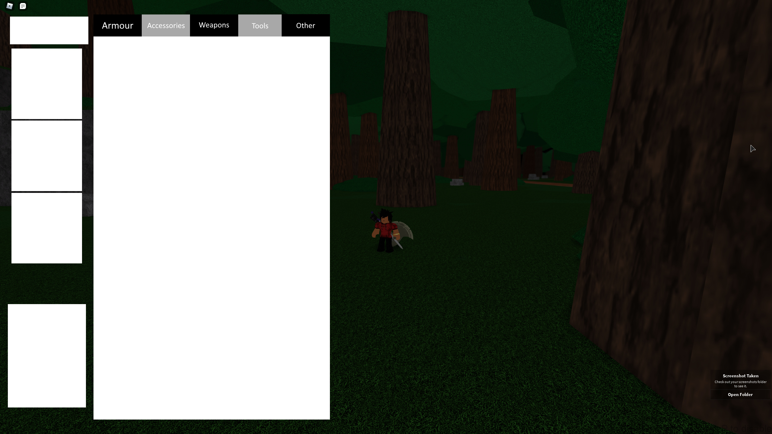
Designated Inventory Sections
Your inventory should only display one section at a time. There would be a section for let’s say weapons, armor, titles, etc. This would also take out the space for showing each equipped item at a time and leave more space for more inventory slots to be displayed. For sorting, it should be an option somewhere still since it’s not something that necessarily should get it’s own section.
I feel like this is a better way to implement filters then a button on the side to see these specific items. It’s just much more intuitive and adds more space for actual inventory.
Inventory Reorganization
The inventory pretty much locks your camera to the right side, which can be very annoying to quickly equip or check items on the go. Here’s some ideas on how this can be implemented.
- Your camera doesn’t lock in place and only opens the inventory.
- Your inventory should be on the left side covering a considerable amount of that area. This allows for more slots to be shown and less scrolling needed. If needed, shrink the icons or reorganize it in some way to allow for this to happen.
- Stats might be moved somewhere instead of underneath. Might be fine but just in case if there’s not enough room.
Inventory Resize Option
This is something a bit more of a quality of life change, but having a way to change how many items are shown in an inventory at once is pretty interesting. This could help for players that want to see a lot of items, alongside helping players that need icons that are bigger to see.
Better Color Coding
The rarity of an item is currently the outline of the item. This is fine, but my issue is that equipped items also have an outline around an item. A good change to this is having the background of an items background color be the rarity, and have a white outline for not equipped and a yellow one for being equipped.
Alongside this, perhaps have different patterns be an option for the background to help mainly color-blind players easily tell which rarity is which.
Double Tap to Equip
I’m pretty sure I’ve heard this somewhere before in the past but hasn’t gotten in. There could be a setting somewhere where you have to double tap to equip to prevent accidental equips. Pretty simple quality of life change for those that have big inventories and having to scroll through a ton of items just to find one.
EDIT: Made a sort of rough draft for how things would work. You have tabs on top, too lazy to add pictures and such for items, up to 3 slots depending on which you need to equip, sort options on top left, and stats on bottom left. It’s just to lay things out and not look good.