I think the first one has the colors I’m looking for
thats fine by me
Forgot to post this so doing it now (have not had much time recently so its taking way longer than expected to make logos)
I went with eosphoros’ comission first since i had a clearer idea. Problem is that i forgot how to do the exact desired coloring so i spent time trying to relearn it. Did learn a new way to do logos so thats cool.
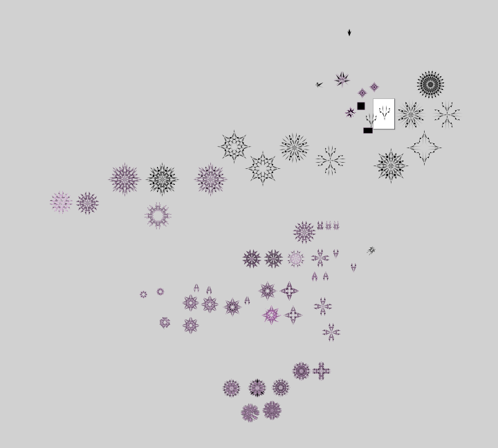
Logos of interest
Dont have much to say for a lot of these, though these are still old coloring styles
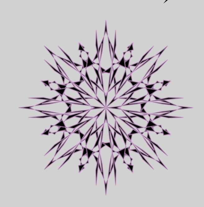
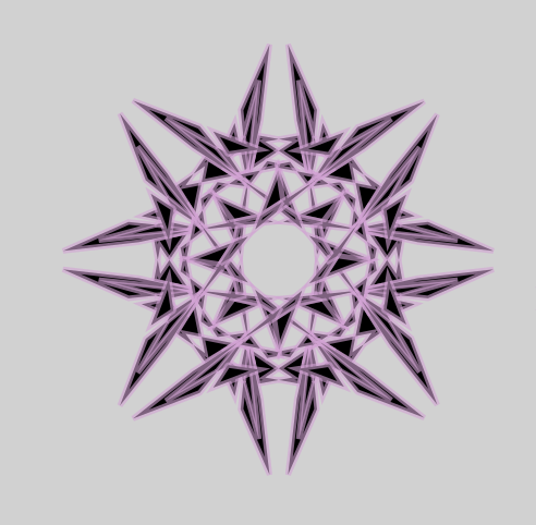
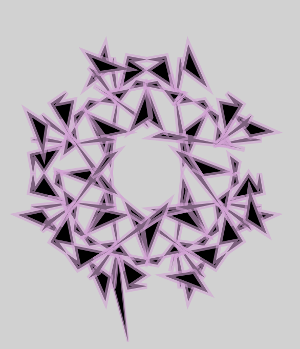
slightly ruined version of the previous one
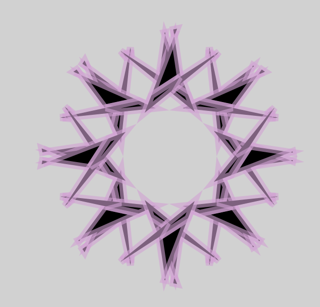
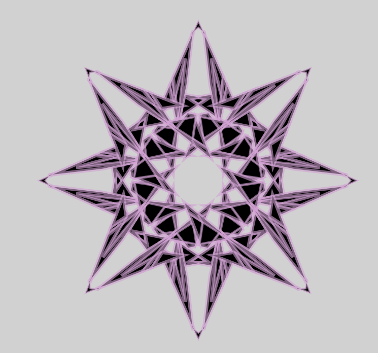
Slightly overcomplex
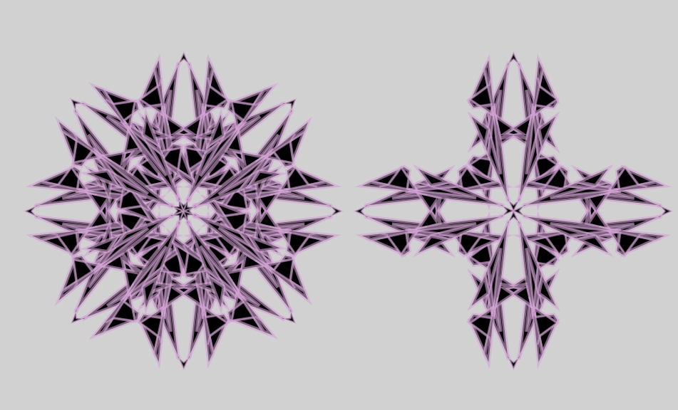
Now to the new creation style i messed around with

this one used simplification which is why theres atleast 2k circles with outlines
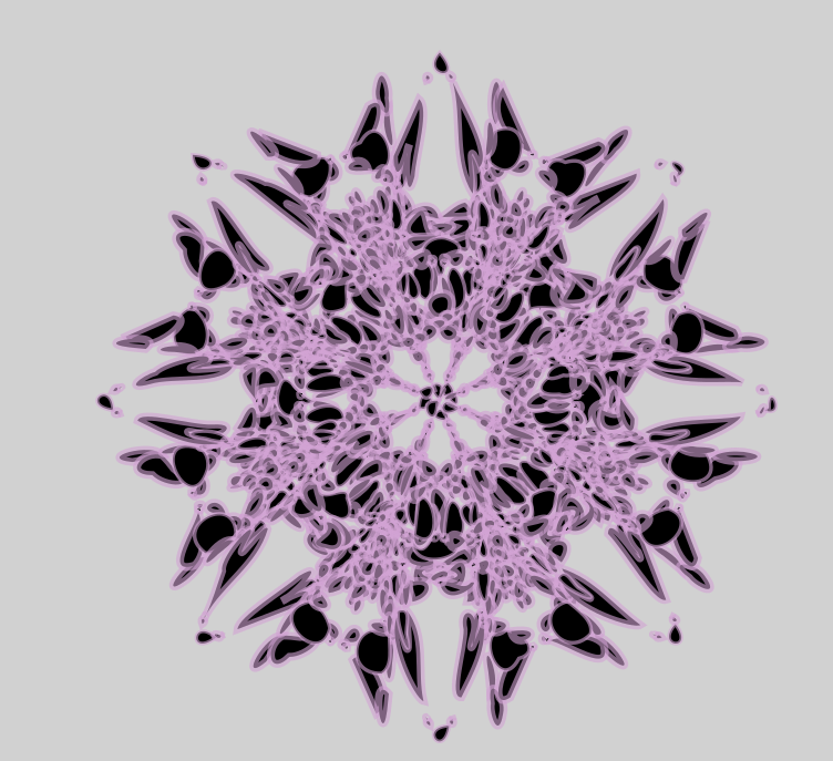
This is the end result of the style on the previous style. It looks like i let shrooms grow on the logo which is interesting
The next experiment was to do it without using simplification, which led to this
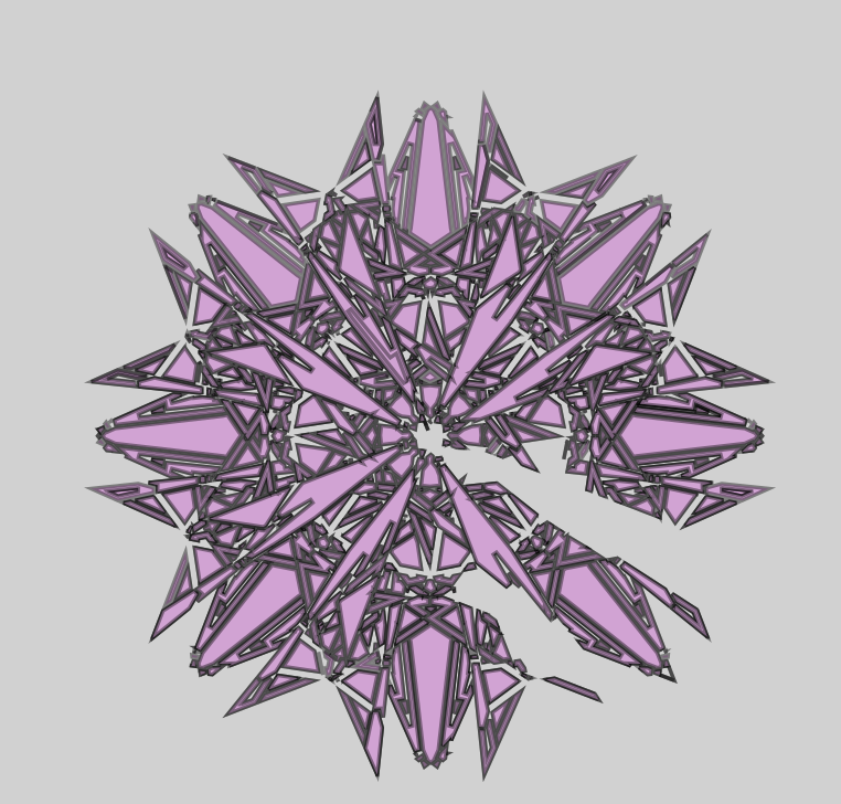
This looks cool and technological (and way too complex for usability unless its put on a map), after this point i remembered i had to make it FOR someone, not for myself so i dialed it back.
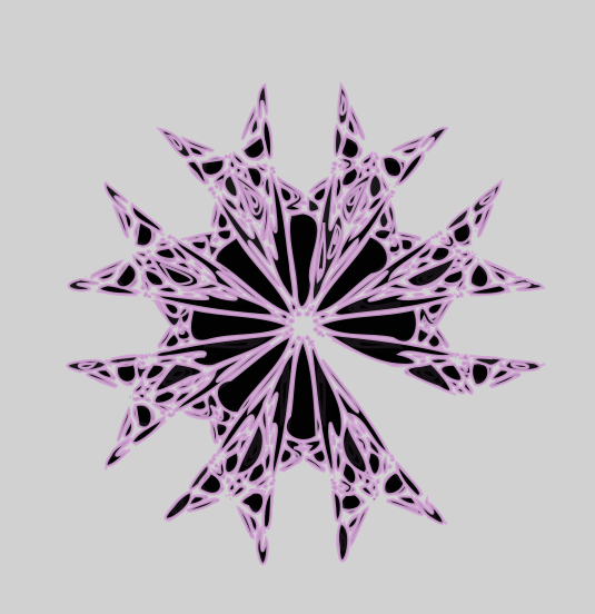
Last thing i made on the document (before going to the next one that ill post soon enough)
Everything here is spare (everything besides one in specific that isnt in this thread) , if you want a transparent version for use just ask for it. Im still not finished with what im making for eosphoros so unless he picks one he already likes enough ill just continue
1 Like
I like the last one the most mainly because it covers a lot more surface area so I’ll be using that one. Tysm
though if you think you can do smth better then by all means try it. I’m just gonna use that one for now