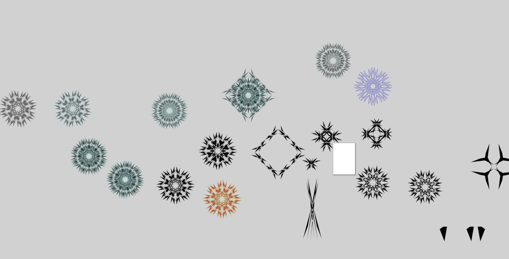
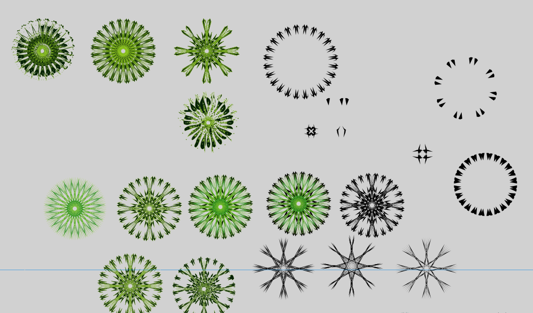
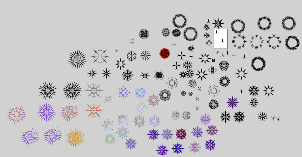
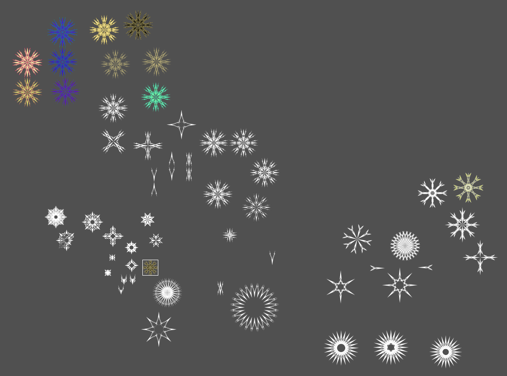
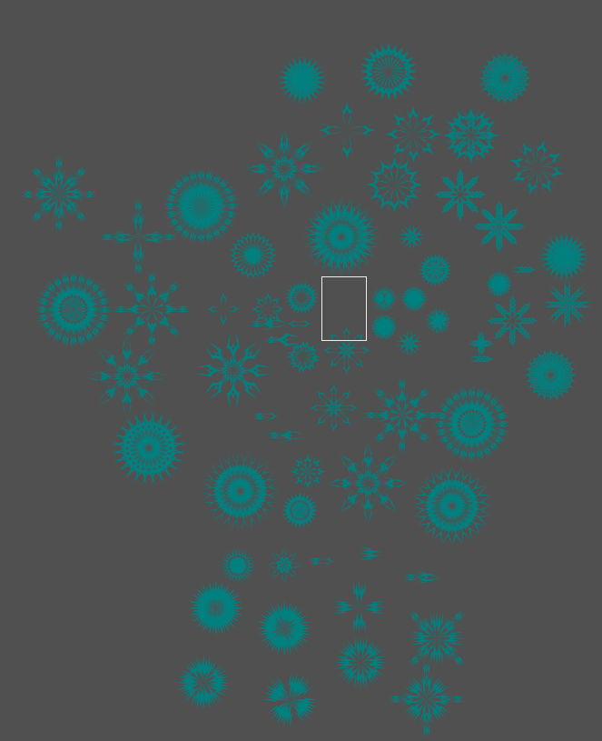
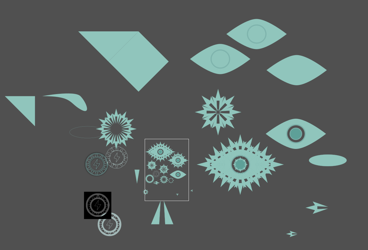
I got the artist role today so i finally can do one of these. Problem is that i have 5 full pages of logos i have worked on (probably more if i look at the older folders) and uploading is a hassle (i am a lazy bum, and i do not want to break the image service), so ill only upload a picture of them all zoomed out and separate pictures for the ones i like or feel proud of.
Feel free to ask stuff of ones on the larger pictures your curious about since i am only making separate pictures for like 10% of the logos (these ones are all from only my laptop). Other questions are fine too
Since theres still quite a few images ill hide them, these are not all of them since im only putting up my newer ones (since those are on my current device). Same reason my main guild logo isn’t on here
Current cool images
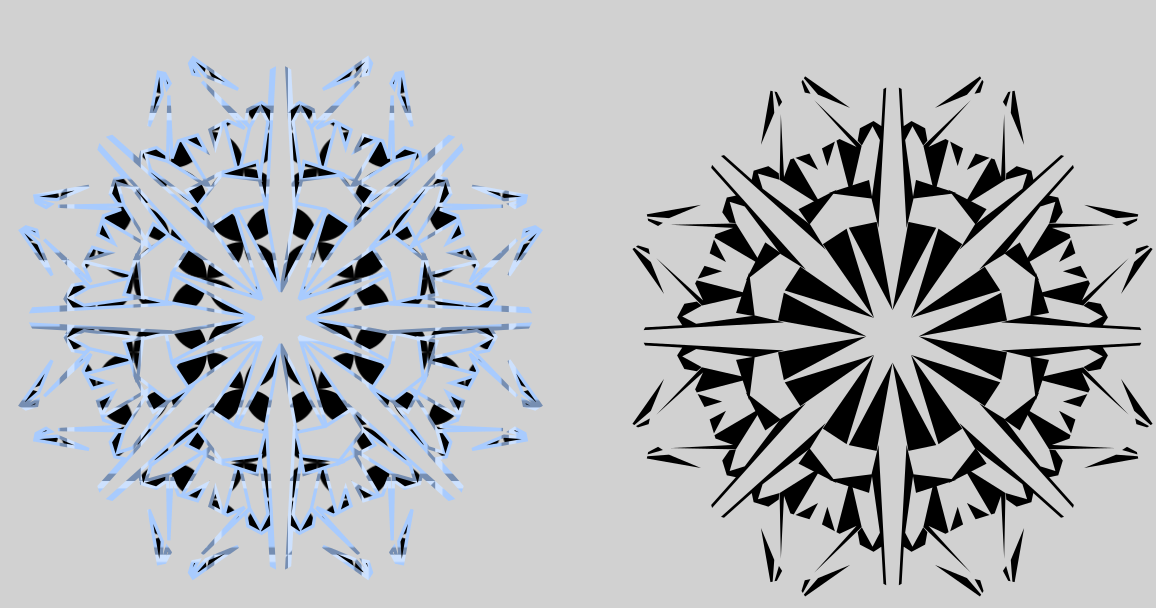
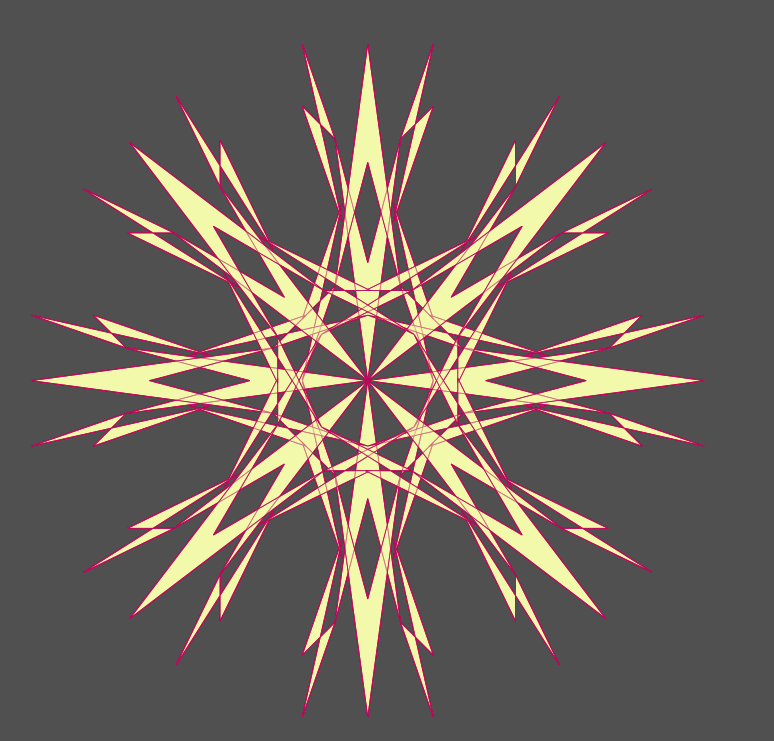
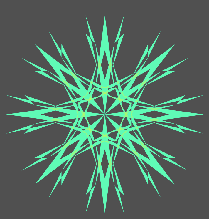
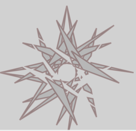
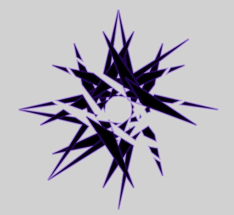
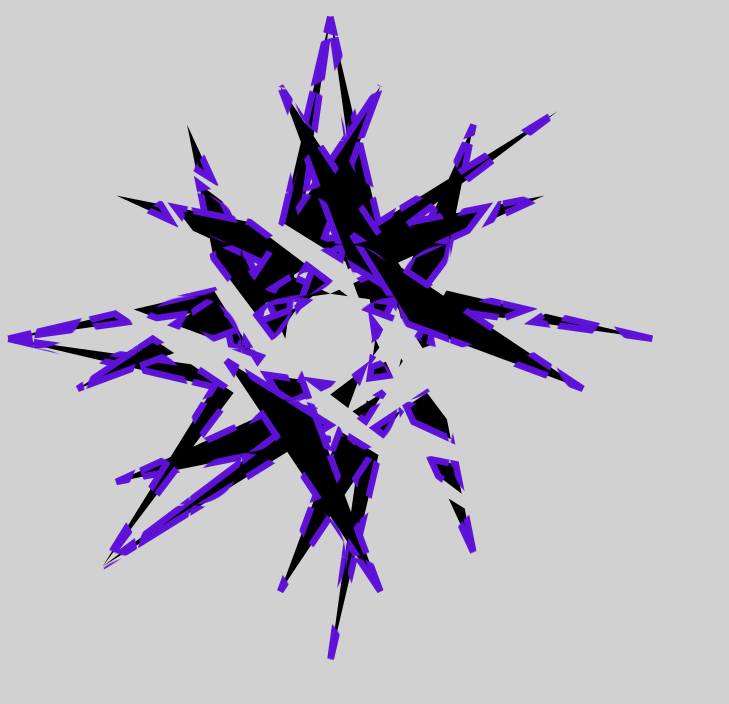
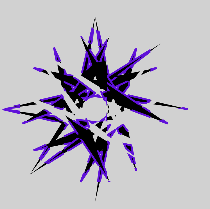
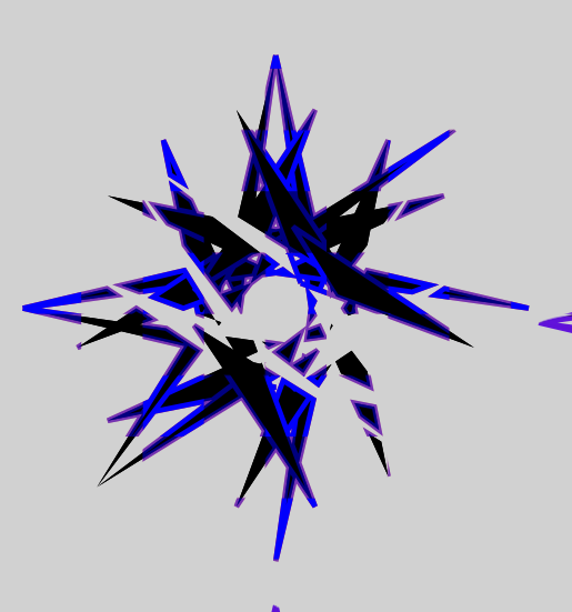
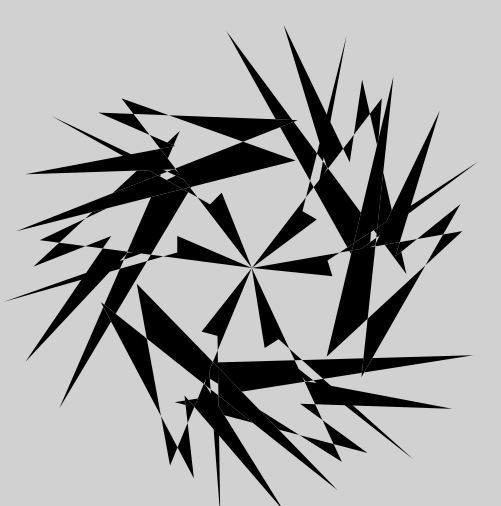
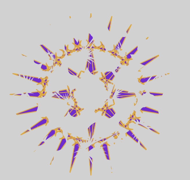
I’d probably give this a name like “fragments of the shattered star”. Also the first good one, completely created on accident but hey it exists now and it looks cool. (also the only one from the first page)
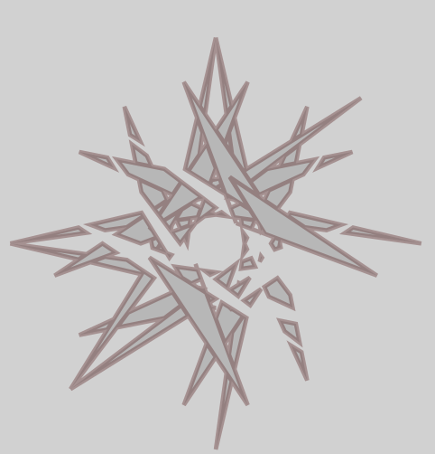
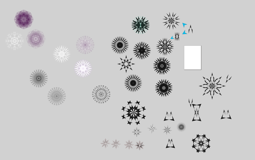
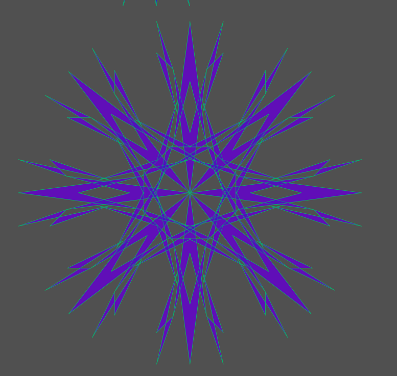
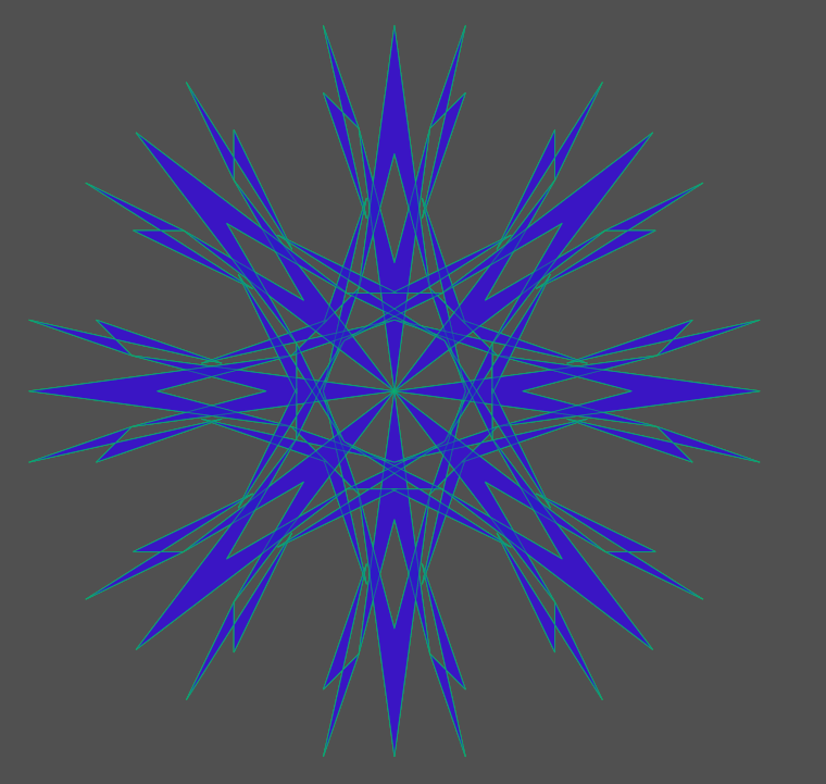
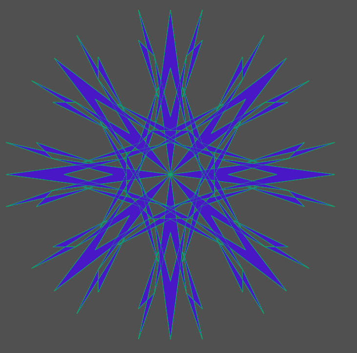
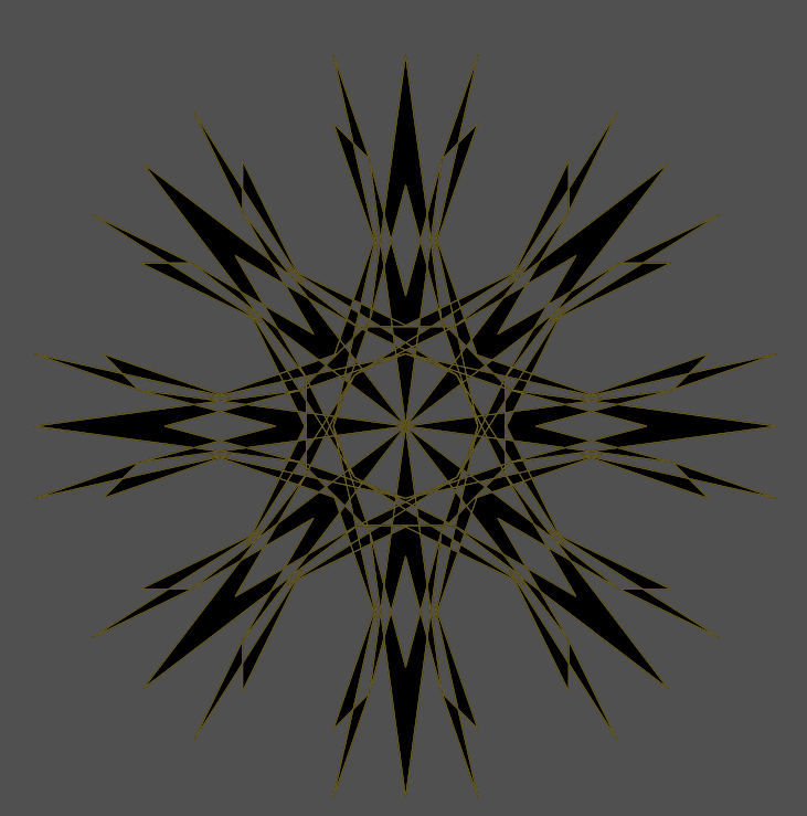
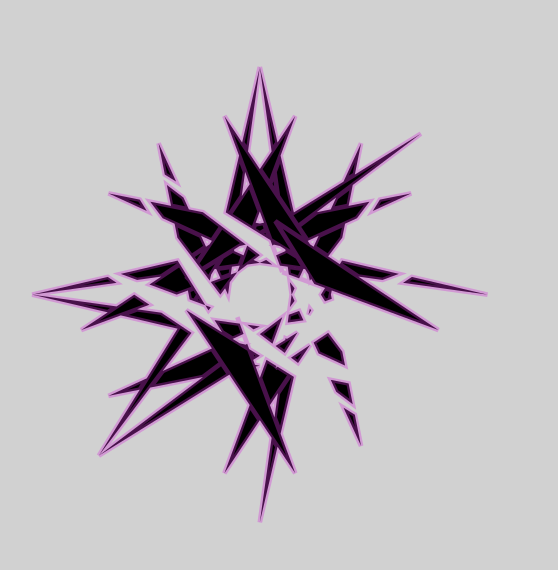
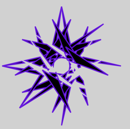
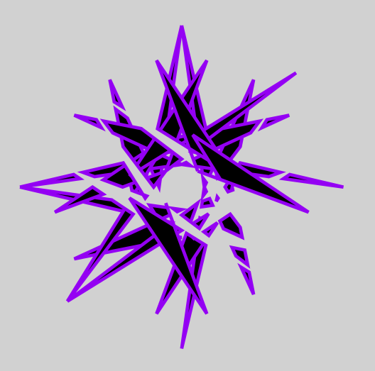
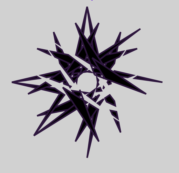
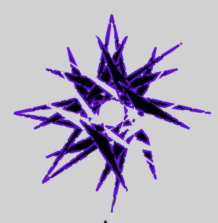
From the second page i have a few more, with these 2 (they are the same but the green one has more work put into it to be only a side grade)
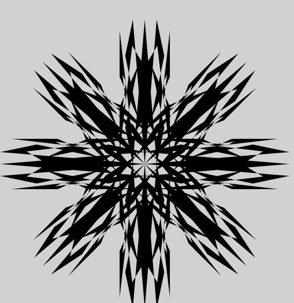
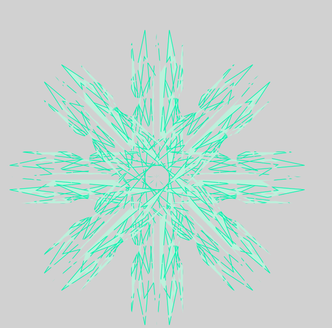
A thing you will notice is that i make stuff way too overcomplex, making them practically unusable for stuff like AO clans/guilds.
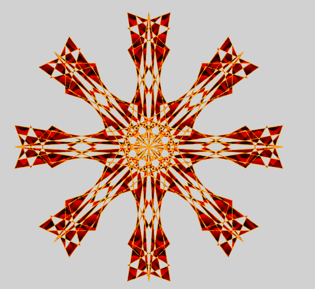
I also dont color much, its usually only if i really like a logo and want to work on it
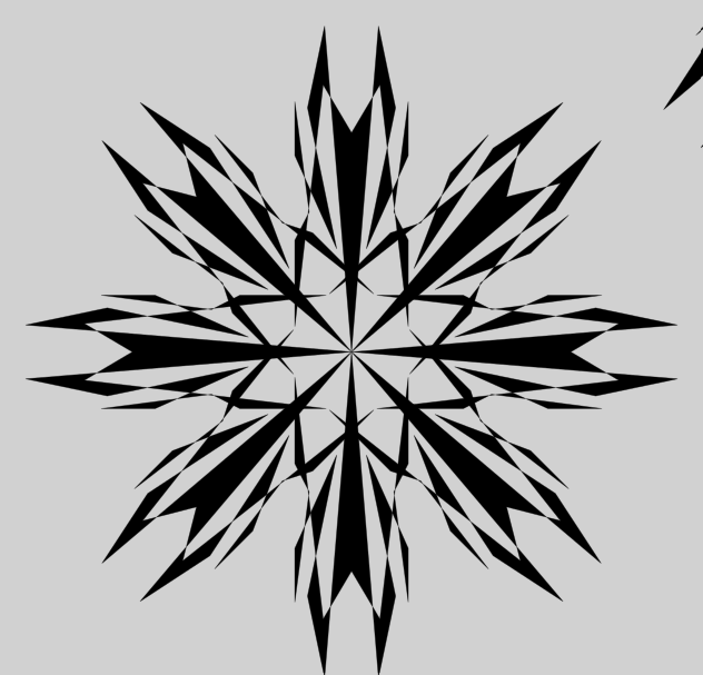
The third page is low-effort but ill put 2 of them here
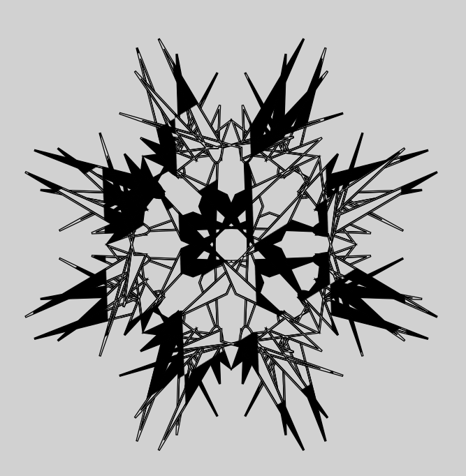
This one is a copy but without a pattern applied to it
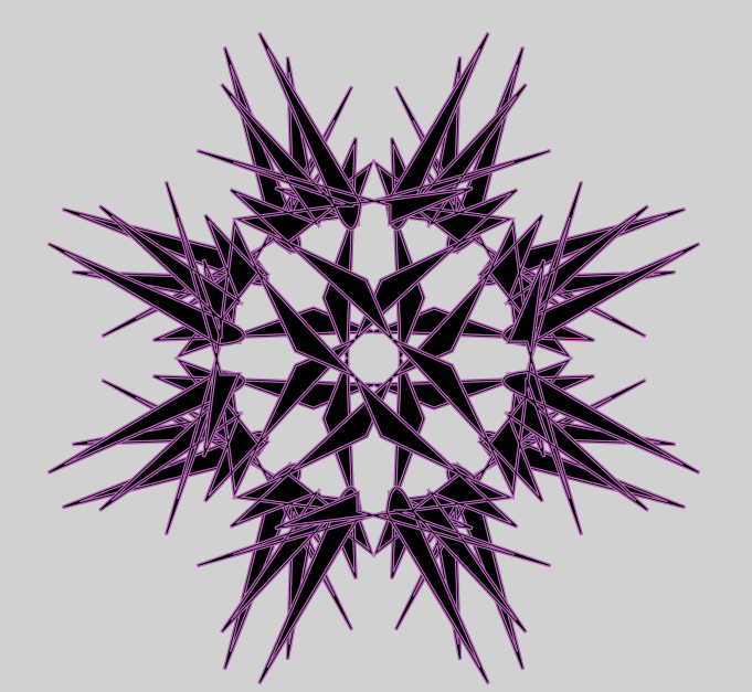
This one is the same but trying to emulate the shattered design i got in the first image
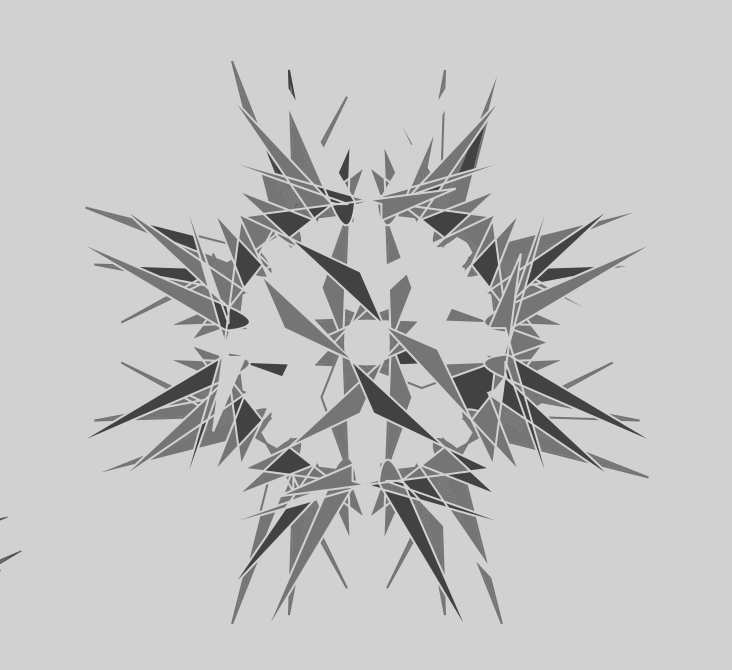
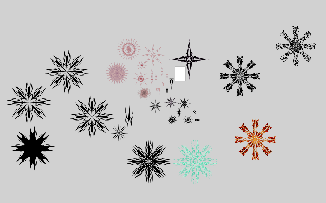
From the fourth
This one is simple and generic (a lot of my patterns are like this) but still cool
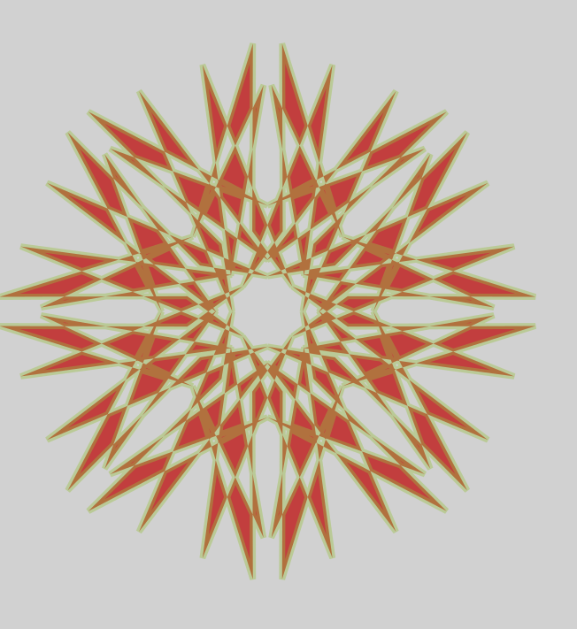
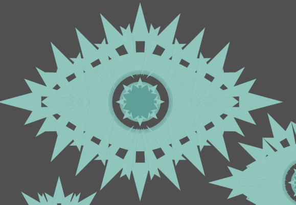
Dont like this one but i put a lot of effort into it so i do want to show it off, was messing around a lot with layered logos that were not fully visible
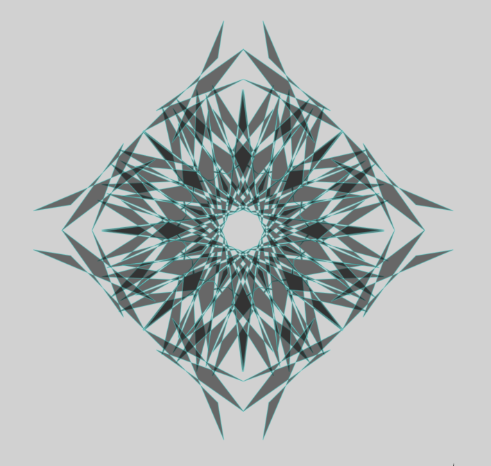
Lab grown one (i tried simplify and the result is semi decent)
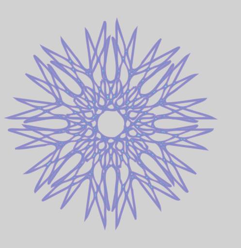
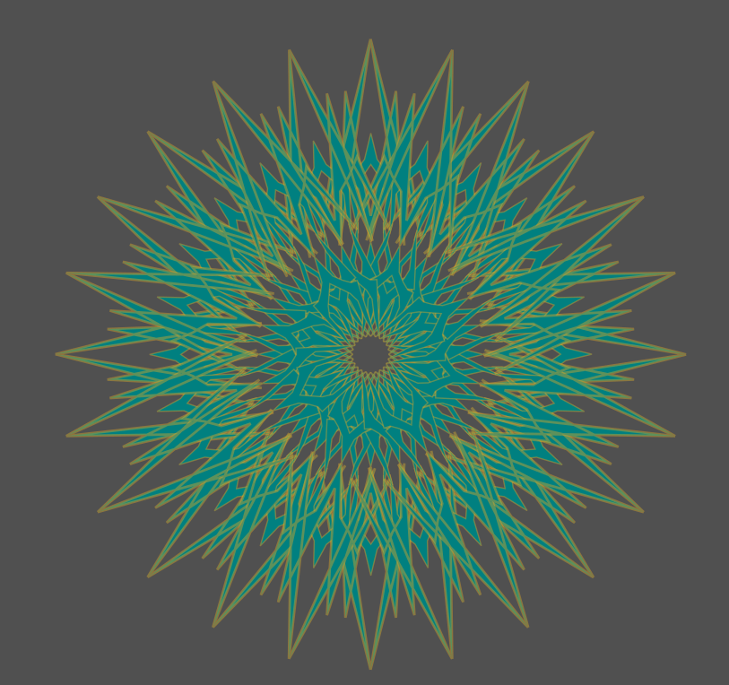
The decay into complexity. Kind of want to improve it but i have let this page rot because of one specific logo it contains.
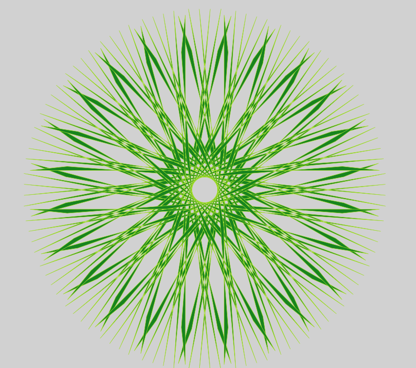
The doombringer
this has atleast 50K (might be 200k but i dont remember) nodes, its the only logo so far to cause actual lag. It has crashed my program multiple times while trying to work on it. Its scary but complex and cool so ill post it
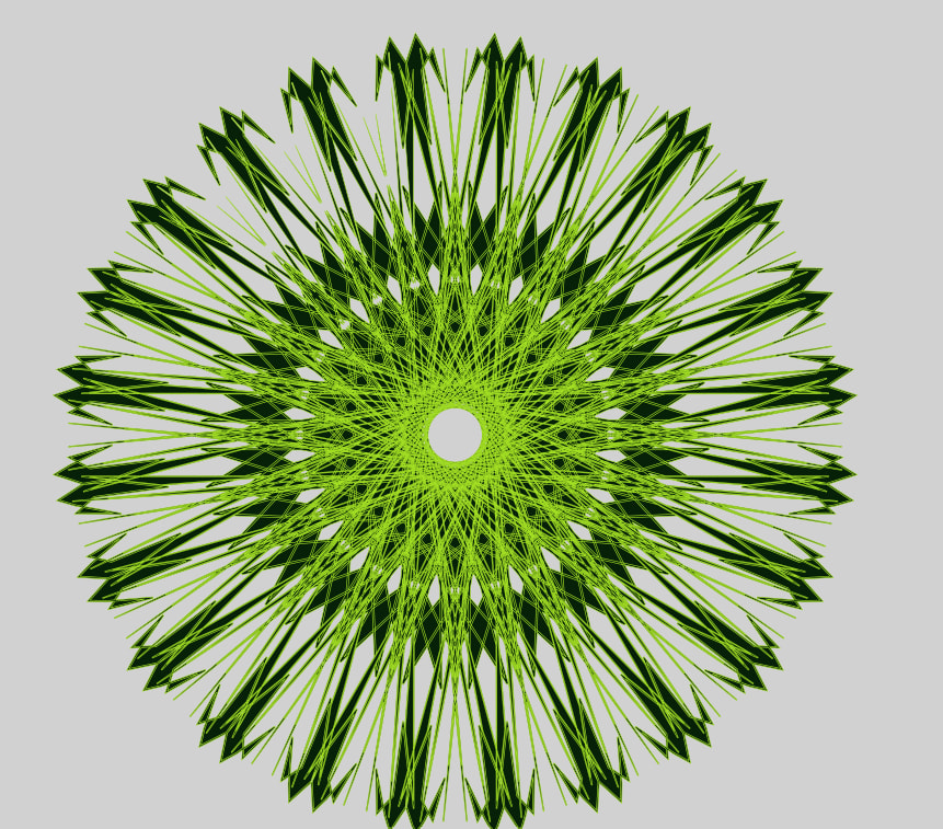
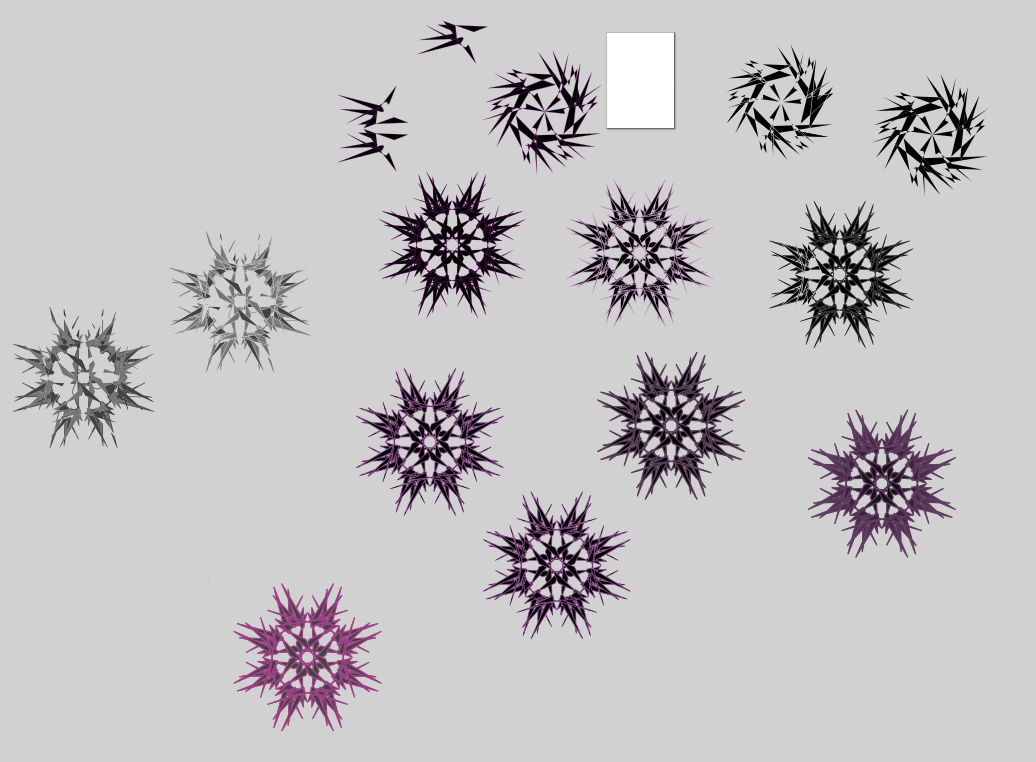
Now for the last page
Looks ugly but took effort
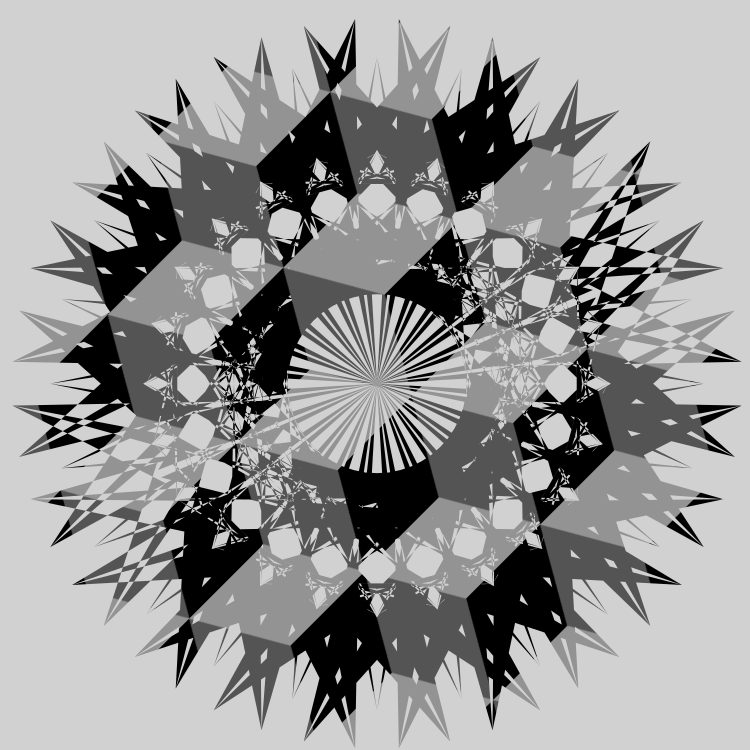
I posted this one before but i made a lot of versions of this so i need to post the original for reference
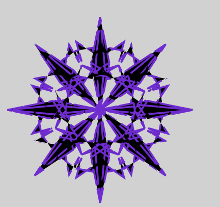
Tried putting my main AO guild colors on it
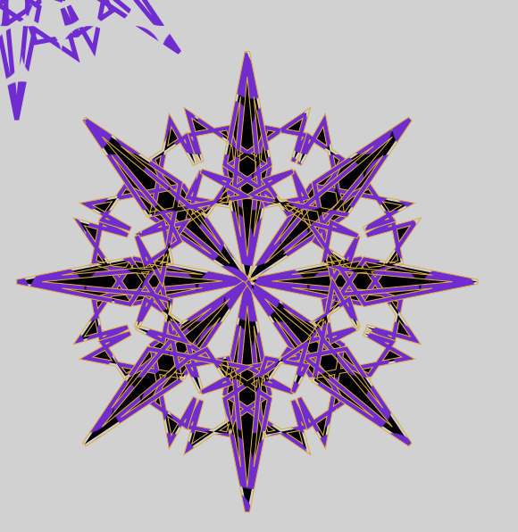
Pattern testing these three (theres improved version later)
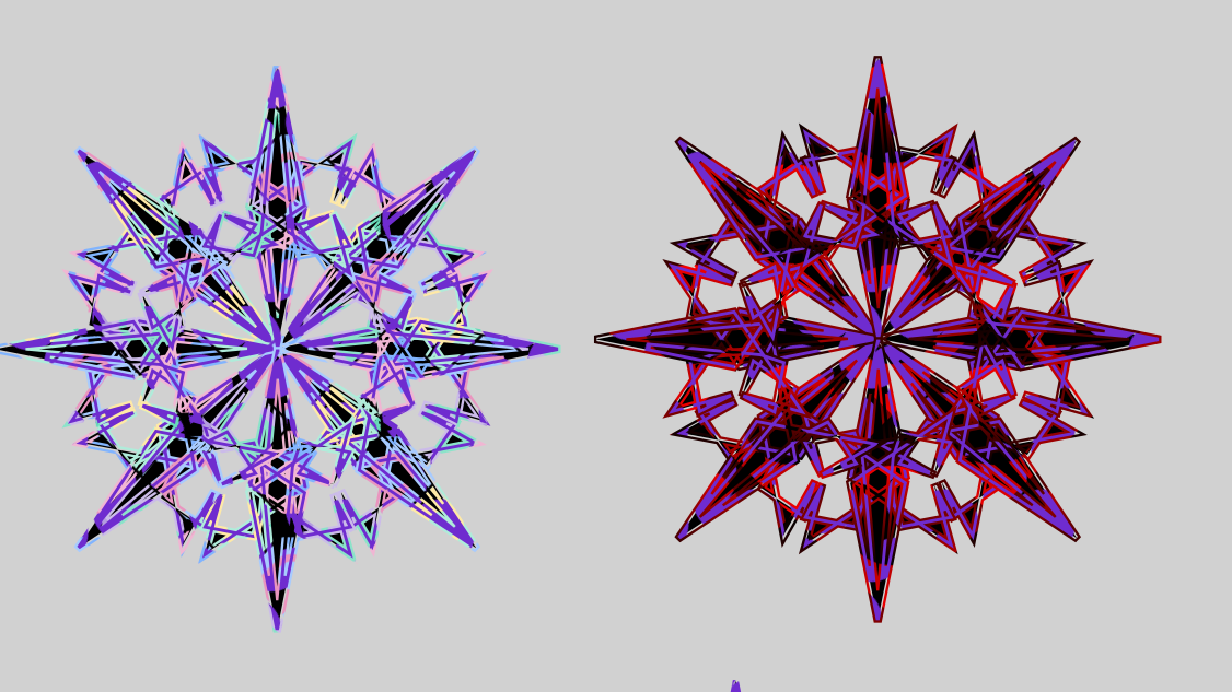
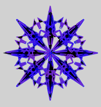
The improved versions (theres a lot)
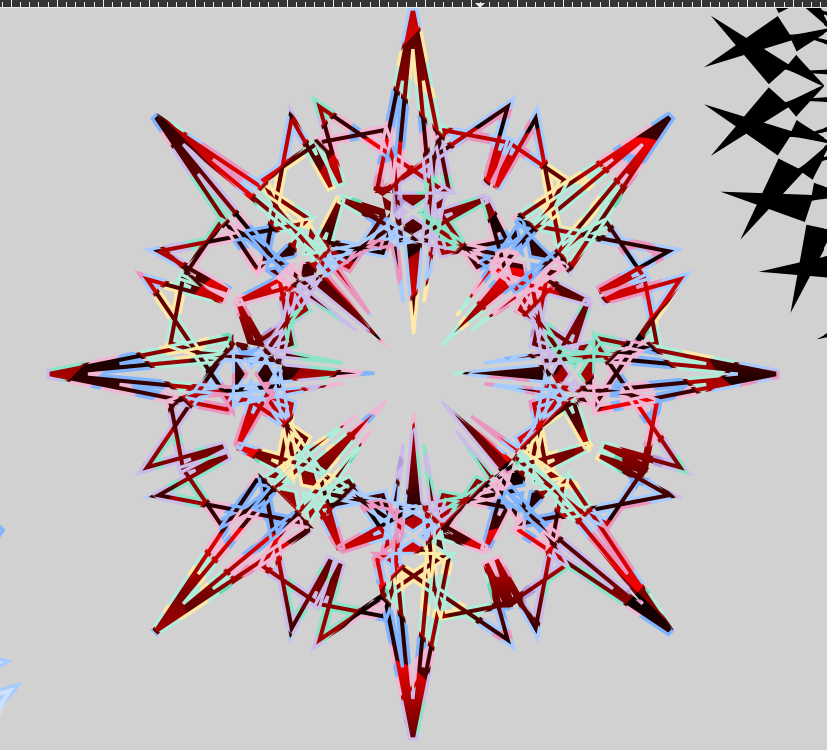
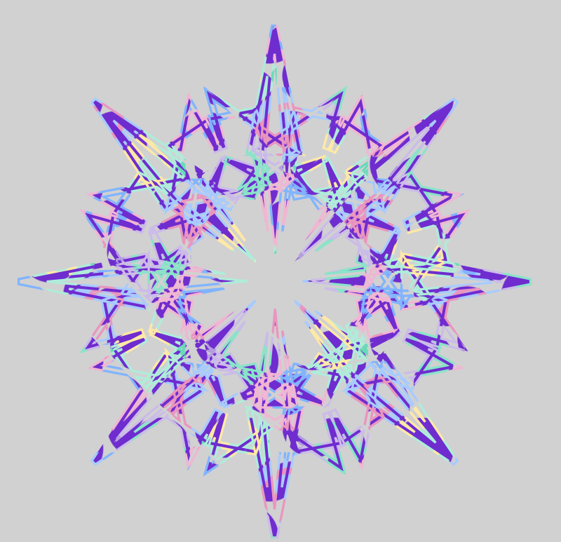
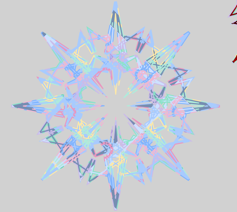
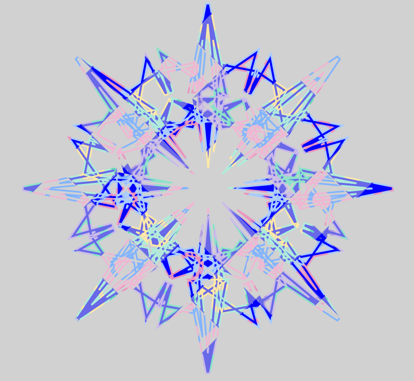
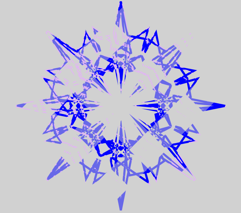
And the last few
Need to color this one soon but its kind of broken
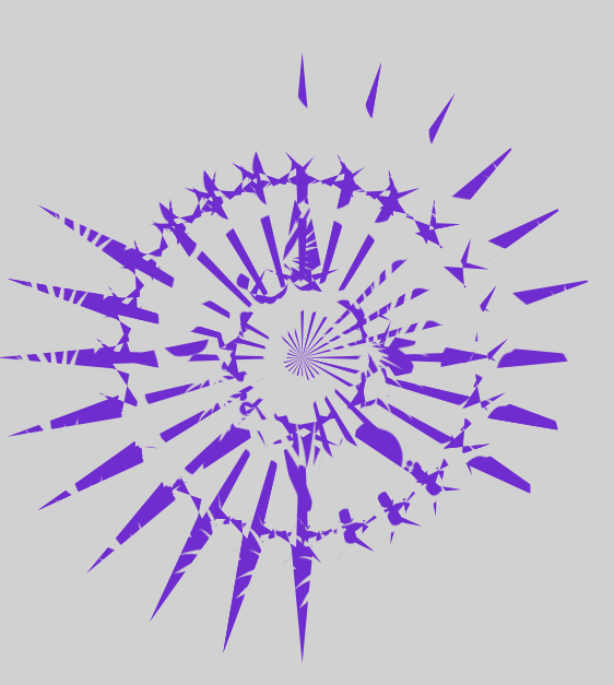
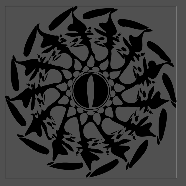
This one is the unfinished one but im proud of it
Difference between one with a outline and one that doesnt