why would you do that though it’s pretty useful
tragedy
half your personality is hating vetex im ngl
Rage bait
Maybe because i couldn’t care less?
Why are you complaining so much vro ![]()
Like most of this stuff is optional (except the HUD)
1 Like
This looks great yoo. I’m glad it start to change
There is still left side stuff like parties and duels
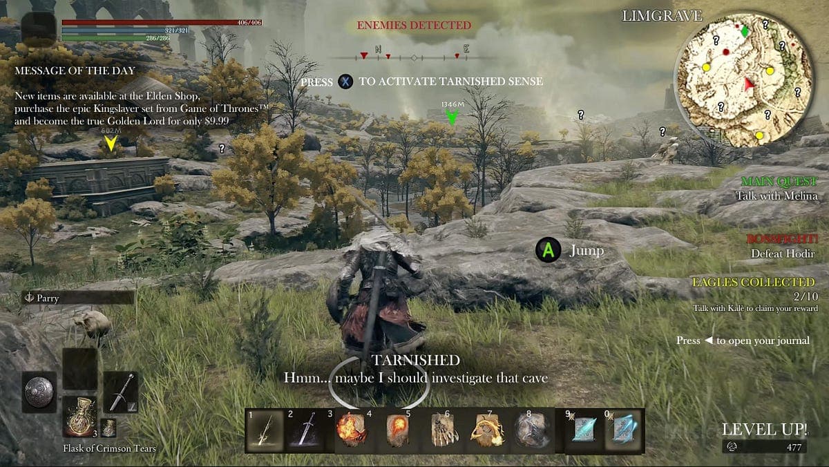
This does show the old HUD, but there has been no note of the parties and duels UI changing position
Also,

god forbid someone has an opinion
It sort of depends what aesthetic you’re looking for. The bottom example is overkill but it can be good if not cluttered
ngl i dont really like the new item box thingys but the hud is sick
i hope theres a toggle for the old ui
i dont like this a ton
I’m more for the idea of minimalistic UI, though the option to change things around would be nice.
i dont like it
reason number 1:
-It only matchs with cold base magics
stupid poseidon
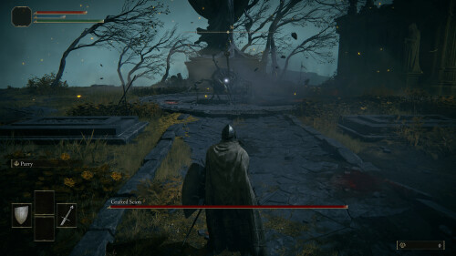
Pretty cool but I really like the old one covering 30% of my screen
only flaw i just noticed is the menu buttons being microscopic
My fucking eyes it will be so hard to get used to
just use hot buttons lol
this is actually peak
It only looks like that since it isn’t in your actual screen ngl, pretty sure it scales with your screen.