cries in vetex not using artists for game thumbnails
I’m down for this instead of reskins of already existing models from roblox so you have my vote.
Voted, models look very cheap and ugly now
I think it’s logical that they look like this
@ansus @vera @ShadeofAzure
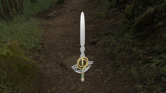
Here is a high-quality version, around an hour to make.
Yes please, gimme
try making it sharper, as in the edges a little more sharp if you know what I mean
Tell your bro that he is amazing but to help it fit ao’s style better he should make the edges sharper, other than that it is well… Amazing
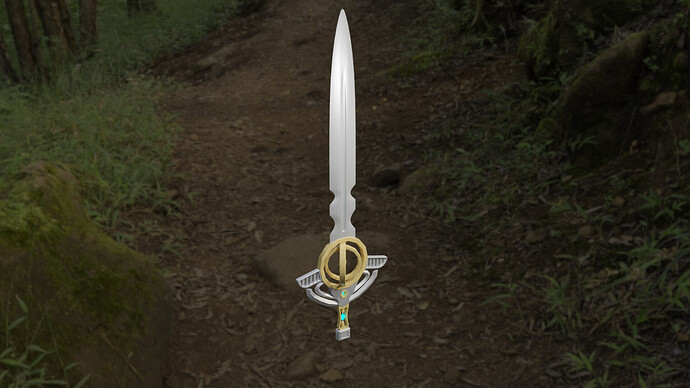
I think sharper point and edges on his sword models could help them fit ao better
I have passed on the message, thanks for telling me!
Here you go @vera @SparkySalmon_iuayo
Now just put a glowing stone in the center of the hollow sphere and coat the blade in magic particles and we have ourselves a legendary weapon.
That’s really good, tell your brother to keep up the good work 
amazing, now we wait for vetex.
maybe katanas will actually have sheaths this time around (assuming those ever get added)
whats writing lol
idk, i never learned how to read
I c u p
kinda weird to use writing for things that go on the game’s page like art does
Alright so the vetex games have been using boring reskinned roblox models for too long now.
Now is the opportunity to make things change.
If your brother can make stuff like that in thirty minutes, he could probably redo all existing weapons in a day or two and have them all look way better than they do now.
Of course the style would have to change a fair bit since it is a tad bit cartoony…
but would it really?
The only part of WoM that has very high detail right now is specifically the weapons so I don’t really see a problem with this at all.
I honestly think that with slightly different proportions and better textures it’ll fit right in

