It feels like the spell creation menu can be utilize much more of the space on the screen. The menu basically forces you to keep going through the same menus constantly just to edit, as well as having layers on layers.
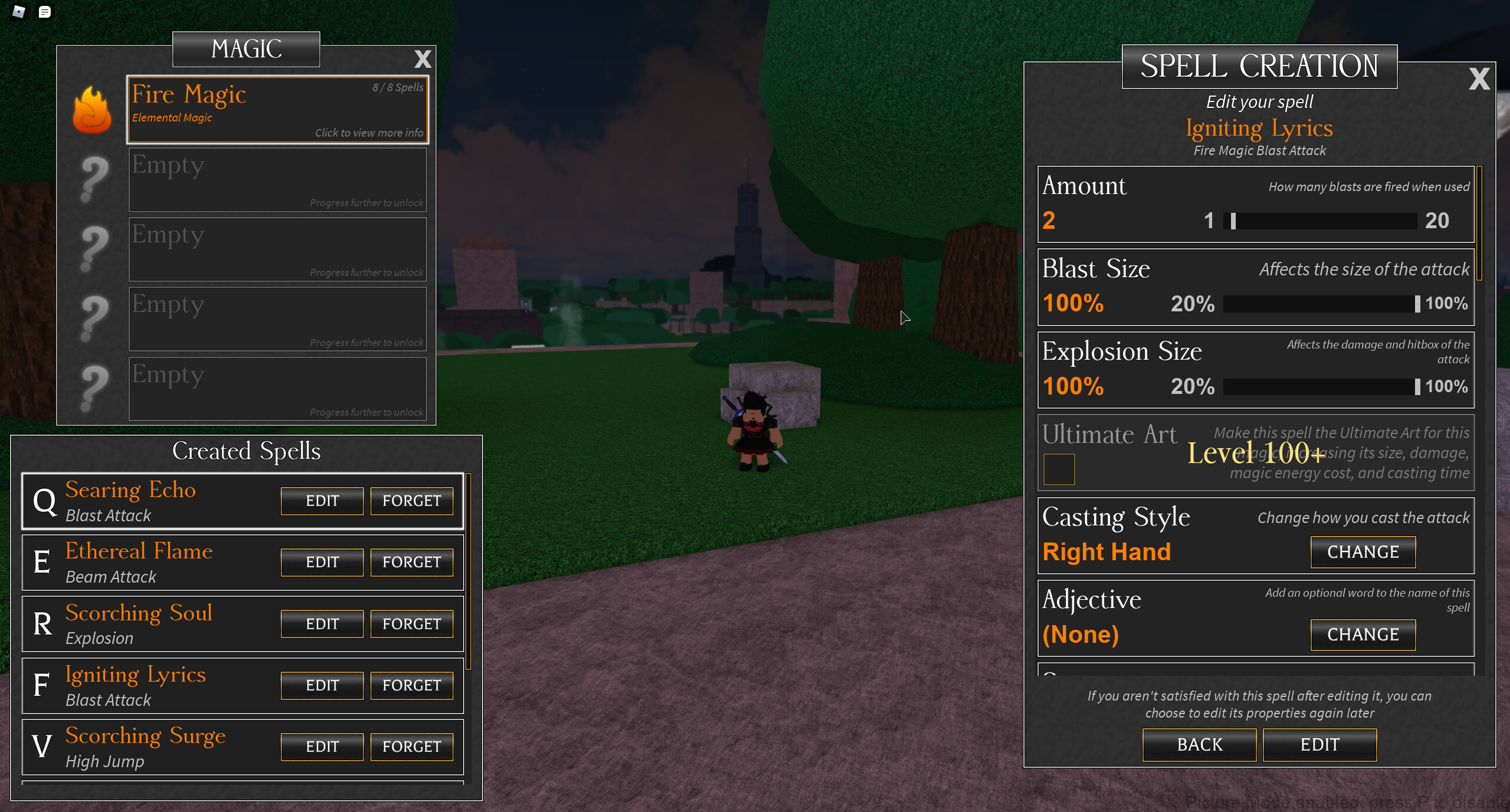
Overview
Here is the concept for a new UI for spell creation. It shows all of the main components as well as adds a ton of new mechanics towards the menu. You start with only showing your magic menu, then shows spells once you select a magic, then it shows the customization options once you choose a spell. Closing the main magic button will close all the UI and go back to viewing the HUD.
Reselecting Magic/Spells
Due to the new layout, you can easily change magic and spells just by clicking. If there’s any unsaved changes, the game would tell you whether or not you want to quit the menu or not. This allows for easier access to all magics and spells instead of constantly going through the menu all over again.
Bigger Spell Creation UI
Another pro to this change would be allowing more space to see more of the customization. It can be pretty crammed since you have to keep scrolling, so having this new change would make things much easier to see.
No Camera Lock
Similar to the suggestion I recently made for an inventory UI revamp, the camera wouldn’t lock to the player anymore. You would freely be able to move it around without any restrictions. This makes it way easier to see what’s going on since the camera currently obscures your view in front of you.
Hidden HUD
Due to the size of the menus, the HUD will have to be hidden. This is to maximize the space of the menu. There is an issue of players attacking and not being able to see any crucial information, but I think it’s fine due to you purposely choosing to edit your spells.
Closing Menus
Once you edit a spell, it won’t close your entire inventory. This will make it much easier to just edit then edit another right away. If you want to close the entire menu, just close it by pressing the X where the magics are listed.
well for us it isn’t cause we’re used to it, but the issue with these is that they’re really not new player friendly. they click “Create new spell” and then they’re bombarded with UI half of which they don’t understand what it does. you gotta take the newbies into consideration too, though this would work nicely if it was a toggleable feature in the settings or something
First it shows just the magics and which ones you have. Once you click on it, it shows the created spells you have. You’re then brought up with a new menu showing which spells you want to create and the creation itself. It shows the same options as any other player would so I don’t understand the issue. They already get this same issue regardless if the UI is revamped or not.
Reminder they can’t even change casting styles, use amount, and can basically only just use blast/explosion and naming stuff.
Maybe you should gray out the part of the UI that can’t be used/aren’t the current focus, like Created Spells and MAGIC when you are using the SPELL CREATOR tab, so that new players can at the very least attempt to understand what are they supposed to click on.
Other than that… well I do like both of these UI (including the inventory one) so far since I have an okay screen and I know the game enough, but they seem terrible for smaller/lower resolution screens or new players.
Also, AO mobile is coming. Idk if you were planning to keep the old UI specifically for mobile, but that one definitely can’t work on mobile.
But the whole sorta point is switching between magics and spells much more easier. Greying it out would go against the whole point of it.
The UI will be scaled depending on the screen and not just remain the same size as someone with a giant one. This is specifically designed for computers though so yeah mobile can just keep the old one