I don’t use lightning really much, but I think the old version looks way cooler.
You could argue that being able to see each chunk is ugly, but it looks more Roblox-y to me.
AO kind of has this identity crisis where it wants to improve its effects to the degree of AAA games, but then you have little curvy man walking around on square tiles with grass.png on them.
What I’m saying is, AO don’t have to look clean to look fun.
But I’m not saying that all improvements are bad unless they serve the WoM style.
For example, a lot of people complain specifically about Plasma’s explosion effects, and how you can see the sphere mesh, but the problem isn’t that you can see the sphere, it’s that the effects are all spheres.
Plasma you’d think would be more of a wave of hot energy than a bunch of pink superheated dots, and you’d probably be right, but the visible sphere at the moment is by no means off-brand, that’s AO’s style of plasma at its finest.
I’m not saying I don’t want it to improve, I’m just thinkin’ maybe the fact that it looks nothing like Plasma is the problem, not the metaphorically transparent design.
While we’re here, let me rant about Magma Magic.
Magma magic looks like bad.
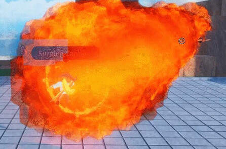
Okay, maybe not bad, it’d make a fine visual for Explosion magic, but definitely not magma.
Matter of fact, it kind of looks a bit like the updated explosion visuals.
The thing about Magma is that actual magma is a slurry of glowing liquid rock. Magma Magic is a bunch of moving pngs of explosions.
I think the whole thing should just look more like the puddle effects, which actually look like Magma.
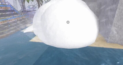
I’ve added a picture of Snow Magic because I think it should be like that, a bunch of textured solids, except instead of looking like snow, it’d look like lava.