Proposal
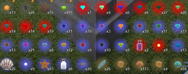
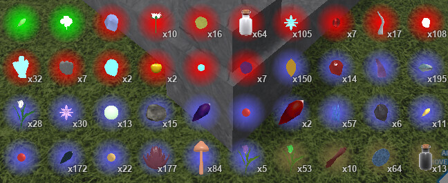
Somewhat simple change, i’ve had this in one of my mega posts before but I think it’s good enough to bear repeating in its own post. When interacting with a cauldron or jewelcrafting table, you now open up a UI which allows you to craft their items directly. For the cauldron, this would be the only UI. For the jewelcrafting table, this would be another tab in it, you would swap between crafting and upgrading/unsocketing with buttons on the top of the ui (like with the buy/sell UI)
Details/background on your proposal
In the UI for either of these crafting methods, the screen would be simple- catalyst/gemstone + reagent = result. Clicking on a slot would open up another smaller menu which shows all the items that you have which can go into that slot.
–For example, clicking on the catalyst slot will bring up a menu showing me every catalyst in my inventory.
When both slots are filled, you can then hover over the result slot to see what you’re about to get.
–Secondary jewel effects would be shown as a range of what they can potentially be, for example, using 5 amphibious blooms on a gemstone would show 1-5% attack knockback
Clicking the result slot will have you craft the item. You can do this multiple times in order to craft multiple items in rapid succession.
–Allowing the creation of batches of potions in batches of 2, 10, or 20 would also be nice as QoL.
For silver and golden cauldrons, 3 circles would appear on the top of the UI. These circles are colored silver or gold, and are a representation of how many uses the cauldron has before it becomes a standard cauldron. When you use the cauldron, one circle disappears.
–While a special cauldron has any uses remaining, creating batches of potions should be impossible to prevent abuse
Also in the case of potions, allow players to set a handful of “favorite” recipes (likely anywhere from 5-10) so that they need to click a single button in order to set everything up to make that potion. Useful for things that need to be mass produced like water breathing.
–If you really have to, this setting CAN be a gamepass, like how the loadouts are. I would recommend giving players at least one or two slots without needing a gamepass like that, though.
Walking away from the crafting station you are using will simply close the UI. Gone are the days of placing an item into a crafting station and then being unable to place something else in order to finish the craft, forcing you to leave the item behind.
–Since the item isn’t crafted until you click the result slot, this also means if you accidentally put an item into a slot that you didn’t mean to you can go back and change it.
I didn’t mention doing a UI like this for cooking pots, since it would probably need its own sort of layout that would be a lot different compared to the jewelcrafting and potionmaking. If it does get added, then clicking on a cooking slot would give you a menu that has 5 tabs- a tab for fruit, mushrooms, fish, other edibles (only wheat would go there rn) and seasonings.
–Since food items would likely all stay in the inventory regardless including fish, there might not be a dire need to add this. If it does, then it would have the same favoriting system and batch creation system like brewing.
Reason to add/change
I see a few main benefits to adding these changes:
–Firstly, it eases new players into these systems a little more. Having a UI which shows them what items they can use and what result it gives before doing it makes the crafting systems more intuitive and easier to understand for new players- especially when jewelcrafting is such an important part of getting stronger.
–Secondly, the batch crafting and recipe favoriting would make brewing (and cooking if the UI would be added for that too) so much easier. It would make XP in the skills a little easier to come by, though, which might be a sticking point? It takes out the most tedious part.
–Thirdly, if these changes are implemented it would allow you to take all of the inedible items that aren’t tools and completely remove them from the backpack. This means that all potion reagents, catalysts, gemstones, and (if the cooking part is added,) seasonings. (Fish wouldn’t be removed, since showing them off is still fun sometimes) You wouldn’t need them there anymore. This de-clutters the backpack immensely, and if it’s a performance issue to constantly open and close it with a lot of items in it, this change would mitigate that.
Ultimately, this is just one big quality of life change. It’s fairly large scale, but I think it would be worth it to add for new players and veterans alike.

