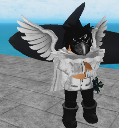
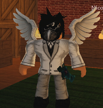
switched up the drip

8/10 kind of edgy but edgy = toxic sweaty pvper so it intimidates
7/10 - You could go with the white crow wings instead cause that’s a crow mask.
10/10 - The fish behind you looking pretty drippy rn
swag/10
Outdripped by Theos 
Ugly ass boots
6/10. Would be higher but I don’t like how the torso is white, while everything else is black. It just feels wrong to me
wym bro they swag
4/10
too excessive honestly
So here’s my thoughts:
I personally don’t like masks but that’s just personal bias the mask looks fine.
As others have mentioned, the pants ought to be white as well, possibly bright leather.
I also think you should ditch either the wings or the cape.
That’s it.
Theos drip always wins
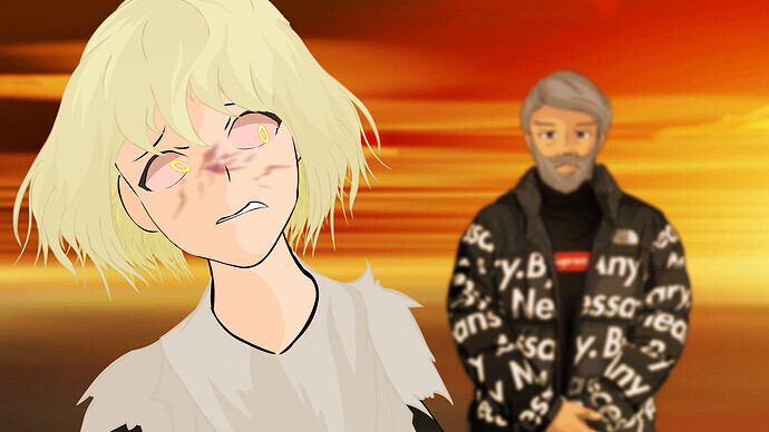
Juniper arriving at her test location only to see Theos with drip on and his staff on the ground behind him
No no you see the problem is his legs are too dull.
They’re just about ready to fade into the background.
If he’s going to go total grayscale like this I doubt he’ll want to use some other bright colors.

0/10 edgy as fuck, roblox white and black rarely work together
edge/10
I’d give up at that point honestly
you look as white as a starbucks cafe in autumn
pumpkin spice/10
