sock
November 16, 2024, 2:39am
3
isn’t this discussing the game
1 Like
smartest opticalcord reply
what are we supposed to say
playrrt
November 16, 2024, 2:48am
6
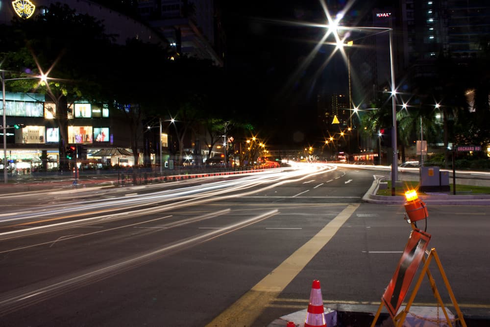
Jee, I think gravity’s looks really clean… Surely an 8/10
it sometimes happens with light sources
What kind of starry ahh camera
Light Magic sure doesn’t look the part.
playrrt
November 16, 2024, 2:49am
9
If you squint you get the same effect!
1 Like
sock
November 16, 2024, 2:49am
10
agree or disagree with them and say why
yeah I see it a lot at night looking at street lights
sock
November 16, 2024, 2:50am
12
who gave the camera astigmatism
The same guy who gave me astigmatism
from the source, it seems to be more apparent the longer the exposure
it happens a lot with night driving, stars are sometimes depicted as having 4 prongs, and there’s also some eye conditions that make lights look like that.
also, refraction can cause light to spread outwards in a pointed pattern. it’s not so much the camera just the circumstances.
but yeah the magic looks nothing like it
playrrt
November 16, 2024, 2:52am
16
Heat almost looks like wind, maybe its a wind mutation… That would make sense for its icon being a swirl
I do enjoy the gradients and colors on the losts and custom magics though, I cannot see how you dislike them…
StockSounds:
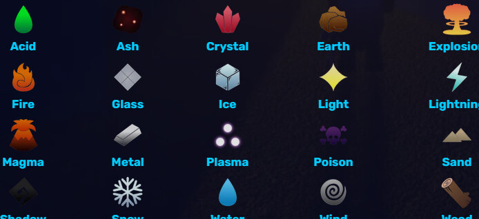
Plasma, another 10/10, it looks exact.
I disagree what was he supposed to do
I don’t dislike them for how much they look like their icons . I think a lot of lowly rated stuff is great.
I gotta recheck the effects, but I swear there’s some pointed ray effects with light magic