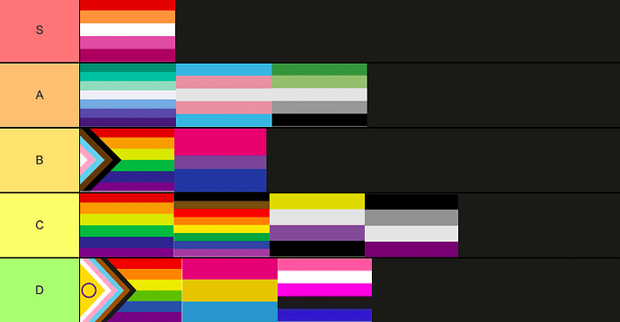
ngl chief the lesbian flag makes me wanna be lesbian
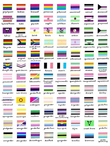
They all look like shit.
I think these look like flags
why are most of them just horizontal lines ![]()
Because whoever designed them felt as though as they needed to conform to the pattern of the rainbow flag, design dwelling in hypocrisy as it is supposed to be a non-conformist movement.
The color scheme all look kinda ass ngl the only good one is the trans one
Lesbian flag is the best flag ![]()
the trans flag having the reversible chemical reaction symbol would be better tbh
lesbian colour scheme is amazing shut up
idk go ask john flag that question
I’m lowkey a lesbian
I have literally found a pigeon’s open corpse that was serving as a crow’s meal to be more appealing than most of these designs.
More flags should have stuff like swirls and portraits of dragons, why is everything so boring?
If I got to make a gender flag, I’d put a pirate on it.
have you lot considered that it would be a lot harder to draw these if they had stylized designs of people on them as opposed to lines
like this is the reason pretty much every european flag is lines
I want cool gay shit not lame gay shit
really cool pride flags outweighs the time someone spends someone tries to draw one
I personally like the simple colour design, it makes for some really nice artwork incorporating the colours, which would be a bit harder to make if it already had preexisting designs on it. when there’s a preexisting design, most artwork would likely be of it, while when it’s just colors it’s more likely to be much more general
male flag and female flag when smh
tbh i don’t believe there’s such a thing as a bad colour scheme, only bad uses of them


