So out of everything I get feedback on regarding the remake, the most common negative one is how terrible the UI looks.
Now, honestly, I was not expecting the UI to be the most criticized aspect, but I’m not too surprised either than people don’t like it either. I’m no expert UI designer, after all; I designed the UI with function over appearance in mind.
Now, here’s my question: What makes a UI good? How should I improve it?
The most common recommendation I get is to make it smaller, which I understand. It is a little cluttered on the screen.
However, what else is there to change?
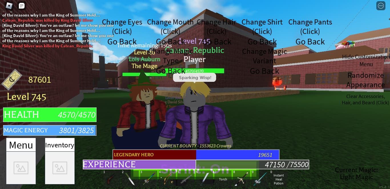
(UI for reference. Note: The sprint button is not mine and will be removed eventually, so ignore that. I already have a ctrl sprint, I just like having the button there for my own convenience)
a good ui is one that doesn’t clutter, one that doesn’t look like you made it in a minute and one that fits the rest of the ui in the game (have a coherent style)
-make most aspects smaller and hug the sides of the screen
-make health and energy bar size consistent
-make current magic icon show over health bar (like in AA)
-add some kind of texture to bars (also tint the magic energy bar to your current magic/plain white and tint health bar based on current health percentage)
-if you are going for a fame/bounty approach like AO: remove reputation bar and only show current bounty
Well, having functionality over form is a good idea, but video games are supposed to allow yourself to express an idea in some creative way, much like painting or writing. You could change the big clunky Menu and Inventory buttons to some stylized symbols that still convey the basic meaning of what they are while adding some character to the game. Also, perhaps you could add a cool little border to the health and energy bars like in AO to make them more than just green and blue boxes.
One tip you could use is using UICorner. Just click on the II in the explorers tab and then add UICorner, you’ll be able to type it in. This way your UI can be round.
Your UI seems too cluttered. Try toning down the size of it all so that the player has room to actually play the game.
Try using circles for the inventory instead of the normal boxes. You might have to look up a video to help you with that
Try making the colors match. There’s a lot going on here in this image and the colors really don’t look nice together.
Try using some different fonts. These seem okay but you could always explore more and see what looks good with what
Make sure your UI is more symmetrical and organized
Consider taking a look into the UX field for better design of UI.
This essentially means User experience, which boils down to how the player experiences or interacts with the UI.
So take note of what will be important to game play and point out those aspects.
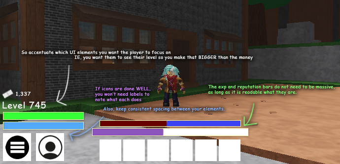
Here’s a little demonstration of what I would change in your design. (It’s proportions are closer to WOM since that is what functionally works best)
(I also see you’re trying to do a customization UI for faces, parts, and alike. I’d suggest putting a frame behind them to make distinct separators on what each element does. It’s a bit late at the moment, so I’ll try to make an example and explain this better tomorrow) @WarmWater and @sock mention some good points on this.
not all of this might apply to yours, but imo theyre good things to keep in mind when making UI
quantity - dont make things overcomplicated with an absolute SHIT load of things on your screen. how is the player even going to be able to focus without seeing what’s in front of them?
size - dont make things INCREDIBLY small so that the player can’t see stuff. this is also why quantity is important bc if you have too much then you gotta shrink your ui down and it looks like shit in most cases still. also dont make things INCREDIBLY large either bc it looks janky and its a little patronizing to have big text on my screen as if the dev thinks i cant read or some shit smh.
color - this kinda depends on what your game is…but rule of thumb imo is if its more on the realistic side stick with more basic, neutral colors like black/white. your colors honestly dont look awful considering the environment you are in but j make sure every piece of ui isnt a different color lmao.
mood - im just gonna say this: flashy colored, boxed ui does NOT look great when making a realistic horror experience. make sure your ui FITS your game. TEXT is also important to consider. PLEASE DO NOT USE COMIC SANS EVER
proportion - speaking of boxes…i would generally avoid making EVERY part of your UI boxed altho i think it can still work if your game is meant to be kinda silly n goofy. anyway things like, for example, your menu and inventory can be rounded and will prob still look good. if youre worried about text…honestly j get rid of it. i really dont think the player needs to know what the ICON at the bottom of the left hand of your screen is if the pic makes it pretty obvious.
organization - j keep things symmetrical and nicely spaced.
the most important part of ui–at least imo–is simplicity. boxes are jarring and kind of painful to the eyes, as are having a bunch of things to look at with a TON of different colors.
some of these ‘rules’ might be able to be broken if youre good at ui…but i prefer to stick by them cuz i am poopy
edit: tldr read what everyone else wrote i just wrote more abt it
Have to thank everyone for the tips, I’ll go fix the UI at some point soon then.
Not sure if I can do everything since I’m inexperienced with making UI in general, but I will try at the very least to make it look somewhat better.