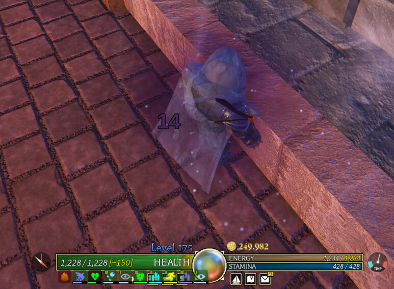
As you can see, I currently have poisoned status but the effect was so cluttered the poison effect don’t show up. imagine wasting healing potion because you don’t see the healing exhaustion effect.
Solution
I’ve done coding on Roblox a pretty long time ago, so I know that changing UI is really not that hard, especially passive UI like this. Here’s my proposal:
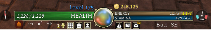
Left for good SE because Warding on that side and right for bad SE because it got Insanity there.
Beside that I guess anything else can stay the same. Also the status effect should go outward instead of inward.
Reason to add/change
I suggest this out of personal experience. One day I was doing dark sea run for fun. I encounter Thymos Bear. I was like “Yeah Imma throw hand with this thing for fun”. Its only when I instinctly look at HP after I receive damage that I realize somehow that bear attack make my 2k hp become 1k. Turn out I got water poisoning but I don’t realize it. Yes, there is white overlay but perhaps I overlook it, cuz usually I look at my hp bar for any status effect.
Beside that, Status Effect shouldn’t be this cluttered. Its not all the time you gonna have all this status effect but this thing shouldn’t even be like this in the first place.
An additional UI change would be to make the status effect icon more consistent, as a rounded transparent black square; it doesn’t fit with the gold-trimmed design of the UI it’s grouped with.
The dials (compass and temperature) make sense because they are separated from the gold-trimmed UI. The status effects are directly within its ‘bounding box.’
Additionally, perhaps adding an accessibility icon (up or down arrow, depending on whether it’s good or bad), so people don’t have to judge based on color or its effect.
Normally status effects just have an icon the player has to decipher, like a fire icon they have to think ‘oh yeah, this is fire, so it’s burning’.
This is however not a good piece of game design in fast-paced games like AO, therefore adding jank in the middle of combat.
The solution to this problem is by adding an indicator that immediately ensures the player if it’s a good or a bad buff at a glance, e.g. an arrow going up or down. This streamlines the process whilst still keeping the functionality of the current status effect icon for those who like to take things slow.
i mean, if this suggestion is added then the arrows are kinda irrelevant, youd already know if a status is good or bad depending on if its left or right
still a good idea but a little redundant in this context
i agree, especially when you can make meals with 6 different effects and potions with up to 4 excluding blood diseases and insanity/warding
so having a different way to view effects would be a lot better than all of them overlapping each other, or even have them show up else where like top left of the screen like in Terraria or smth
Personally speaking: Yes, I’d like to be able to determine the difference between this effect and that. My physicks and my gels look exactly like the effect, just with a symbol on top of or underneath it to identify, “this is an effect that I’m applying/resisting”.
Separation of the effects helps, and so would putting arrows up and down to determine if it’s positive, negative, or “neutral”.