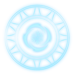
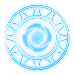
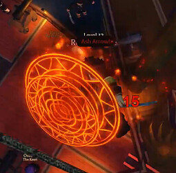
YO! Honestly, that color looks pretty good. Here is what I did.
UPDATE:
-
 Remade Storm and Blizzard symbols.
The symbol for Storm was inspired by the symbol
I remember seeing in the AA Webtoon. -
 Deleted old Storm and Blizzard circles/symbols and replaced them with new ones.
 -
 Added purple version of Sacrifice Magic.
could you do blizzard magic with the same color variations as ice magic? thanks!
Looks cool! Shiny
thank you!
HUGE UPDATE:
-
 Added Mutations: Speed, Whirlpool, Steam, Cloud, Plant, Mud, Flash, and Atomic
 -
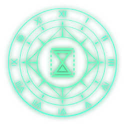
 Added 3 new Ancient Magics: Time, Darkflame, and Aethereal Flame.
 -
 New version of Sacrifice Magic + new circle.
 -
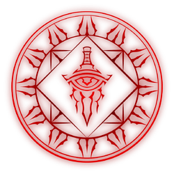
 Updated Apacolypse Bringer circle.
 -
 Updated and tweaked some symbols for Arcane Odyssey base magics and Lost Magics.
 -
 Added tons of new color variations for Base, Lost, and Ancient magics. As well as tweaked existing magic colors.
 -
 I noticed that my AO magic circle designs were not evenly spaced and the strokes of the lines were too thin for my tastes. I remade the circles (not an easily noticeable change) and updated EVERY magic circle design with this issue.
Update highlights (not everything):
These are hot
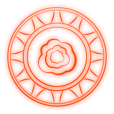
wait a second… ash only has one color variant…
unless…
Art of Infinity lookin fire rn
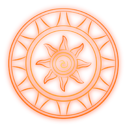
Thanks! I’m really happy with the magma design. Same with the updates sun symbol.
Honestly, I think it’s due to the lighting?
Thanks! It’s probably my most complex magic circle yet. Took some inspiration from a symbol I saw in one of the Hogwarts Legacy trailers.
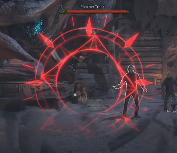
Yeah possibly. Orange ash still sounds dope though.
that’s just because of lighting sadly
The literal edges of Darkflame is so good mmmmmm
ash circle in ao seems to just be orange, the colors of the actual effects are the same as normal
orange ash would look great though
Real clean magics!

