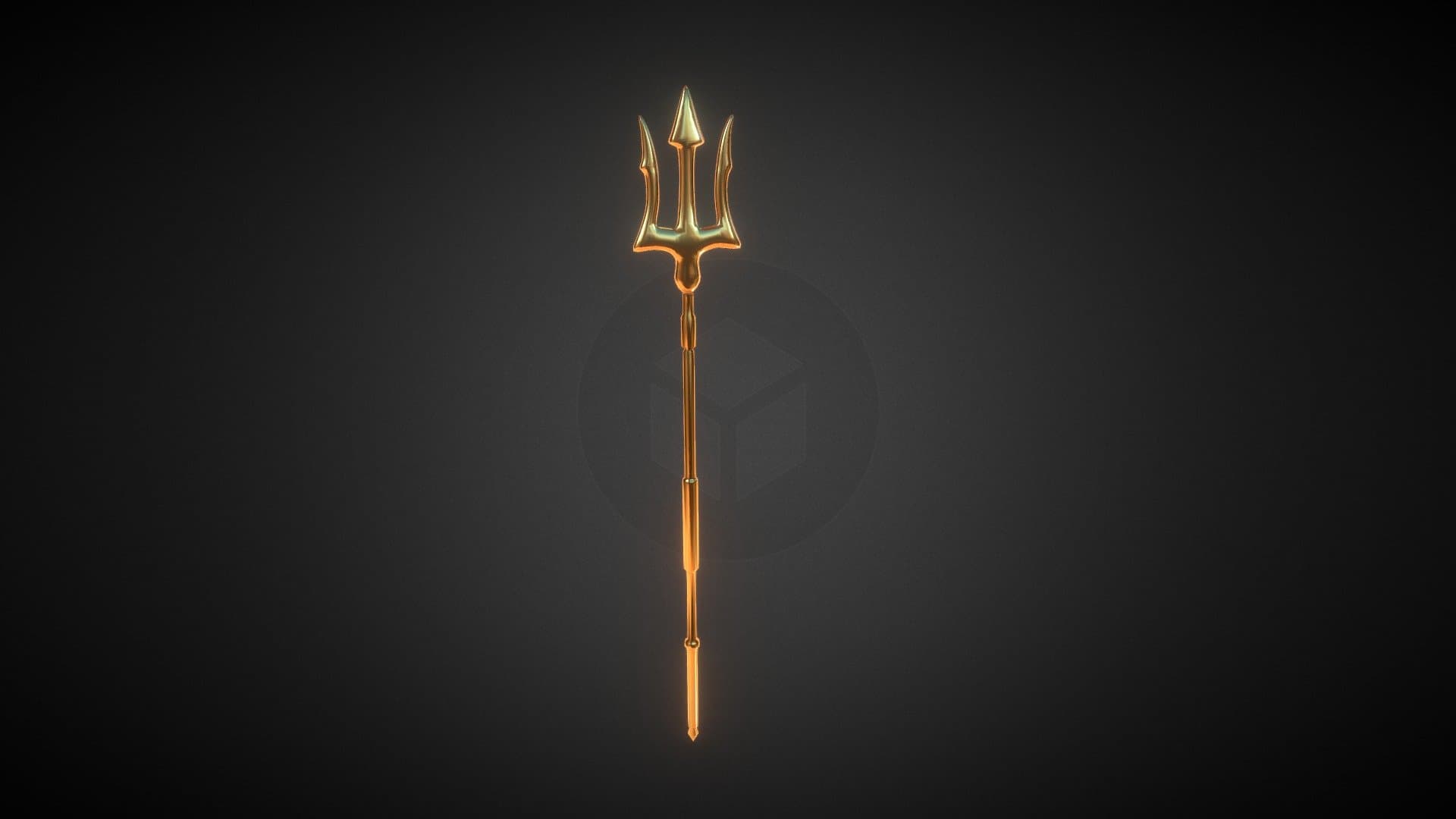
Poseidon is literally the god of the bronze sea
Looks like someone hasn’t read the lore doc
Poseidon is literally the god of the bronze sea
Looks like someone hasn’t read the lore doc
*hasnt played the game ![]()
![]()
*doesnt know who Poseidon is outside of AO
that just looks weird, especially when placed. although i dont hate the idea of every sea having a flag design or something, since, quote
presumably other seas wouldnt have the same because a trident as the only flag available wouldnt make any sense
anyway its a flag, the point is to basically minimize the pole and focus on the flag and logo itself, which is the opposite of this redesign. if it was hella longer like this thing :
you are not cooking my guy
its ugly man
he’s not, poseidon is the god of the ocean, not a specific sea, and it’s not even that he’s the main one that people follow there, almost no one follows the old gods anymore
never cook again you burned down the kitchen
you could’ve just done something simple like idk using the new little flag at the top of your boat as the flag on the claiming flag, it even uses the clan image already
the trident just doesn’t make any sense and it looks pretty weird
maybe you can try to ask people wether it’s a good idea before you actually post it in suggestions.
You have hidden talent. Keep it hidden ![]()
Bro exploded over a harmless flag design holy shit calm down
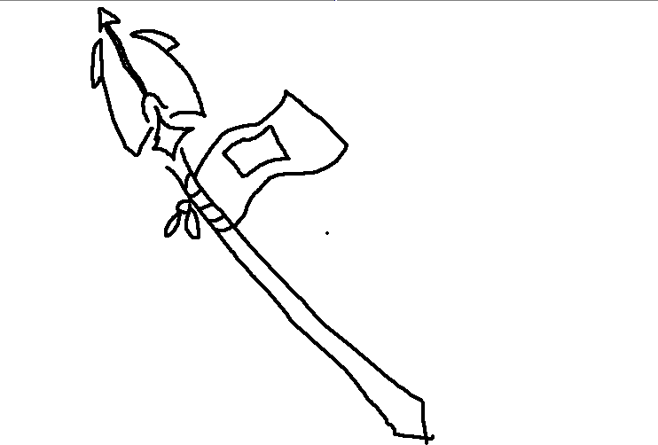
Anyways, as for you Ramen1, in all seriousness… this flag isn’t of the highest caliber… look I’m not gonna be an asshole and shame you for your amateur status in the 3d modelling department or bully you for how the design doesn’t look that great, but I think a little more practice would be probably the best way to go since I feel as if this flag is just a little bit too… like… short? squished? I dunno it just looks a bit compressed.
I think where the actual flag comes off from seems a little awkward too… if you perhaps made the actual “staff” part of the trident longer and then put the flag under the trident tip itself, that could look pretty cool probably.
I know it’s hard to receive rejection but hey, don’t feel too bad about it, we all start somewhere right?
Also here’s a crappy MS paint drawing I made that represents my idea for how this flag could be made better
Finally someone with constructive criticism instead of being rude as fuck, I’ll definitely improve my modelling skills ![]()
![]()
good luck, don’t let the haters bring you down fr ![]()
Oh you’re the guy who made that cool ass flag design! What the hell is this though? I think you should stop
Still though, I think that the trident just stands out too much. It feels like it’s trying to grab the focus when your eyes should really be drawn to the flag itself. While having a polearm weapon as a flag is a great idea, a trident’s just not the right fit-or at least this style of trident.
If you made the trident more dull in color and made the pikes smaller, the flag could stick out very easily.
I think it’s because the flag doesn’t look like it’s at the highest it could be, like it’s been lowered slightly
hear me out
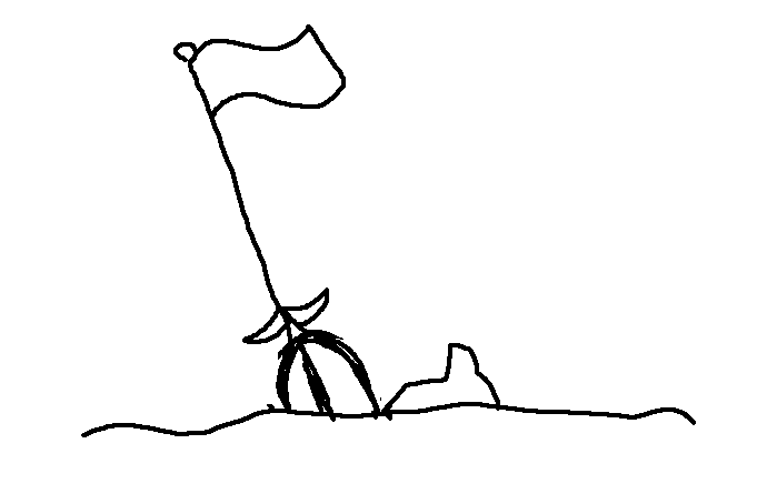
the pikes on the trident are in the ground.
also valid.
but I was going to suggest that if you want a polearm or smth as a “flag skin”" mabey you could use a spear and tatter the flag a bit to kinda convey a thrown together “we win” feeling. basically improvising to plant your flag.