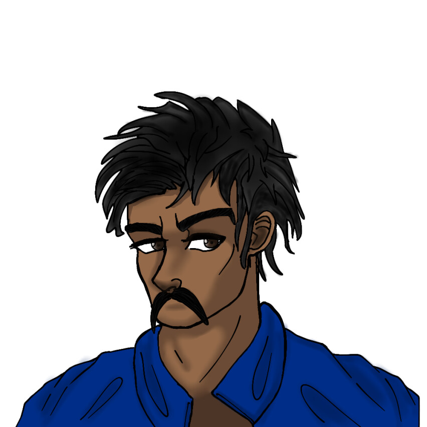
I did this with absolutely no tracing my trad art and I did this with suprising people in mind but I couldn’t stand doing this with a blind eye so I just did it and put it in places where I could share art to y’know get some tip ig so yeah! I might also train more and more on digital art since I wanna make a comic and stuff soooo yeah!
14 Likes
This looks pretty cool! >:>
1 Like
Me who has been looking for tips basically forever:
Whatcha needs tips my friend?
ooh, i have plenty of tips for digital art! (and some for art in general)
-on all your brushes, go to the brush settings, find “anti-aliasing,” and turn it OFF. this reduces blurriness
-you dont have to blend everything! you should look into hard vs soft edges, learning that helps SO MUCH
-Avoid using built-in blending tools and instead find a blending brush that you like when you do need a soft edge. I’m not sure what program you’re using, but theres probably tutorials on how to make one
-Use hue shifts in your lighting! For example, if you want warm light, make it a little more orange, and the shading look a little blue
-A good way to do lighting or to finish a piece is to play with blending modes. Theres only so much i can say about them here, but trust me, they’re super fun to play around with to figure out what works. My personal reccomendations are screen for light, multiply for darks, and a gradient with hard light or soft light. You should be able to find these in the layer settings
-Mess around with different styles! try out every technique you can find, change up your rendering style, take some inspiration from masters and artists you like, ect
-Try a painterly approach! Find a brush someone made meant to replicate something like watercolour, oil, ect, and try to use that for a piece instead of lineart and typical shading!
-NEVER, and i mean NEVER, give into perfectionism. Every artist struggles through it at some point. Sometimes its okay for a piece to not be completely to your liking
and finnally, try to learn colour theory & character design principles! This might all seem super overwhelming but!! its very worth it. just pick a random art thing to learn every once in a while and do it. Remember its never gonna be perfect on the first try, but remember you CAN work towards art skills, one step at a time!!
1 Like
TYSM OMG ![]()
I will def take your tips into account and thank you again wolfiestarzz, you genuinely helped me.
Just doin what i can with the knowlesge i have :]
1 Like
Yoooo this is new, I love it!!! ![]()
![]()
![]()
![]()
![]()
1 Like
I’ve heard that some artists struggle going digital, so for a first time digital art piece this looks pretty good.
1 Like
Tysm ![]()
Almost like every single person lately has been telling me, it may be that I did traditional for a long time but the coloring part for me was actually pretty new lol.
2 Likes
Hey, do you want any advice on colours? I’d say I’m pretty good at them :]
yes please!
buckle up its gonna be a long one
Colours have 3 main components: Value, Hue, and Saturation. Values are lights and darks, which are, arguably, the most important out of the three. Something I avoid is having multiple of the same or similar values touching each other, as it can create an unclear artwork. You can use values to assist in composition, which in case you are unaware, is how different elements are arranged on a piece, usually with a focus on drawing the eye to whatever you’d like to emphasize most. A way I like to do this is through making a few areas i’d like to emphasize a light value, while the rest of the piece consists of dark values. You can achieve some effective contrast and easily draw the eye where you want by making like, 60-80% of your artwork one intense value, while the other 40-20% is the opposite.
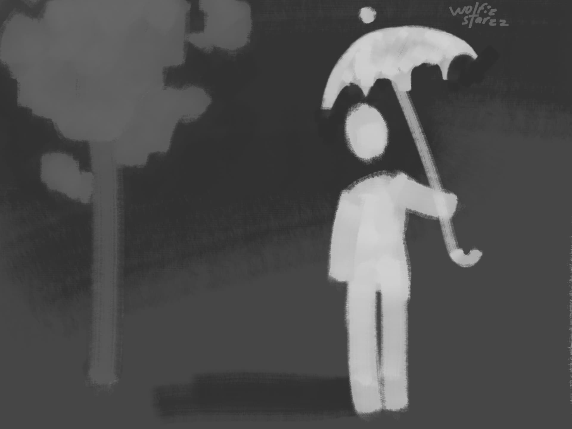
As you can see in this example, your eye is first drawn to the person, because they’re a much lighter value than the rest of the drawing. You can also see that the mood is very dramatic, because of the dramatic contrast. If I were to, say, do a medium value subject on a very light background, the mood would be more lighthearted.
“Hue” refers to where something would be on the colour wheel. This is usually what people think of when they think of colours. Warm hues are red, orange, and yellow, and can be used to evoke things like heat, comfort, passion, anger, etc. Cold hues are violet, blue, and cyan, and can be used to evoke things like freshness, cold, sadness, ect. You can achieve interesting visual effects with hues by using contrast. Some examples:
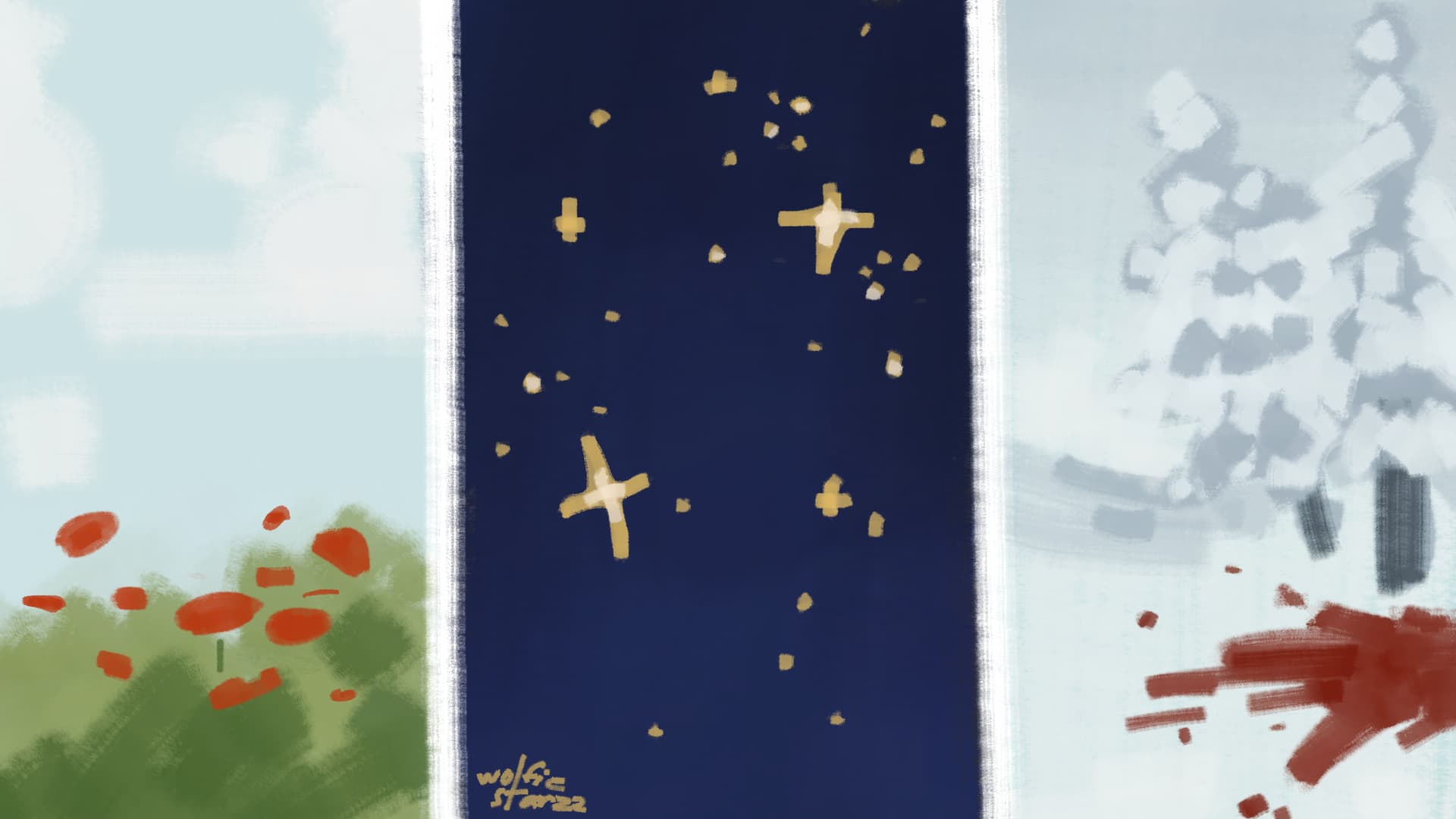
In the first one, a lot of the visual interest is coming from the warm hues in the flowers, which contrast against the cool hues in the sky. The warmth of the flowers contrasted against the freshness of the background convey a pleasant summer afternoon. In the second example, the small, warm, light stars against the deep, cold background creates visual interest, and creates a sense of peace. In the last example, the visual interest comes from the (admittedly large) puddle of blood disrupting the simple winter scene. The cool red against the bright white assists in conveying a sense of urgency. I suggest you notice my use of values in these examples, as well. Warm hues tend to make something feel closer to the viewer, colder hues tend to make something feel further away.
Saturation doesn’t require as much explaining. High saturation would be a very bright, vivid colour, while low saturation would be a dull colour (as shown here.)
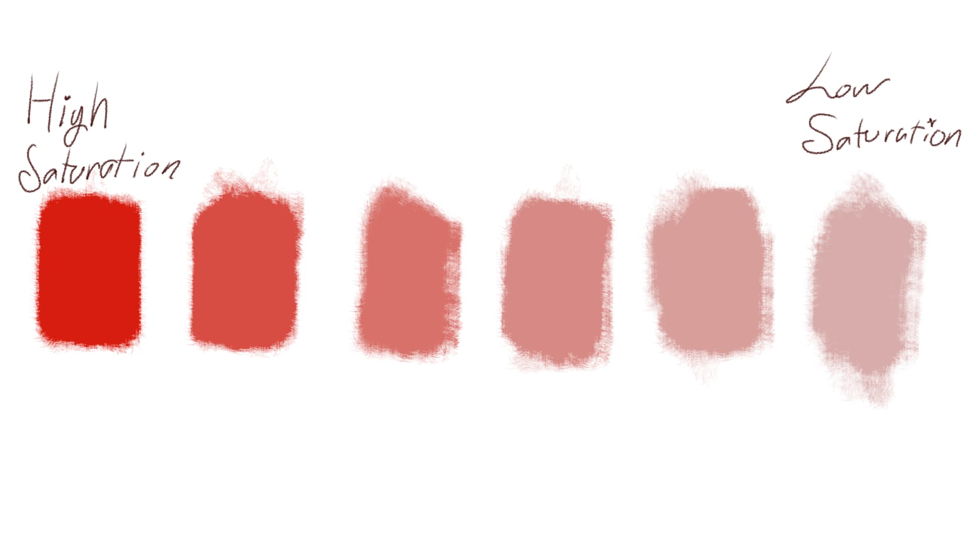
As you can see, less saturated colours tend to be more gray. Saturated colours are more punchy, so they’re good for things you want to be noticed. A trick I use is on full illustrations and landscapes, when i want something to be very far away from the viewer, I mix whatever colour I’m using for that thing with a bit of whatever colour is in the sky. Vivid colours are punchier and are noticed first.
I’m sure you get it by now. Contrast is good and you should strive for it. Also strive for having a clear subject along with having harmonious colours in your artwork. I don’t know how to properly wrap this up as that is all I have to say.
1 Like