top one was made by me btw B)
1 Like
correct.
i personally think the gun/sword looks a little offset in comparison with the magic circle. i also dont really think the cartoony gun/sword match well in terms of syle overtop the magic circle.
i prefer the simplicity of the boat, it’s nice.
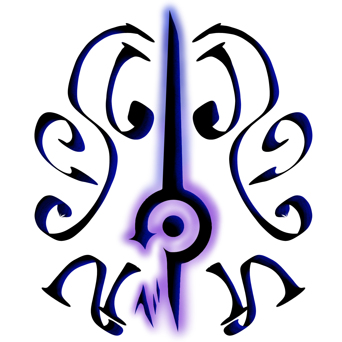
lemme tell you what it is, captains saber and flintlock. With the water magic casting thingy behind it. It’s way better then the boat. the boat is too basic
i get the concept, i just dont really like how it looks. it’s off centered, too many bright colors, and tbh it kind of looks like 2 images placed on one another.
simplicity is key in terms of logo design.
BOAT
1 Like
I don’t agree with the “simple”
A good chunk of the top logos aren’t simple. Imo more complicated logos are miles above simple ones
they most certainly are lol.
behold, one of the biggest worldwide company logos:

here, have another:
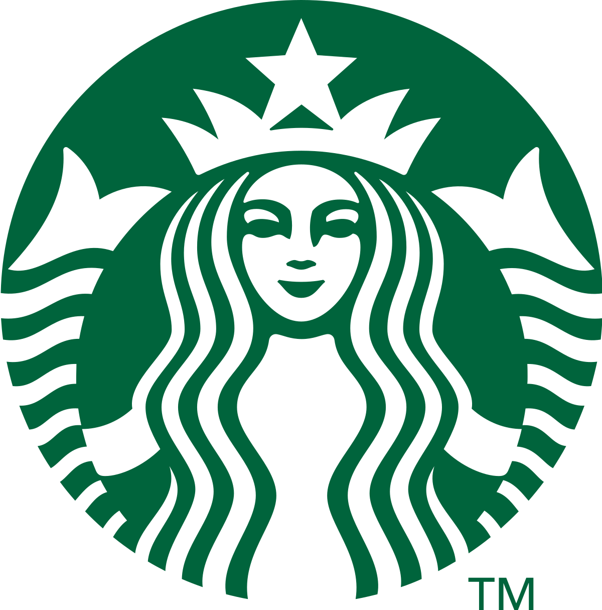
both companies have symmetry, simplicity, and few colors that blend nicely.
okay thats fine, but you were asking me which one I thought was better. if you are just going to ignore constructive critique, then don’t ask at all.
not trying to be a prick or anything, i’m just answering your question as honestly as i can.
mk. While I see your point, those aren’t guild logos…
gun wins everythime
i dont see the difference. logos are logos. its up to the creator of the guild to decide upon their design. if that guild owner wants to make their guild like everyone else’s guild’s logos that’s perfectly fine. if that guild owner wants to decide based on others’ opinion that’s fine too. i just think having a simple logo that people are drawn to (like so many companies have done) can increase likelihood of success.
again, though, it’s not up to me. it’s up to you.
ic ic.
Similar to what @Burgr said, the first design is, imo, ruined by the magic circle. The boat, while simpler, is much more defined and looks quite nice.
1 Like
I mean.
Let’s review other guild logos.
SunCry Is memorable with its white and yellow but looks like a glorified PP. Nothing to learn here lmao
Roselight has… a rose. So go with what fits your guild.
Pandemonium is groot. Pandemonium means Wild and crazy disorder or confusion and the Groot looks like he is screaming sooo.
Spearbreakers made their logo memorable with literal fucking meaning. This is if you want to go the extra mile.
Spellbreakers just has a magic fist. Nothing to learn too lmao
thing is with the saber and flintlock, it does too. It’s symbiolizes power and peace over the seas (the water thingy refers to that)
its great if you understand the meaning, but if you have to tell people what your guild logo means, then the picture doesn’t really have a purpose. everything in your guild from description to logo should match perfectly. if the image doesn’t look good, a lot of people are going to take a hard pass on joining. that’s why having something simple will draw more people in.
agree with this
somewhat disagree, simple logos imo don’t look better then more complicated ones
My, my, do I love the top one, lovely job you did. 
Choose the boat, be the goat.