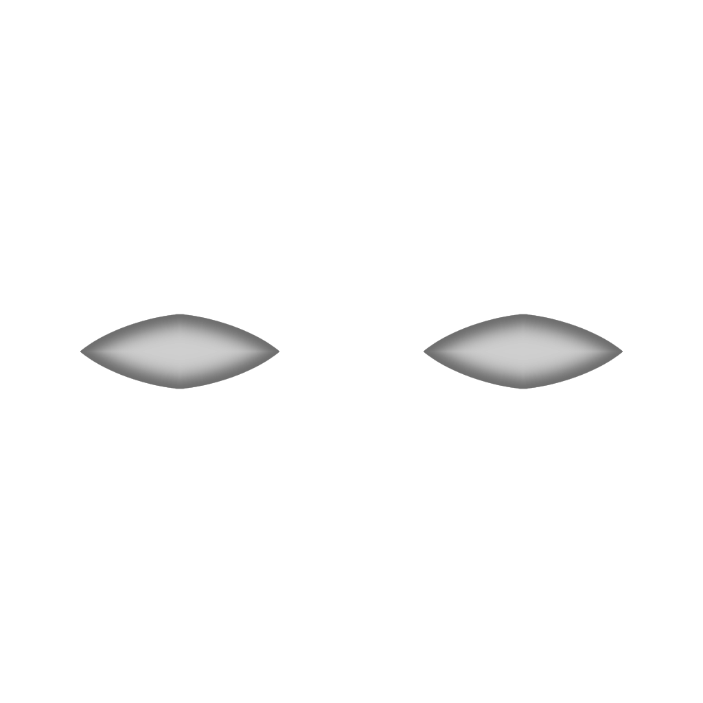
worst as in the ones that least represent their element (or something)
these tattoos appear and glow when someone is using their super mode/“avatar state” (the people can NEVER VOLUNTARILY activate it)
Personally, I think you should change all of them. If I were to look at each of these at a first glance, I very well could tell which element is which, but I feel as though maybe you should polish it up a bit more to make it more aesthetically appealing. Just my suggestion, I don’t want to intrude on your work
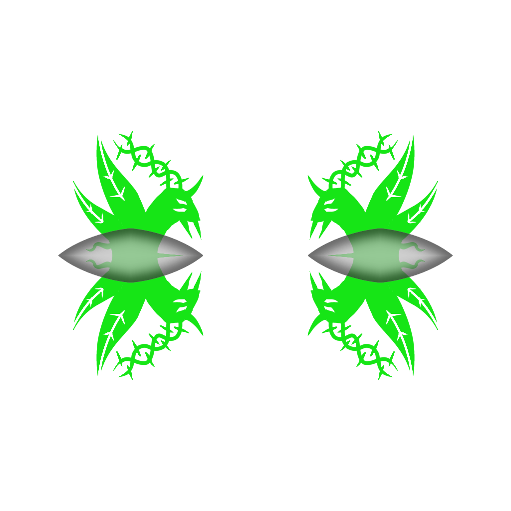
Grass looks awesome, with cool thorns, leaves, and other stuff.
Water is cool with the snow/wave in it
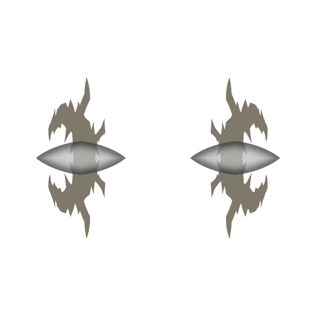
Terra looks like a cavern with cool stalagmites/stalactites around the back
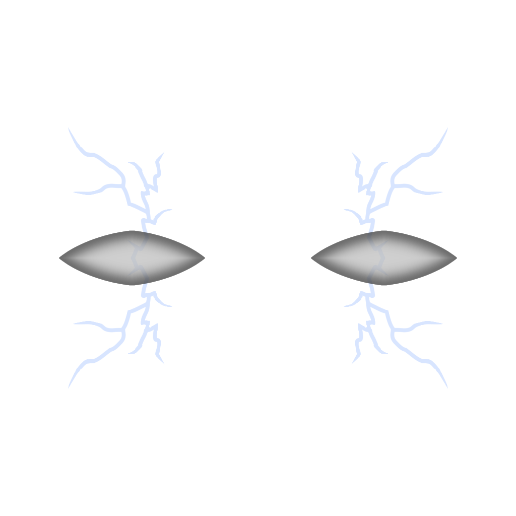
Lightning you can’t do much with, could use a rework too
Wind you once again can’t do much with
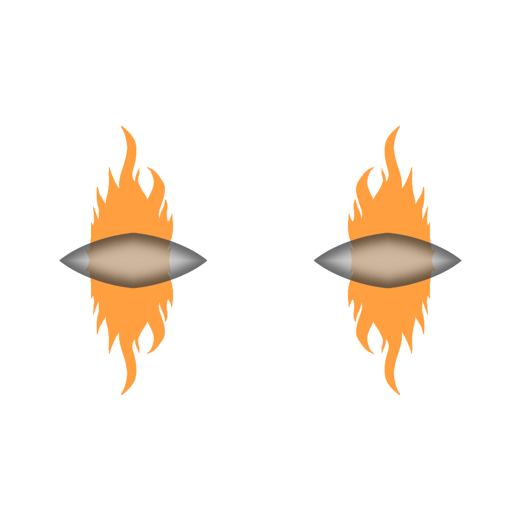
But fire is just… fire. Nothing really special like smoke or abstract fire designs, just looks like a fire png slapped on
(no offense on any of these, just trying to give tips maybe)
(I suck at drawing & stuff, but maybe one of these is helpful?)
water looks so wrong and idk why
i mean it kinda just looks like a snowflake png colliding with a wave png, a lot less tatoo-like than the other ones (way too precise, super thin line with a thick paintbrush stroke next to it)