rate pls
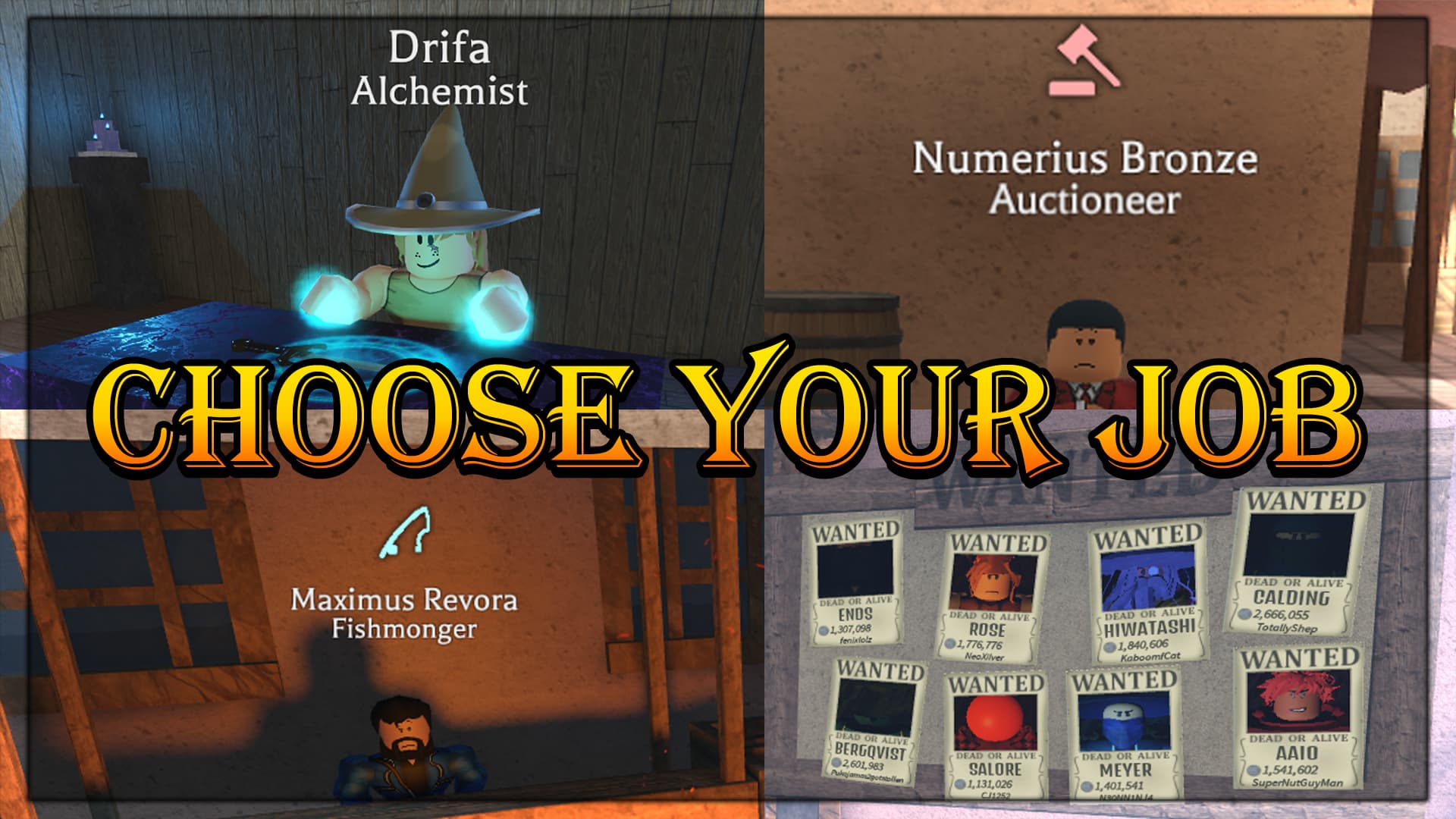
for my profession video
- 1

- 2
- 3
- 4
- 5
0 voters
I’d give it about a 3.5. It’s not bad, it’s just not that eye-catching
what should i change without adding corny arrows and circles
Add peter griffin onto the bounty board with circles and arrows all over
Ok nah but maybe make the text look more colorful and add a border ig
Maybe you could separate the images into a more unique style (like side to side images instead of having 4 corners of images) and also possibly change the font. Maybe an outline to the whole image might work too.
This topic was automatically closed 182 days after the last reply. New replies are no longer allowed.