if they connected it with the tree like Mexico’s eagle sits on the cactus then that’d be great
10k 1 day
Can you imagine what things would be like if RFAO still didn’t have any rules on what you could post, given what is happening here
for a good flag based off the union jack, check out newfoundland

very nice way to keep the original design while also making it unique
the navy base was added YESTERDAY, this is crazy
oooo and it can be rotated 90 degrees and be turned into one of those banners as well
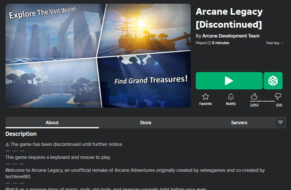
what a great discussion about the hit roblox game arcane odyssey
this was discontinued like years ago i think
I didn’t hear of it, good sir.
I wouldn’t say it’s a hit considering the rest of Roblox’s opinion on it
(Holy crap deepwoken players are pretentious, to the point vetex had to ban perma death as a suggestion cuz it was suggested so many times cuz “every Roblox rpg is either deepwoken or fodder” as they say)
What are the odds that two people have the same idea to remake Arcane Adventures? I hadn’t even heard of it until Arcane Odyssey.
Well it was a popular game, lots of people were looking forward to the future of it so when it is forcibly discontinued, people would want to give it the continuation that they were hoping for
I mean all it takes is someone who was passionate for AA to have some programming skills, and to want to make the game.
We’ve come full circle, the seemingly hidden inevitable has come around again with us going into long winded reply chains that are off topic.
It’s like RFAO2 all over again.

In other news, who’s ready to get shot at by Shieldguard for you Negative Renown people out there?

Considering that Shieldguard is 4x as large as Silverhold, do you think it’ll be more dangerous to passby it? Watch them have higher tiered cannons and mortars than we have now.
Wouldn’t it also be pretty funny if the Rear Admiral upon being agro’d by the defenses pull you into Shieldguard with her Gravity Magic too? Forcing you to a confrontation with the GN and herself there.
As a fame player yeah I’d absolutely run from hunters by just sitting in shieldguard (or passing by it)
Bro, with this amount of yapping, i wouldnt be surprised if we reach the 10k cap before the update comes out ![]()
(Magic) Savants are actually getting a buff next update on tiers for their second magic
Also why do I torture myself going through all this yappery
As the source of 1/12th of the yapping
I’ll make sure of it
Depends on where its at really, it may just be out of reach within important islands