the avatars i’m most proud of
avatar 1 (stop sign is usually removed when i’m using shiftlock, it blocks the way resultingly and messes up aiming scripts in some games)
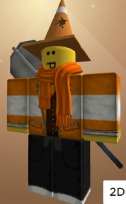
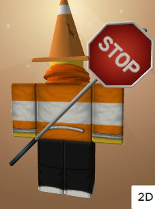
avatar 2
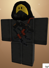
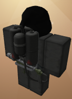
the avatars i’m most proud of
avatar 1 (stop sign is usually removed when i’m using shiftlock, it blocks the way resultingly and messes up aiming scripts in some games)


avatar 2


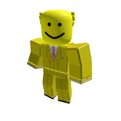
The very concept of perfection lies in this image
can’t wait for someone to take a suicide bomber outfit from the internet made from the few days people had with the dynamo’s dynamite bandolier before it was turned into power cell
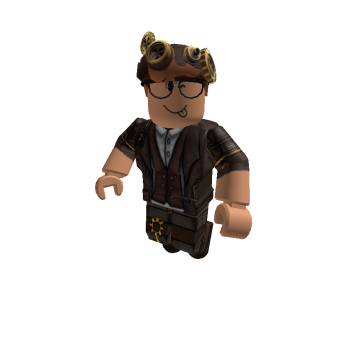
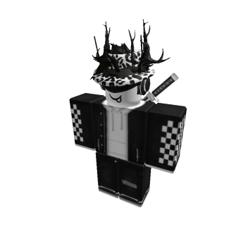
Probably my most okay avatar
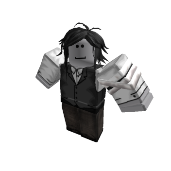
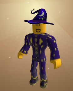
wizard made of sentient slime
Why are peoples avatars so good compared to mine
was:
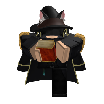
is now:
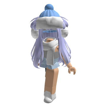
(egirling)
5.2/10 Its simple and nice but a bit jumbled, overall a meh
6.24/10 can’t really rate it higher or lower, i like that you definitely got rid of excess stuff but pretty simple and not much notable about it
8.84/10 Simple but i really like it, the hat, shirt, scarf, and hair bland perfectly, not much cons i can really point out about it
9.1251/10, like before everything flows into each other and i like the overall traffic theme, a bit more complex than the generic “blocky” avatar
6.7/10, i like the theme you were going for but literally feels like it doesn’t flow that well between the hats and the suit, looks like something you would see in a 2014 roblox survive the zombies game so points for that
7.1/10, The theme stays strong, I’m not sure about whatever the fuck the things coming from the head are supposed to but otherwise goes kind of hard
9.561/10, simply amazing, from the steampunk look to how overall cohesive the outfit is, its probably the best one in the thread so far, not much i would do to improve to it
10/10
6.53/10, Looks like something i would make when i just got roblox when i was like 11 so a bit of nostalgia there, everything flows but something just feels plain/ generic when looking at it idk ![]()
7.33421/10 Once again, goes to show that simple can be best sometimes, it flows very well, not many flaws i can point out with this one
5.1534/10, Cool outfit but I can’t feel like the shirt and overall look of the character match but i kind of like it
3/10 this looks too much like an anime cosplay and i don’t like that ![]()
7.24/10, The winter theme in this one goes kind of hand but honestly the main flaw in this is that the korblox feels pointless and really doesn’t add too anything really it just makes it look odd idk why people feel the need to constantly use headless/ korblox but overall i like the theme
my main avatar tbh
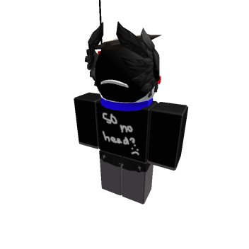
the shirt has lasted a literal year without being taken down ![]()
6.9213/10, I like the shirt and pants part of the outfit but you kinda fucked up at the astronaut part with the wings or smth idrk and the shirt is definitely something ![]()
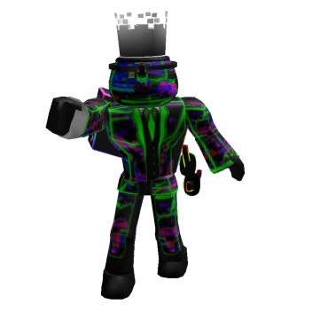
8.12/10, I really like every part maybe leading up to the hand and hat, the colors are ballers and overall it would say the only thing that ruins it is probably the hat and the hand which kinda stand out in a negative way
the wall fixes everything

would’ve been better if I got the grass one instead
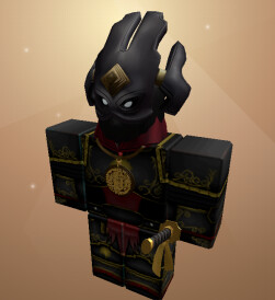
9.6/10, The best one I’ve probably seen in the thread so far. Not too simple but not to complex, everything goes well, the accessories fit, and i genuinely can’t see what is wrong with it besides some mishaps
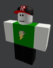
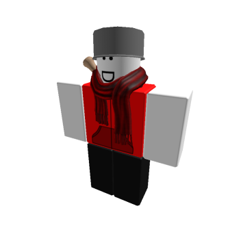
here’s my current one and unchanged for 1 year, though I might change later.
before you say anything about ABD, I will say this:
I got the tin pot idea from R2DA, not ABD.