SO THAT’S WHY YOU’RE CALLED GOOPMAN
bruh I never saw that tbh
SO THAT’S WHY YOU’RE CALLED GOOPMAN
bruh I never saw that tbh
so here are MY main avatars!
ples rate ;_;
we have:
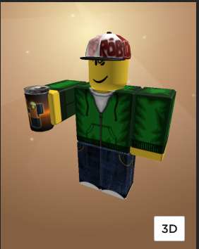
the standard hectopopobro:
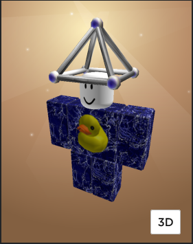
a man who I call “discus” he doesn’t have the duck anymore but replaced with a DVD.
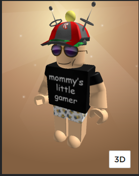
and the avatar I use to recreate war crimes on a kids game platform with
Front view
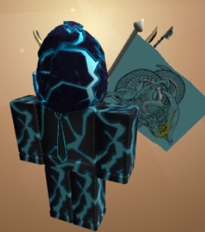
Back view
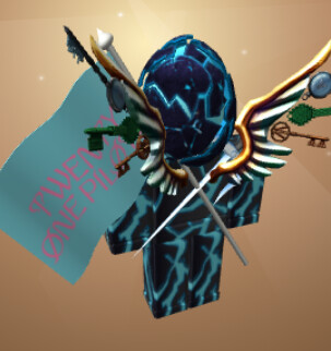
updated discus:
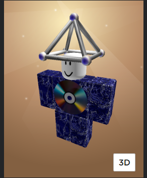
no idea who these are may as well throw em in:
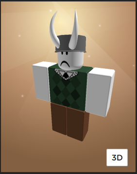
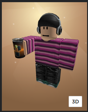
omg how did you find that ![]()
yeah that’s me
it’s been a loooooooonnnnggg time
I got banned for arguing with one of the most braindead people ever
goober
mine’s wearing racist clothes
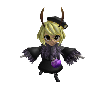
got two
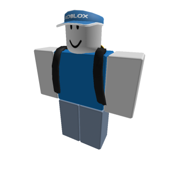
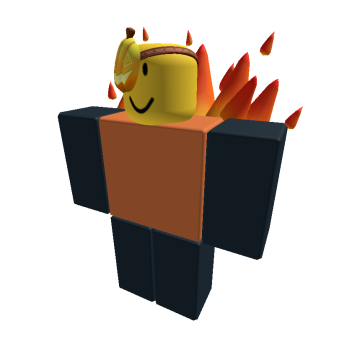
Normal/Global Archenhailor
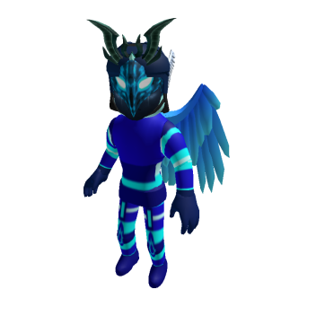
Robloxian Archenhailor
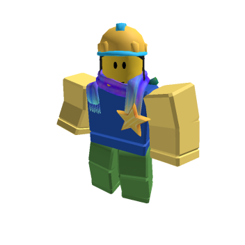
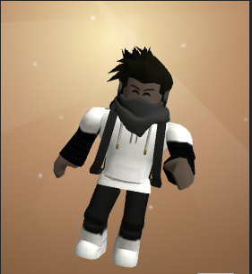
6/10, same rating i would give a generic blocky avatar, not much to hate but also not much positives i can point
6.4/10, similar to same reason above but the scarf kinda adds to it, not too sure about the pothead
I forgot this game even existed ![]()
7.1/10, I like it reminds me of something i would see in a club hangout game during 2014
4/10, im not gonna lie this one kinda sucks. Even with the classic looks nothing really blends and it honestly just looks kind of ugly
2/10 for reasons listed above x2
6.534/10, i like the synergy between the hat and clothing, but the flag doesn’t really bode well, you could get away with the wings (fuck that accessory in particular ![]() )
)
3.5/10, listed for reasons above x1.5
6.2/10, Actually kinda good, not much else to add
6/10, also kinda good but i feel like the classic avatars are a bit oversaturated now (not necessarily a negative, just try changing things up a bit)
2.4/10, you definently play Da Hood
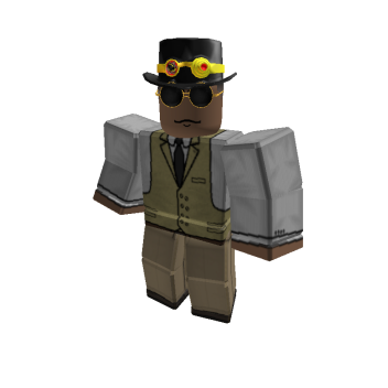
7.543/10, Very good outfit. The glasses and the hat thing with class (i forgot the name) get very well with the outfit. Not much i would add to it
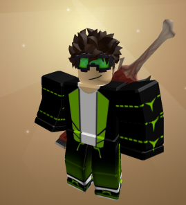
6/10, Im honestly not sure what i even think about this, no like seriously my mind cant register what is right and wrong with this outfit (maybe because im tired as fuck rn) but i like the green/ black theme throughout the outfit, the meat stick on the back kind of conflicts with it though
5.321/10, The hat + horns feel kind of original but i feel as if i’ve seen this exact fit like 1000 times already, kind of generic imo
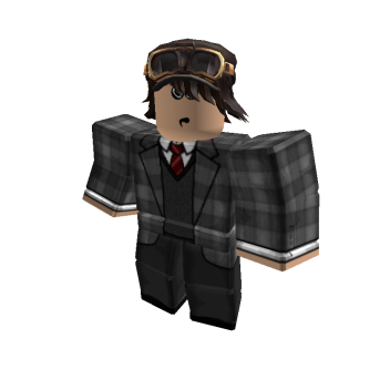
7.11212/10, Nice overall. Like many others the hat and clothing fit, not much to do here
1/10 what in gods name is this abomination
6/10, same rating i would give to a generic blocky avatar
6/10, same as above
3.6/10, im not gonna lie this is kind of ugly asf, the shirt and pants match but their brightness and texture conflicts with the hat kind of badly and kind of with the wings, the hat doesn’t exactly blend with the outfit overall and i feel like something is just off with the overall texture
8/10, This one is good. I would normally give a generic noob outfit a 6/10, however the color sceme matches eachother very well and the BC hat is a good addon
9.6/10, i don’t know who that is your cosplaying, but INSANELY drippy. I can’t even explain how fire it looks but it just is really good overall
there arent really any items that can make that
Ah i can see where you were going, it actually does like nice but its a shame there isn’t much you can really do with the current amount of hats rn
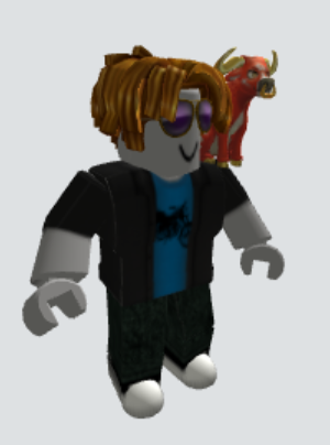
6.5/10, bacon hairs are already kind of dripped out but the glasses make the outfit go harder, not sure about the bull though
hilarious forum auto-edit