Basically just a generic avatar rating thread, ill try and give some criticism if it is bad or smth. Ill do a tierlist if this thread is kind of successful or smth ![]()
My avatar is a stereotypical noob. Just kinda like simple avatars
forgot what mine looked like
Can i atleast have the image if im gonna put it on a tierlist ![]()
and if it is just a stereotypical noob then all i can rate is a 6/10, not much to say, kind of oversaturated but i also can’t really think of any cons and the only pro i can think of is the epic nostalgia feel
Are you gonna rate forum profile pictures
Already did that in a tier lists thread with like atleast 200+ Forumers i never want to do that again ![]()
This one (kinda outdated now)
7.86/10, goes to show that simple can really be best at times, I like the mask because it fits the overall look of the character/ outfit but the rose feels a bit off (maybe because it clips into the mask)
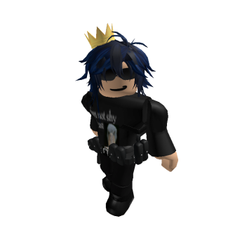
the shirt says “i’m not shy, i just” and then a picture of a shoebill.
7.0942/10, like the overall design, the hair rand shirt fits, based t-shirt,. The one thing i would probably change is the crown as i don’t really know why it is there but other than that badass overall
i added the crown since that area felt empty and there weren’t any hats that fit around the hair
fair enough
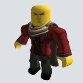
6.291/10 definently something, the uhh anime face is kind of throwing me off but the outfit is pretty dripping, i lowkey thought it was OPM for a sec tho ![]()
0/10 no explanation required ![]()
search hectopopobro
ok heres a few of mine
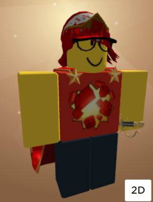
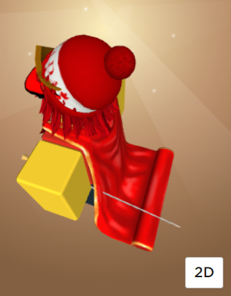
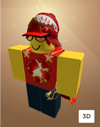
also heres a more cleaned up version
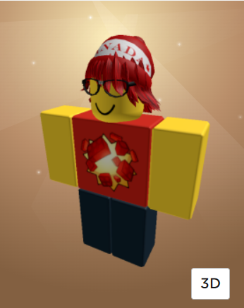
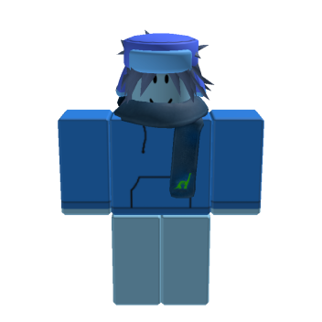
I kinda like it, looks great
I’d say 10/10 at the most
you look like someone who would give you all the help you ask for in something like Find Everything
