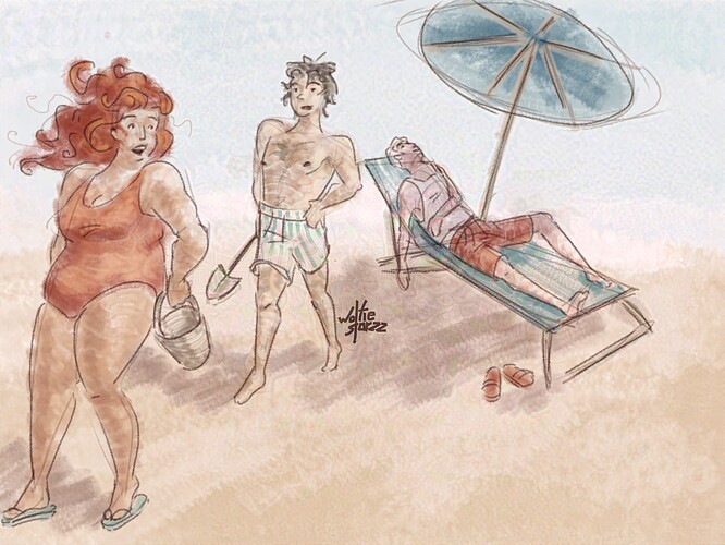
You’ll get torched by iris simps for making her look like that ![]()
morden with body hair🤮 /j
neviro my boy urgonna burn!!!
also ur iris is GORGEOUS. absolutely STUNNING.
They’ll have to pry my iris design out of my cold dead hands ![]()
Interesting character designs
@Mirage ! Someone has taken your chunky Iris design!
(Also, I do quite like your more traditional looking style.)
Actually, I haven’t seen Mirage’s art. Nice to know someones in agreement with me on Iris though ![]()
thank youuuuu <3
and thank you for the compliments to my art style ![]()
![]()
this is really cool! I aspire to color this way someday!
Thank you! I could put some tips together sometime, if you’re interested in that ![]()
Been a while since I’ve seen a trad art style like this. Pretty cool ![]()
ILOVECHUBBYIRIS
auugh it’s so peak
Here you are!
Mirage is my friend and it’s my duty to ensure they get praised as much as they deserve. As is any artist’s duty to another artist.
honestly I’d love to hear some tips please!
I mean I don’t like iris at all, and this doesn’t change my view
I’m not exactly an art teacher, but I’ll do my best to explain how I use colours :]
I plan out my colours first by using a layer above the sketch to mess around with them until they look good. I usually take values into account, like in this one I wanted a light and airy atmosphere so I used lighter values with less contrast than usual. Contrasting values are essential in every art style. In case you don’t know, values are basically how dark or light a colour is. An example of how I use them would be to highlight a subject by painting the subject in lighter colours when the rest of the piece is in darker colours, or vice versa.
On this piece, I used mainly red, yellow, and blue, with an emphasis on warmer colours. Out of the whole pallete, the red has the darkest value, and the warmest hue, which makes it feel closer to the viewer, and the light blue I used in the sky has the lightest value and the coldest hue, which push it further away from the viewer and provide contrast against the subjects. This use of colour, and my use of perspective, push Iris close to the viewer and Neviro away from the viewer. Everything kind of meshes together, its really cool to think about :]
Another thing that gives this piece harmony is the red used in small amounts where theres more blue, to make everything tie in with the subject.
That wraps up my explanation of how i used colour in this piece!! :] If you have any questions please let me know, I love explaining my methods!
Why are you commenting on art depicting her, then?
