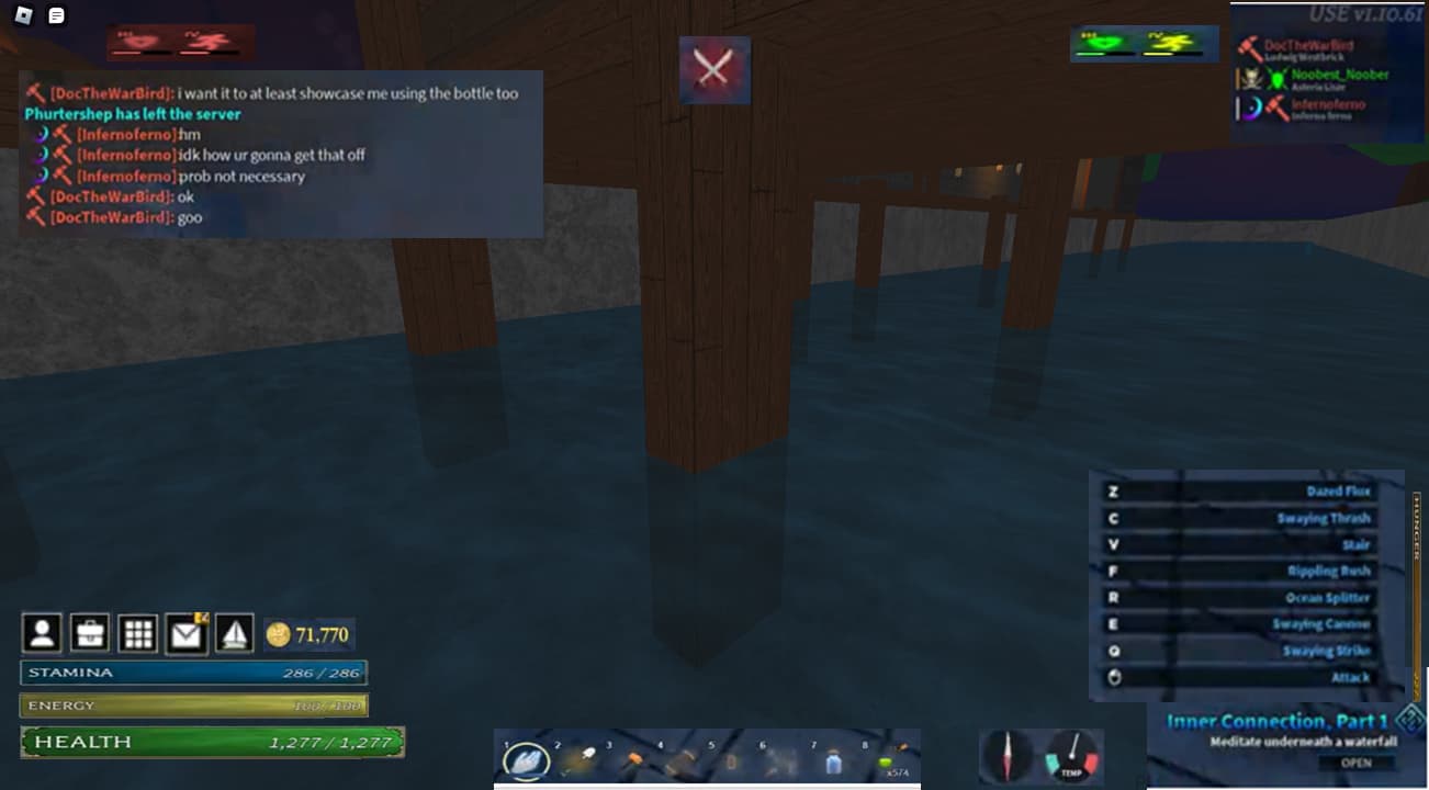
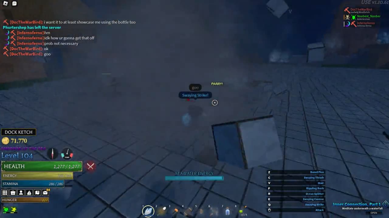
the former image doesn’t look very playable for obvious reasons, where the current UIs on screen would better be, with hunger being on the far right, whatever the boat icon did could be within the nine square icon and the current one could be to ‘dock ketch’ and the icon could go light grey when already, debuffs at the left side and buffs on the right side of the ‘battle engaged’ icon, in case a mechanic of ‘thirst’ gets added it could be on the latter side of the shape hunger is above and of course the bar would have a slanted side to be parallel with the side of the shape beneath it, use the latter image for actual size comparisons, i’m only suggesting where they should be moved and i understand the sizes of the former one really take up the screen, your level can already be seen hovering over your username, any issues address yourself, there’s alot more space when the sizes are the same as the ones from the current image , just move everything within your mind and it’s alright.
Image (1) indicates the order of the UIs however Image (2) contains the actual sizes the UIs will take.
Suggestions are currently closed, please wait for #suggestions to reopen.