here’s my thoughts on this before AO back when i saw how the UI was from WoM:
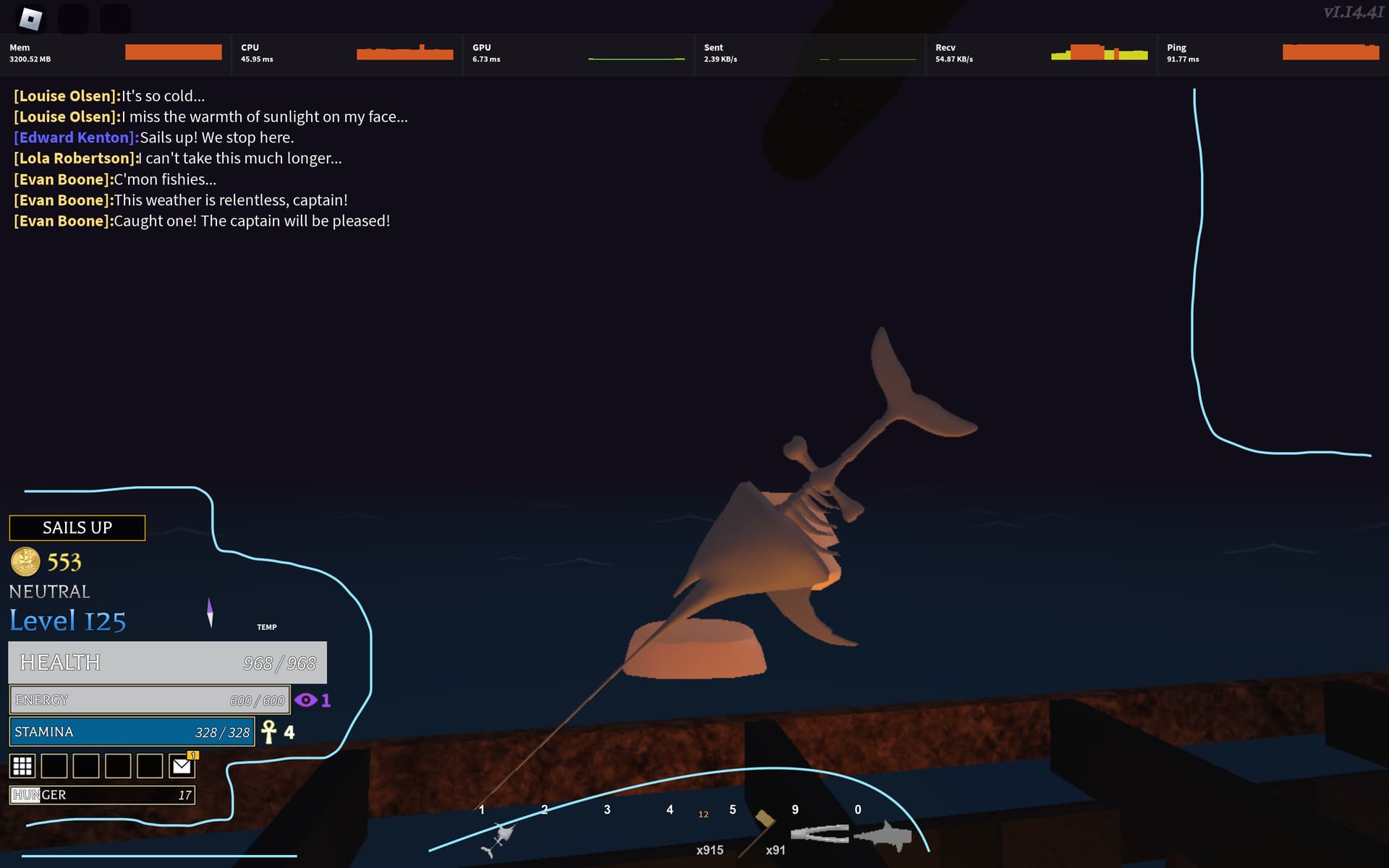
[image]
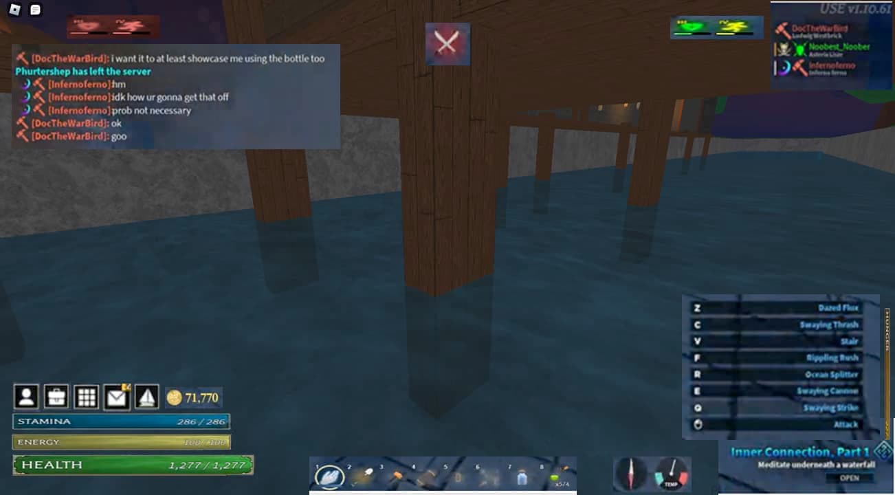
[image]
the former image doesn’t look very playable for obvious reasons, where the current UIs on screen would better be, with hunger being on the far right, whatever the boat icon did could be within the nine square icon and the current one could be to ‘dock ketch’ and the icon could go light grey when already, debuffs at the left side and buffs on the right side of the ‘battle engaged’ icon, in case a mechanic of ‘thirst’ gets added it could be on the latter side of the shape hunger…
^I proposed a redesign too in case that will help any of you with ideas, It’s just really annoying to see; maybe it’s the missed opportunities, and it doesn’t seem like something that new players would be comfortable with or would think is “cool” for a new game they’re getting into yknow?
does anyone see how much easier the new design is on the eyes? just imagine it but in AO i don’t wanna redesign that in an AO setting pls…
@Forty-Eight i’ll leave this to you
unc casually dropped the
nah you gotta put the effects at the lower right, bee swarm simulator lookin
just shrink everything that isnt the hotbar by like 25-50% and you’re golden
deepwoken ui is peak I’m ngl
and yeah ao UI is way too big and misplaced, the style is nice tho
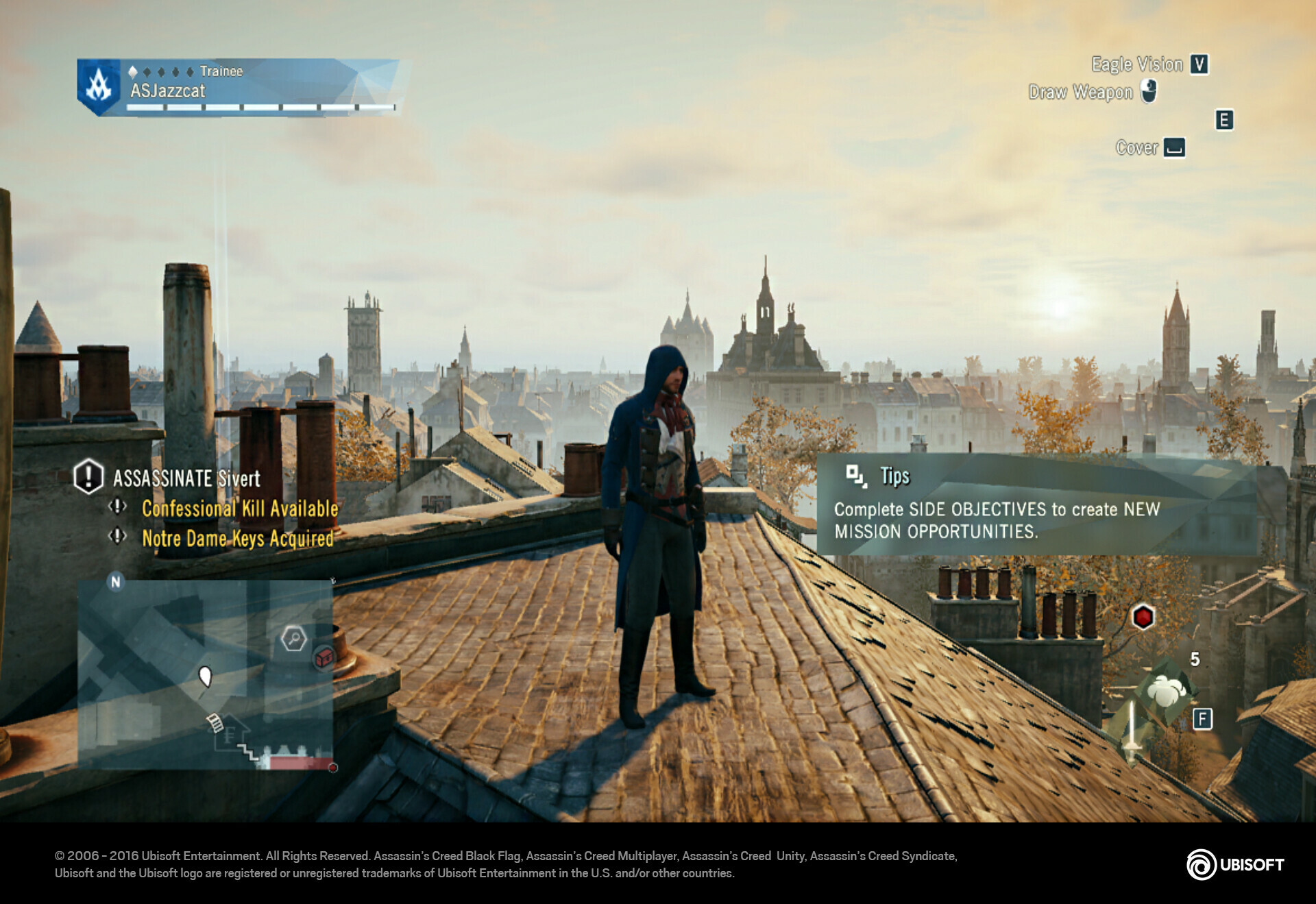
This design is horrible wtf there are indicators on each corner of the screen like it’s an Ubisoft game
P/S: I do have like 5 AC games on Playstation but they’re acceptable since the icons are way smaller compared to pc
you mean the old or proposed design?
system
September 27, 2024, 12:45am
16
This topic was automatically closed 182 days after the last reply. New replies are no longer allowed.