Tobi's Logo Hub

━━━━━━━━━━┛About┗━━━━━━━━━━

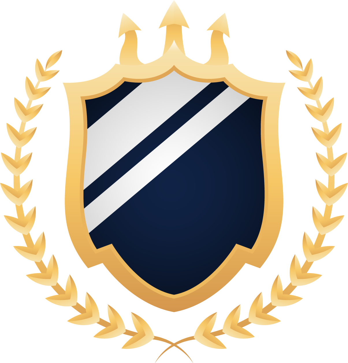
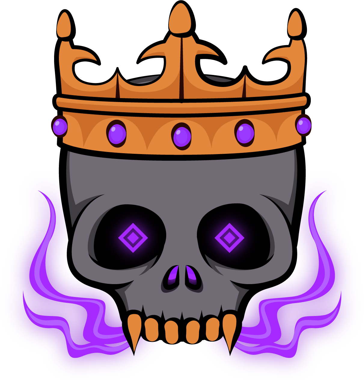
This is a topic featuring my custom Arcane logo designs and emblems.

Important: These logos are of my own personal design and aren’t 100% accurate to the lore or games. Feel free to use these logo designs, in whole or in part, but please link the resource or credit me in some way. If you’re unsure about using my logos feel free to ask.

Join my discord for updates and WIPs

Discord Community

Tobi Hub 🍡

━━━━━━━━━━ ↓ The Topic ↓ ━━━━━━━━━━

━━━━━━━━━━┓Resources┏━━━━━━━━━━

AO Logos
Logos
AO Logo

More Accurate:


Regular:

Compass:

Compass + Stars:

Regular Pirates

Logo:

Jaw Pirates

Logo:

Logo Outline:

Sameria

Logo:

Logo Outline:

Ravenna

Logo:

Logo Outline:

Assassin Syndicate

Logo:

Logo Outline:

Grand Navy

Logo:

Version 2:

Quest Markers

Main Quest Marker:

Side Quest Marker:

Concepts
Summary
Villian Logo Concepts
Tyrant

Logo:

Demon

Logo:

Most Wanted

Logo:

Warlord

Logo:

Emperor of the Sea

Purple Version:

Gold Version:

Hero Concepts
Savior

Logo:

Legendary Hero

Logo:

War Saint

Logo:

Guardian of the Sea

Logo:

Monarch of the Sea

Logo:

(Navy Concepts Coming Soon)

(Assassin Concepts Coming Soon)

My Hubs
Links

Tobi’s Magic Circle Hub - Art - Arcane Odyssey

Tobi’s Wallpaper Hub - Art - Arcane Odyssey

36 Likes

Hey look you got back from being kidnapped by the Assassins Syndicate

1 Like

They couldn’t keep me contained forever! Tobi_buff

2 Likes

Theyre so clean

1 Like

I made sure to wash them for this special occasion. :smiling_imp:

1 Like

GN logo
ok, but heres the actual logo that JTN brute forced with ids

1 Like

here before this gets flooded with replies

1 Like

also they are class ngl

1 Like

Cool

1 Like

jesus christ bro, your art just keeps geeting better and better! This is so damn clean

1 Like

If I had a nickle for every time Tobi made a hub filled with absolute fire for art, I’d have two nickles. Not a lot but I am glad it happened twice.

3 Likes

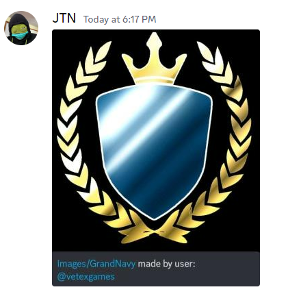
JTN showed this to me earlier and I have my own opinions about it, but overall I do think the concept is very strong. I’m personally not a fan of the way the gradient/fabric texture for the logo is used, but that’s strictly my opinion.

If you compare my logo to the official one you can see that both take completely different design approaches. Most of my design choices are derived from the official grand navy logo, with a few stylistic choices thrown in. For example, I went with a trident instead of a crown because I felt that would be a stronger design choice to represent a navy. I also shaped the shield to match the curvy and pointed shape of the trident to create consistency throughout the design. Both logos take the appearance of royal crests, but both have their own unique flare.

Anyway sorry for the paragrpah, I’m just very passionate of design.

Dam you’re richer than me Tobiemoji_sadness

Thanks! I hope to keep improving. Tobiemoji_gogogo

Why thank you m8 Tobiemoji_noprob

Imagine 4 of these mfs pull up :skull:

1 Like

doomsday

1 Like

Ragnarök

OH SHIT , atreus lets use ragnarok to kill the all father!

1 Like

awesome concepts! if i had any critique i would say to move the canines to the outermost teeth since that is where they actually are in the mouth

1 Like